Graphic design for advertising emerged as an essential practice in the early 20th century, crafting compelling visuals that capture consumer attention and convey messages effectively. Back then, traditional methods dominated the field, but today the landscape of advertising design is as diverse as ever. Regardless of the medium, graphic design for adverts aims to create a connection between the product and the audience, often turning heads and prompting action. While it might initially seem daunting or overly structured, creating advertising graphics is actually quite dynamic and creative--and it's gaining more importance than ever before. Boost your campaign's effectiveness with the following design strategies and create impactful adverts of your own.
Visual hierarchy
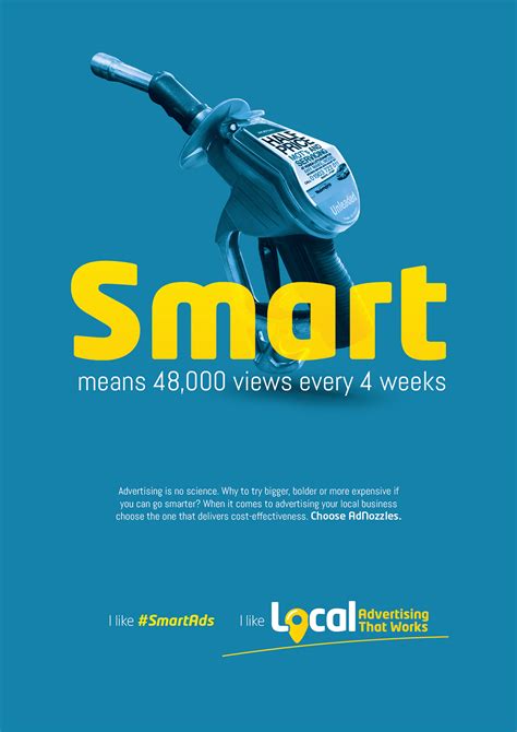
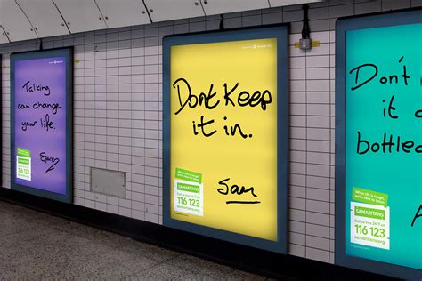
Visual hierarchy in graphic design is crucial for advertising as it guides the viewer's eye to the most important elements first, ensuring the message is effectively communicated. Designers strategically use size, color, contrast, and typography to create emphasis and direct attention toward key information or calls to action. For instance, a bold headline with a larger font size at the top of an advertisement immediately captures attention, while supporting images and text are arranged in descending order of importance. Skillfully managing visual hierarchy not only enhances readability but also influences the viewer's perception and retention of the advertised product or service, ultimately aiding in achieving marketing goals.
Typography selection
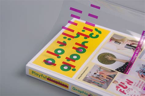
Typography plays a pivotal role in graphic design for advertising, as it not only conveys the message but also influences the viewer's emotional response. Selecting the appropriate typeface can enhance brand perception by aligning with the brand's personality; for example, a sleek, sans-serif font can suggest modernity and innovation for tech companies, while a serif font might evoke tradition and reliability for more established brands. The hierarchy of type should be meticulously planned, with the headline capturing attention through bolder and larger fonts, while subheadings and body text remain clear and legible, guiding the viewer's eye seamlessly through the advert. Kerning, leading, and tracking must be adjusted precisely to ensure optimal readability and aesthetic balance, as poorly managed typography can lead to visual clutter and dilute the effectiveness of the advertisement's communication.
Color palette
In graphic design for advertising, the color palette is crucial in evoking emotions and delivering a brand's message effectively. Warm hues like reds and oranges can create a sense of urgency or stimulate excitement, which is ideal for clearance sales or limited offers. Meanwhile, cool colors such as blues and greens often convey calmness and reliability, resonating well with brands promoting health or technology products. Strategic use of contrasting colors can enhance readability and attention, ensuring that the call-to-action elements stand out, while complementary colors build a cohesive yet dynamic visual narrative that can enhance brand recognition and memorability.
Brand identity
In crafting graphic design for advertisements with a focus on brand identity, cohesion across all visual elements is paramount to affirming brand recognition and loyalty. Every choice, from typography and color palettes to imagery and layout, must resonate with the brand's core values and ethos, encapsulating its unique persona in a way that is instantly recognizable to its target audience. Utilizing iconic visuals or consistent design motifs not only fortifies identity but distinguishes the brand in a saturated market, making it memorable amongst consumers who are constantly bombarded with diverse media messages. Moreover, subtle reinforcement through design elements like logos or taglines, tactfully integrated rather than dominating the visual narrative, ensures that the brand's message is perceived as both persuasive and authentic, leading to a deeper emotional connection with the audience.
Design layout
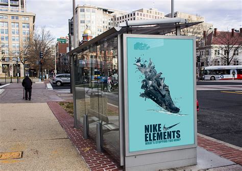
For creating an effective advert through graphic design, focusing on the design layout is crucial as it dictates how information is structured and visual elements are perceived, ensuring clarity and impact. By employing the principles of hierarchy, a designer can guide the viewer's eye through the advert, giving prominence to the most critical message, often using size, color contrast, or positioning to create focus points. Utilization of a grid system can bring cohesiveness and balance, aligning texts and images in a manner that enhances readability and aesthetic appeal without any elements feeling cluttered or misplaced. Negative space should be strategically used to create breathing space around various components, allowing for increased emphasis on crucial aspects, and complementing the overall harmony and flow of the design, ensuring that the advert remains both engaging and persuasive to its intended audience.
Target audience
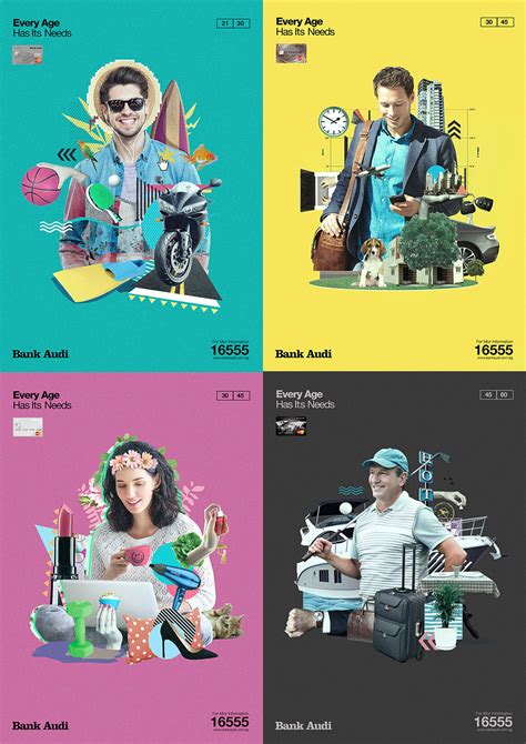
Understanding the target audience is crucial in graphic design for advertising as it directly influences both the aesthetic and communicative elements of the design. For a younger audience, vibrant colors, modern typography, and dynamic imagery resonate better, grabbing their attention and evoking emotions aligned with current trends. Conversely, for a more mature demographic, a classic, sophisticated design with muted color palettes and elegant typography can communicate professionalism and build trust. Delving deeper, designers should also consider psychographics, including lifestyle, values, and interests, which can inform not only the visual style but also the messaging hierarchy and call to action within the advertisement, ensuring that the design effectively engages the audience and drives the desired response.
Image resolution
High image resolution is crucial in graphic design for advertisements, as it ensures clarity and professional appeal, influencing consumer perception positively. Detailed and crisp visuals draw viewers' attention, making the advertisement more engaging and facilitating the conveyance of the intended message effectively. Designers typically opt for images with a resolution of at least 300 DPI for print advertisements, ensuring the images remain sharp and vibrant in various sizes and formats. Furthermore, high-resolution images prevent pixelation, enhancing the overall quality and effectiveness of the advertisement in competitive marketplaces.
Design consistency
Design consistency plays a pivotal role in strengthening brand identity and ensuring effective communication in advertisements. Every element, from typography and color palettes to imagery and layout, must align with the established brand guidelines to maintain a cohesive visual language. Consistent design elements create familiarity and trust among the audience by enhancing recall and reinforcing brand messages. Such visual harmony also aids in an uncluttered presentation, allowing viewers to process information quickly and efficiently, thereby increasing the ad's overall impact.
Creative brief
A creative brief serves as a foundational blueprint for the graphic design of an advertisement, outlining the strategic objectives and creative direction that the design should encapsulate. It functions as a comprehensive guide, detailing the brand's identity, target audience, key messages, and the specific goals the advertisement aims to achieve. By articulating elements such as tone, style, and required deliverables, the brief ensures that the design speaks coherently to its intended audience while maintaining brand consistency. Well-structured collaboration between designers and stakeholders is thereby facilitated, leading to more efficient processes and targeted design solutions that resonate effectively across various platforms and media.
Call-to-action
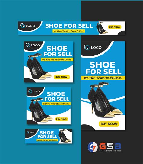
The success of a graphic design for an advertisement relies heavily on the effective integration of a compelling call-to-action (CTA). A well-crafted CTA acts as the driving force that motivates the audience to engage further, whether it's making a purchase, subscribing to a newsletter, or attending an event. To achieve this, designers should employ bold, contrasting colors to make the CTA button or text stand out, ensuring that it draws the viewer's attention immediately after they process the core message. Placement is key, as the CTA should be strategically located near primary content, using concise and action-oriented language to create a sense of urgency and purpose, encouraging immediate interaction from the audience.

















Leave a Reply
Your email address will not be published.