Graphic design for social media feeds gained prominence as platforms like Instagram and Facebook became integral to everyday life. Initially, there was a predominant style focused on bold colors and minimalism, yet today, the variety of graphic design ideas is vast. Whatever the aesthetic, graphic design enhances the storytelling and visual appeal of digital content. While at first glance designing for feeds may seem purely technical, it is, in essence, a creative and exciting endeavor--one that's currently experiencing significant innovation. Enhance your online presence with the following graphic design tips and elevate your social media feed.
Visual hierarchy
In graphic design for feeds, visual hierarchy is paramount, guiding the viewer's eye through content seamlessly while establishing a coherent narrative that captivates the audience. The strategic use of size, color, contrast, and positioning dictates the significance of each element, allowing the designer to prioritize information that needs immediate attention. For instance, oversized typography can command focus on a headline, whereas subtler, harmonious hues can lead the eye gently over supporting text or imagery. Negative space plays an instrumental role, granting breathing room and highlighting essential elements, ensuring that the viewer's gaze flows intuitively from focal points to supplementary information without overwhelming the sense of balance and rhythm in the overall composition.
Color palette
In crafting graphic designs for feeds, an expertly curated color palette plays a pivotal role in capturing attention and conveying the brand's ethos effectively. Harmonized colors not only create visual appeal but also establish a distinctive identity that differentiates a brand or message within the crowded social media landscape. A designer must carefully select hues that align with the intended mood or emotion, considering psychological impacts; for instance, blues can evoke trust and calm, while reds might elicit excitement or urgency. Strategic use of complementary or analogous color schemes can guide the viewer's eye through hierarchies of information, ensuring that essential elements, such as calls-to-action or brand logos, are both highlighted and seamlessly integrated into the overall design.
Typography balance
In graphic design for feeds, typography balance serves as a crucial element that dictates both the aesthetic appeal and functional readability of a design. A designer must carefully choose typefaces that harmonize with each other, taking into consideration variations in weight, style, and size to achieve a visually pleasing composition. The contrast between headings and body text should enhance the hierarchy, guiding the viewer's eye in a natural sequence without overwhelming them. Negative space plays an essential role, providing breathing room around text elements to prevent clutter and optimize legibility, ensuring that the typography doesn't merely occupy the feed but commands attention and conveys the intended message effectively.
Brand identity
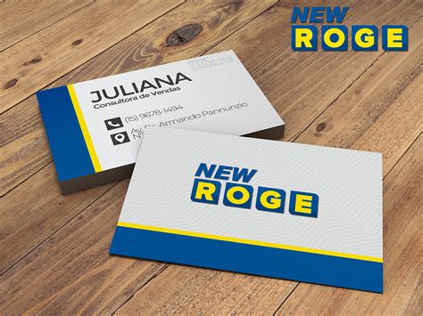
Graphic design for feeds centered around brand identity requires a meticulous and strategic approach, one that aligns visual elements with the core values and personality of the brand. Designers must craft compelling graphics that reflect brand colors, typography, logos, and thematic elements consistently across all feed posts, ensuring each image resonates with the intended message and maintains a cohesive look. Mixing innovative design techniques with the existing brand guidelines, designers should aim to evoke emotion and recognition, subtly reinforcing brand recall through creative storytelling and consistent visual motifs. The challenge lies in balancing creativity with uniformity, ensuring graphic elements not only capture the audience's attention but also foster a sense of familiarity and trust with each interaction, ultimately strengthening the overall brand presence in digital spaces.
Image composition
Image composition plays a critical role in graphic design, especially for social media feeds. Designers must make strategic use of the space within the frame, aligning focal points according to the rule of thirds to naturally guide the viewer's eye across the image. Contrast and balance create a visual hierarchy, highlighting essential elements without overwhelming the viewer. Negative space must be expertly utilized to provide breathing room, emphasizing key messages while ensuring harmonious integration with branding elements such as logos or text overlays, resulting in an engaging and aesthetically pleasing feed layout.
Grid layout
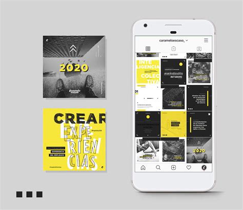
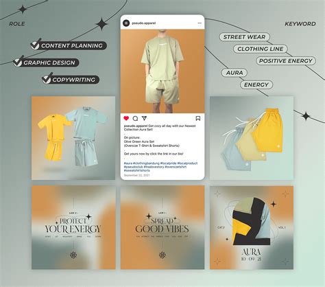
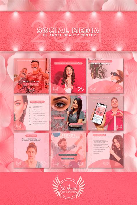
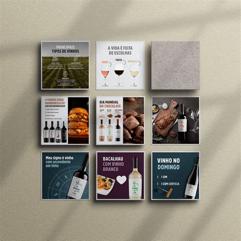
Grid layouts in graphic design for social media feeds provide a structured yet versatile blueprint that enhances visual consistency and coherence. Designers often adopt a modular approach, dividing the feed into sections or blocks that can be individually tailored yet collectively harmonious. This methodical arrangement not only facilitates a balanced visual rhythm but also allows for a strategic narrative flow, where content can be staggered or sequenced to reinforce brand messaging or thematic storytelling. The grid serves as a silent framework that guides the viewer's eye, enabling effective emphasis on key visuals or information while maintaining an effortlessly engaging user experience.
Negative space
Negative space, also known as white space, holds immense power in graphic design for feeds, creating visual harmony and emphasis. It serves as a buffer around and between objects on your feed, allowing the viewer's eyes to rest while enhancing the overall reading flow and comprehension. This strategic use of empty space can transform a cluttered and overwhelming feed into a sophisticated and professional layout, where each element is given room to breathe, ultimately spotlighting the focal points. By doing so, negative space not only enhances user engagement but also reinforces brand identity through a minimalistic yet impactful approach, making your design aesthetically pleasing and functionally effective.
Social media templates
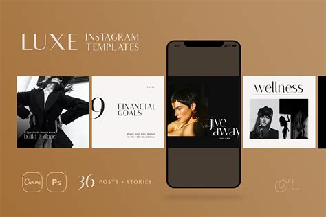
Graphic design for social media feeds necessitates creating visually appealing templates that align with the brand's identity and effectively capture the audience's attention. Each template must maintain a balance between aesthetic elements such as color schemes, typography, and imagery, ensuring they are adaptable across various platforms like Instagram, Facebook, and Twitter. Designers must emphasize consistency, making certain that every post within the feed maintains a cohesive look through the use of visual hierarchies and grid systems. This approach not only strengthens brand recognition but also facilitates engagement by employing compelling call-to-action placements and integrating trending visual elements that resonate with current audience sentiments.
Engagement metrics
Graphic design for social media feeds is paramount, emphasizing engagement metrics such as likes, shares, comments, and saves. Striking a balance between aesthetic elements and functional messaging can significantly boost engagement, encouraging users to interact and share posts. Visual hierarchy guides the viewer's eye, incorporating bold colors, typography, and strategic use of white space to enhance readability and draw focus to call-to-action buttons. Iterative design processes, A/B testing, and analyzing which graphic elements resonate with the audience enable designers to refine visuals, ensuring they align with user preferences and platform algorithms for optimized engagement.
Responsive design
Responsive design in graphic design for feeds is crucial to ensuring that content is seamlessly viewed across a multitude of devices with varying screen sizes. By employing techniques such as flexible grids, scalable images, and media queries, designers can craft interfaces that fluidly adapt to the constraints and capabilities of the user's environment. It also involves understanding the hierarchy and prioritization of content, allowing designers to efficiently reorganize and resize elements to maintain functionality and aesthetic on both mobile and desktop platforms. This approach not only enhances user experience by providing consistency and readability but also optimizes loading times and accessibility, thereby increasing engagement rates and user retention in an ever-evolving digital landscape.














Leave a Reply
Your email address will not be published.