Graphic design for books emerged as a vital art form to complement the rise of the publishing industry, adding allure to the words bound within. Initially dominated by traditional typesetting and classic covers, today's book design landscape is rife with innovation and diversity. Whether through striking covers or intuitive layouts, graphic design enhances the reader's experience and elevates storytelling. Although book design might appear to be merely functional and conventional, it is, in fact, a highly creative and evolving field. Revamp your perception with these contemporary book design ideas and embark on crafting your own visually captivating literary work.
Book cover design
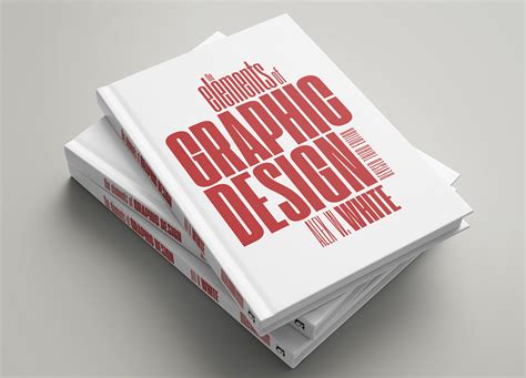
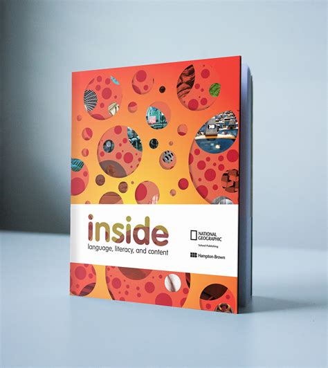
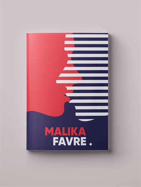
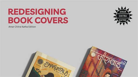
Book cover design serves as the visual gateway to a book's soul, synthesizing the thematic essence and the author's tone into a single, captivating image that beckons readers from the shelf. Designers must meticulously balance typography, color schemes, imagery, and layout to evoke emotion and curiosity without overwhelming the eye, often drawing from art history, current cultural trends, and psychological principles to create an engaging visual narrative. The strategic use of white space and alignment guides the reader's gaze, ensuring that both title and author's name are prominent but not overpowering, thus respecting the hierarchy of information; simultaneously, any motifs or graphic elements embellishing the cover should subtly hint at the story's key plot points or mood. Collaboration with authors is paramount, as their insights and vision can illuminate nuances that elevate the design from merely beautiful to profoundly resonant, creating a symbiotic relationship where visual and literary artistry converge to form a cohesive, marketable commodity in the competitive world of publishing.
Typography layout
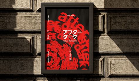
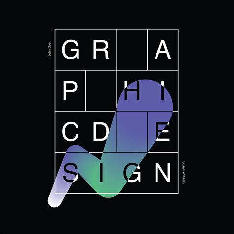
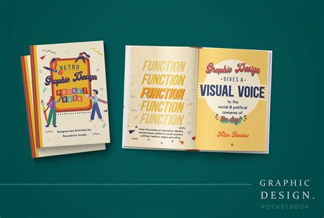
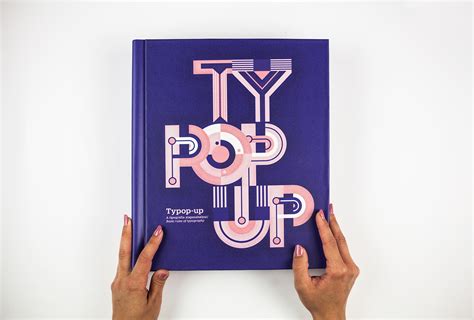
Graphic design for books, particularly the typography layout, involves a meticulous blend of font choice, spacing, and positioning to enhance the readability and aesthetic appeal of the text. Selecting an appropriate typeface is crucial, as it sets the tone and mood of the book while ensuring it aligns with the content's message. The interplay of leading (line spacing), kerning (space between characters), and margins critically affects how a reader engages with the text; tight kerning might create a cramped feeling, whereas generous leading facilitates a more comfortable flow for the eyes. Balancing these components with elements like headers, footers, and pagination forms a cohesive layout that guides the reader seamlessly through the narrative or information without distracting from it.
Dust jacket art
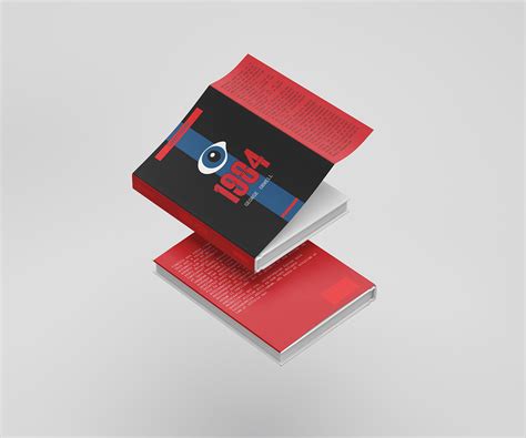
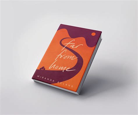
Dust jacket art serves as a critical visual gateway into the thematic heart of a book, capturing the essence of the narrative while alluring potential readers with a blend of aesthetics and symbolism. Designers must intricately balance typography, color palettes, and imagery, often integrating subtle cues that hint at the book's genre or central motifs without overpowering or misleading the potential reader. This delicate dance requires a deep understanding of marketing psychology and artistic technique, as the dust jacket not only protects the book but also acts as a three-dimensional advertising tool, communicating the book's promise with a mere glance. Artists often employ a harmonious fusion of traditional and digital media, utilizing illustration, photography, and digital manipulation to craft a cover that resonates with the target audience while standing out on crowded shelves, echoing the book's unique voice and inviting exploration.
Spine typography
The spine typography in book design holds significant importance as it is a key element of visual communication and branding when books are displayed on shelves. Designers carefully select typefaces that encapsulate the book's tone and genre, often opting for bold serif or sleek sans-serif that ensures legibility from a distance. Typography hierarchy may play a crucial role; the author's name, title, and subtitle are strategically placed to maintain visual balance and engage prospective readers effectively. The choice of color and texture can contrast or complement the cover design, often using embossing or foil stamping techniques to enhance the tactile experience and create an inviting allure that triggers curiosity.
Cover mockup
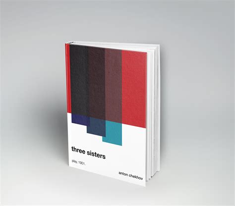
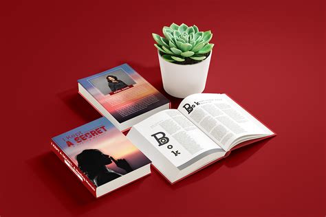
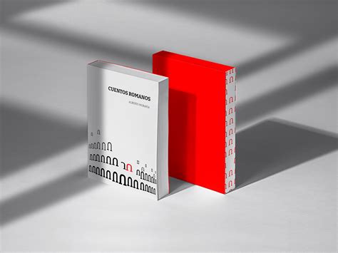
In the realm of book design, creating a compelling cover mockup demands a delicate interplay of visual hierarchy, typography, and color psychology. A designer must skillfully orchestrate these elements to ensure the cover not only captures the essence of the book's content but also stands out amongst a sea of competing titles on the shelves. A meticulous attention to detail is paramount in choosing the right fonts that convey the mood of the book, while a strategic use of color can evoke immediate emotions, intriguing potential readers and urging them to take a closer look. Integrating textures or illustrative elements can enhance the tactile appeal, making the mockup not just a preview but a promise of the sensory experience contained within the pages.
Color palette
Choosing a color palette for book design involves considering the psychological impact colors have on readers. Designers often begin by evaluating the book's themes, genre, and target audience to ensure colors align with and enhance the narrative. In fiction, a vibrant color palette can evoke excitement and energy, while pastels and muted tones often lend a sense of tranquility or mystery, consistent with genre expectations such as romance or mystery. Non-fiction works, especially those focused on self-help or academic subjects, frequently use bold or contrasting palettes to convey clarity and authority, guiding the reader's focus and enhancing the overall reading experience.
Typesetting skills
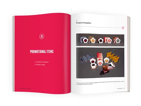
Typesetting skills are paramount in graphic design for books, as they determine the readability, aesthetic appeal, and overall visual organization of the text. A skilled typesetter must have a keen understanding of typography, including font selection, size, spacing, and alignment to ensure the text is both engaging and accessible to readers. They must balance white space with text density, considering factors like line length and paragraph breaks to avoid reader fatigue while enhancing the narrative flow. Additionally, they must be adept with design software, possessing the ability to manipulate not just the text but also integrate it seamlessly with graphic elements, which assists in maintaining a harmonious layout that supports the book's thematic and stylistic goals.
Illustrative elements
Graphic design for books with a focus on illustrative elements can transform a simple book into a visual masterpiece, creating an immersive experience that complements the narrative. Detailed custom illustrations tailored to the story can bring characters and scenes to life, allowing readers to forge a deeper connection with the content. Intricate typography and carefully selected color schemes can further enrich these illustrations, enhancing the mood and tone of the literary work. The layout design skillfully integrates these elements, ensuring that each illustration flows harmoniously with the text, guiding the reader through a seamless journey of visual storytelling.
Endpaper design
Endpaper design in books serves as a captivating prelude to the narrative, offering designers a canvas that bridges the exterior cover art with the interior content. The selection of intricate patterns or illustrative artwork can convey the thematic essence or mood of the book, immersing readers from the first glance. Designers might employ techniques using specialty inks, foil stamping, or even debossing on textured paper to add dimension and a tactile experience. The choice of colors, motifs, or even a gradient of hues can be intentionally crafted to evoke emotional responses, subtly hinting at key symbolisms or underlying tones that complement the author's vision.
Blurb layout
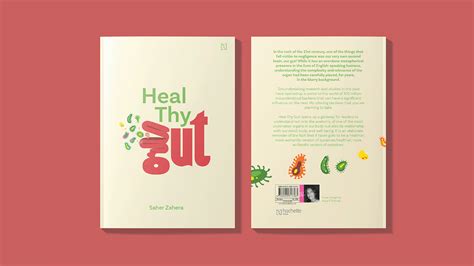
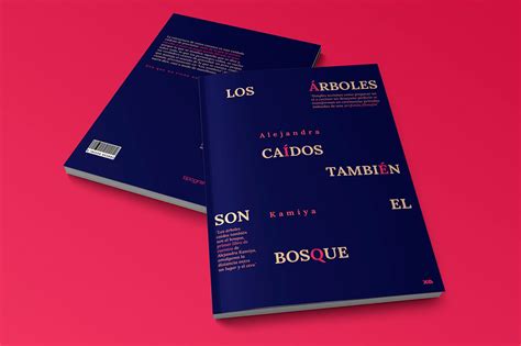
A blurb layout in book graphic design must capture the essence of the book while also enticing potential readers, making it a critical element in the overall packaging. The blurb should be strategically positioned, usually on the back cover, where the font style and size harmonize with the book's design theme to maintain aesthetic consistency and readability. The use of whitespace around the blurb can dramatically enhance its appeal by preventing it from appearing too cluttered, thus ensuring that it draws the reader's attention effectively. Color choices need to complement the book's cover palette, which can be achieved by selecting contrasting or harmonious hues to create a visual hierarchy that guides the reader's eye through the text effortlessly.














Leave a Reply
Your email address will not be published.