
Graphic design for Airbnb emerged as a key component in enhancing user experience and brand identity in the digital age. Initially, there was a straightforward focus on functionality, but now graphic design ideas in this space are flourishing. Fundamentally, graphic design in the Airbnb realm aims to blend aesthetics with usability, transforming spaces into inviting and unique experiences. While at first glance this type of design could appear basic and utilitarian, it actually offers versatility and creativity--and is currently undergoing a dynamic evolution. Elevate your listings with these graphic design ideas and captivate your audience.
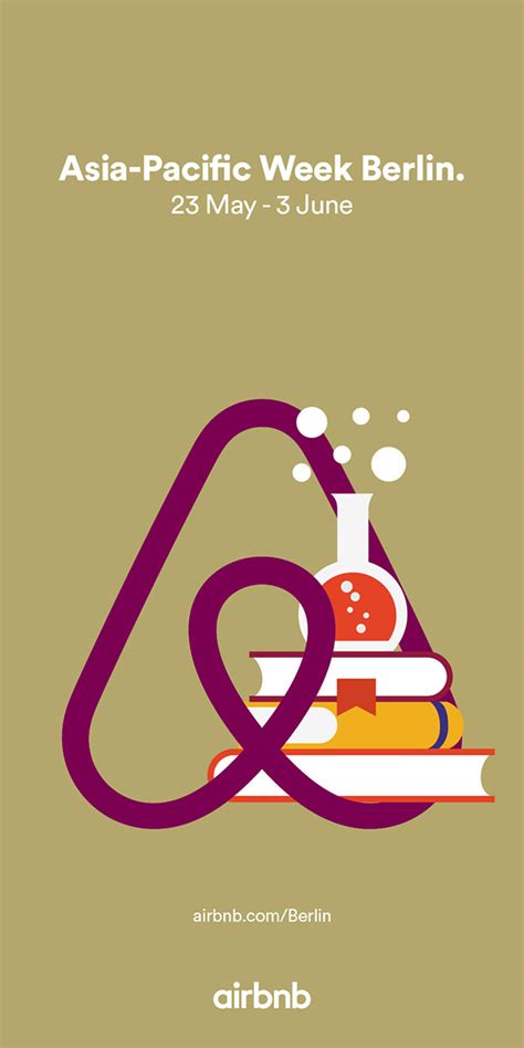
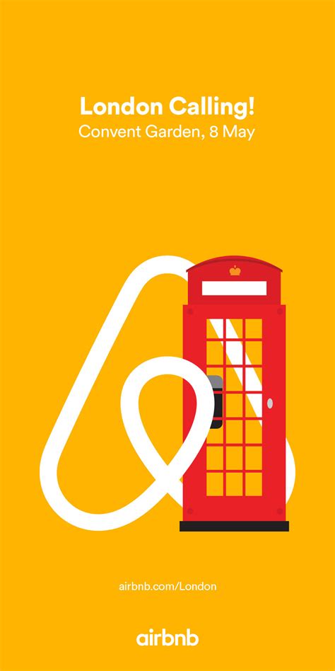
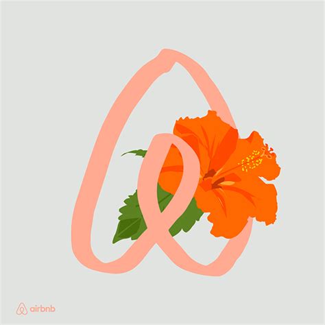
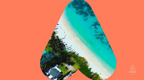
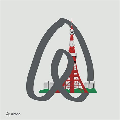
Airbnb logo redesign
Graphic design for an Airbnb logo redesign demands a keen understanding of both the brand's visual history and its evolving identity. The original "Belo" logo, emphasizing belonging and community, serves as a foundation to retain its emotional resonance. A modern redesign would involve experimenting with abstract geometric forms, yet maintaining an organic symmetry that reflects the universal embrace Airbnb seeks to symbolize. Additionally, the color palette could be refreshed, possibly incorporating gradient hues that signify diversity and vibrancy, while subtle textural variations offer depth, distinguishing it from the flat aesthetics prevalent in digital design.
Brand color palette
Airbnb's brand color palette radiates warmth and approachability, primarily utilizing a range of coral and salmon hues that embody the brand's spirit of human connection and inclusivity. The primary shade, named Rausch, is a vibrant coral color that reflects energy and friendliness, serving as a core visual element across Airbnb's platforms. Complemented by a palette of supporting colors like Babu, a calming blue, and Foggy, an understated gray, the color scheme offers versatility and contrast, allowing for a cohesive yet dynamic design. Each color is carefully chosen to enhance user experience by creating an inviting digital atmosphere, also ensuring accessibility, where color contrasts are optimized for readability and user interaction across diverse digital interfaces.
Visual identity guidelines
The visual identity guidelines for Airbnb emphasize creating a cohesive and recognizable brand experience that resonates with diverse cultures and local communities. Central to this is the use of the Belo symbol, a simple yet dynamic logo representing belonging, which should be consistently integrated across all platforms and touchpoints. Color palettes are meticulously selected to evoke warmth, inclusivity, and openness, with a primary focus on shades that are both inviting and adaptable to varied cultural contexts. Typography is carefully chosen to maintain clarity and legibility, often featuring sans-serif fonts that balance modernity with approachability, alongside imagery guidelines that highlight authentic, human-centered experiences, ensuring all visual elements work harmoniously to enhance the brand narrative.
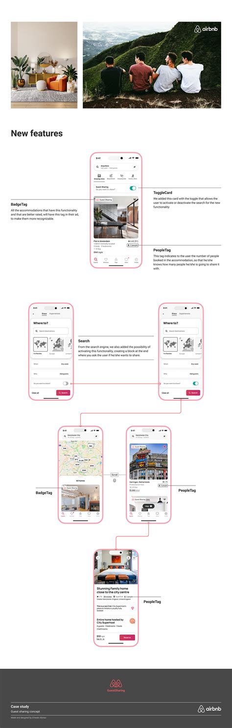
Custom iconography
Custom iconography in graphic design for Airbnb enhances user experience by creating unique, easily recognizable symbols that reflect the brand's ethos and functionalities. These icons must seamlessly integrate with the platform's aesthetic, offering intuitive navigation and a visually cohesive experience. Designers meticulously consider Airbnb's diverse user base, ensuring icons are universally understandable, culturally sensitive, and aligned with the global theme of belonging and exploration. Each icon, from booking to specialized accommodation features, is crafted with precision, utilizing consistent line weights, color schemes, and design language to maintain brand identity while fostering a sense of trust and familiarity with users.
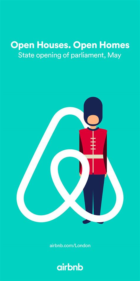
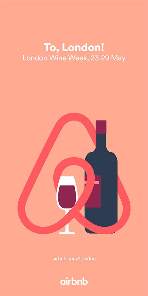
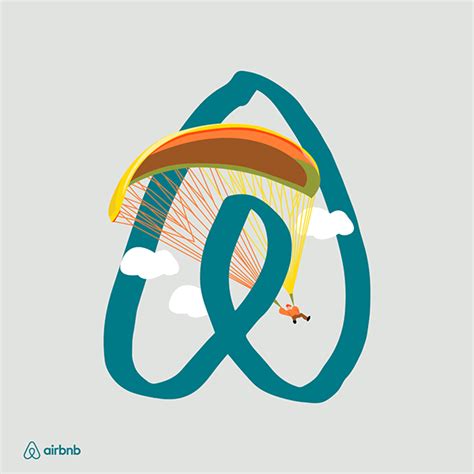
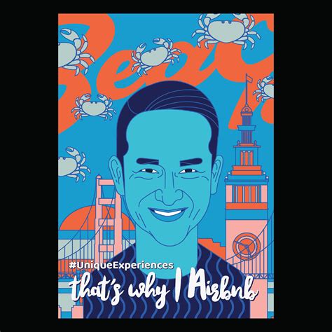
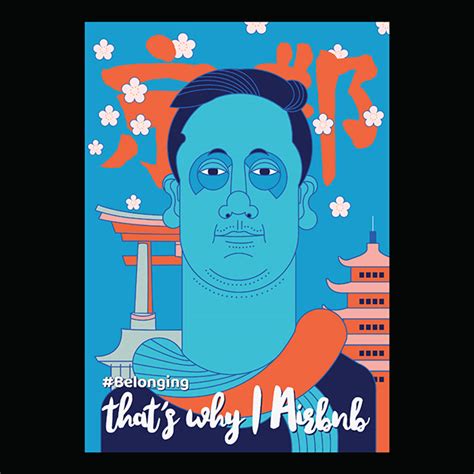
Experience-based illustrations
The essence of experience-based illustrations in graphic design for Airbnb lies in their ability to capture the heart and soul of each destination, blending cultural nuances with artistic flair. Designers delve into local traditions, iconic landmarks, and vibrant street scenes, drawing inspiration from diverse elements such as the bustling markets of Marrakech, the serene fjords of Norway, or the aromatic spices of Indian bazaars. Each illustration functions as an evocative narrative, seamlessly integrating digital aesthetics with tactile textures that evoke a sense of wanderlust and adventure. These works aim to engage the viewer on a sensory level, encouraging a deeper emotional connection to the places and experiences Airbnb offers, transforming the digital journey into a precursor to real-world exploration.
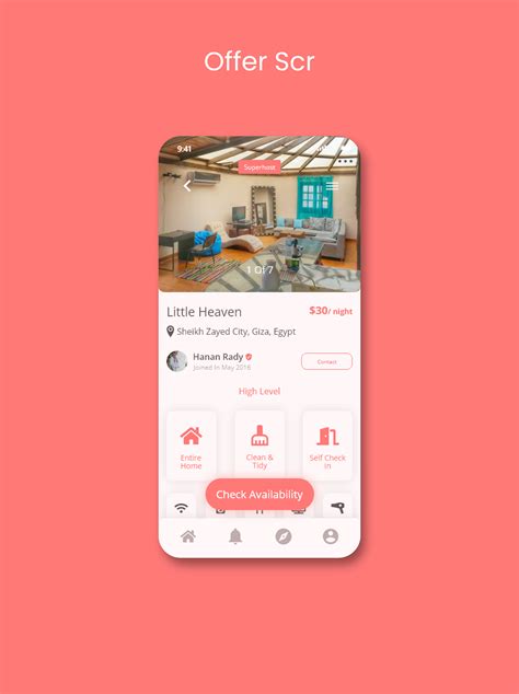
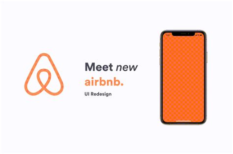
User interface elements
Graphic design for Airbnb's user interface requires a strategic blend of intuitive functionality and aesthetically appealing visual elements. It's essential to incorporate a clean, minimalist design that uses ample white space, ensuring that elements like buttons, icons, and typography stand out without overwhelming the user. The user interface must feature seamless navigation paths with strategically placed calls to action, which guide users through the booking process with minimal friction. Color schemes should reflect the brand's identity with soft, warm tones that evoke a sense of comfort and hospitality while maintaining high contrast for readability and accessibility.
Typography standards
In the realm of Airbnb's graphic design, adherence to precise typography standards forms a critical element of its brand identity, ensuring consistency and accessibility across all user interfaces and marketing materials. Airbnb employs its bespoke typeface called "Cereal," which is characterized by its clean, geometric sans-serif form, specifically crafted to evoke warmth and friendliness while facilitating readability in both digital and print contexts. Each character in the Cereal font family, encompassing different weights such as thin, light, medium, bold, and extra bold, is meticulously designed to maintain visual harmony and legibility at various sizes and across diverse languages, including those with non-Latin alphabets. Detailed spacing guidelines and hierarchical structures are strategically implemented, allowing for seamless navigation and engagement, whether on a mobile app interface or a physical brochure, further bolstering Airbnb's commitment to an inclusive and universal design ethos that resonates with its global audience.
Marketing collateral design
Airbnb's marketing collateral design leverages clean, modern aesthetics to engage potential customers, employing a palette that's both bright and inviting to evoke a sense of exploration and comfort. Carefully curated imagery showcases diverse, unique properties alongside captivating destinations, creating a narrative that encourages discovery through elegant yet consistent typography. Infographics and icons are strategically used to simplify information presentation, ensuring that key messages about amenities and booking processes are communicated swiftly and clearly. Moreover, Airbnb's collateral seamlessly integrates user-generated content, fostering an authentic community feel while subtly highlighting functional elements in a sophisticated, visually appealing manner.
Infographic storytelling
Infographic storytelling in graphic design for Airbnb encompasses creating visually compelling narratives that convey complex data and concepts in digestible formats. It involves utilizing Airbnb's brand elements, such as its signature color palette, typography, and iconography, to create cohesive stories that resonate with both hosts and guests. Expert designers harness data visualization techniques, like charts and maps, to illustrate trends, from preferred travel destinations to seasonal booking patterns. The design must evoke emotion and curiosity, converting raw data into engaging tales that effectively communicate Airbnb's innovative solutions and global community engagement, ultimately enhancing user experience and facilitating informed decision-making.
Branded pattern designs
Graphic design for Airbnb necessitates crafting branded pattern designs that enhance the platform's identity while ensuring aesthetic coherence and versatility. Designers initiate by delving into Airbnb's core values--belonging, exploration, and hospitality--translating these themes into visual motifs that resonate across various mediums like digital platforms, printed materials, and merchandise. The challenge lies in creating patterns that not only echo Airbnb's branding attributes such as its iconic Belo logo, color palette, and typography but also exhibit adaptability to different scales and contexts, from full-page layouts on websites to subtle backgrounds in promotional flyers. The development process often incorporates collaborative brainstorming sessions, leveraging modern design software to experiment with shapes, lines, and color interactions, ensuring the patterns remain memorable and engaging yet never overshadowing the brand's key message of creating a world where anyone can belong anywhere.


Leave a Reply
Your email address will not be published.