Graphic design for announcements serves as a powerful tool to capture attention and convey important messages in a visually appealing way. Initially gaining popularity with the advent of print media, announcement design has evolved significantly, offering endless creative possibilities today. Whether it's a party, product launch, or corporate event, an effectively designed announcement can set the tone and generate excitement. Though some might consider it a purely aesthetic exercise, in truth, it's an artful blend of creativity and communication strategy. Get inspired with the following graphic design tips and make your announcements truly stand out.
Color palette
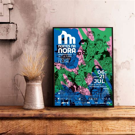
Choosing a color palette for a graphic design announcement involves understanding the psychology of color, target audience, and the message you wish to convey. A harmonious blend of colors can enhance visual hierarchy, evoke emotions, and draw attention to key elements within the design. Consider the environment in which the announcement will be viewed, such as digital or print, as it affects how colors appear. Use contrasting colors for text and background to ensure readability while incorporating a few accent colors to highlight important details without overwhelming the viewer.
Font selection
Font selection in graphic design for announcements is a crucial element that significantly influences the message's clarity and impact. The choice of typeface can convey the tone, emotion, and urgency of the announcement; for instance, a bold sans-serif font might suggest modernity and importance, while a serif font may exude tradition and formality. Designers must consider the readability factor, as announcements often need to be easily digestible at a glance, ensuring the font size and weight are suitable for different viewing distances and mediums. Moreover, the font style should complement the overall design aesthetics, harmonizing with colors, images, and other elements to create a cohesive and visually appealing piece that draws the intended audience's attention.
Visual hierarchy
Graphic design for announcements heavily relies on the careful execution of visual hierarchy to effectively convey messages and guide the viewer's eye through the content. Designers prioritize elements such as contrast, scale, and composition to emphasize the most critical information like the event title, date, and location. Utilizing a typographic scale, larger font sizes are assigned to the headline or focal point to attract immediate attention, while supporting details are rendered in smaller fonts with ample spacing to ensure readability. Contrasting colors or bold graphics frame the central information, whereas alignment and repeating visual motifs enhance coherence and ensure the viewer navigates through the announcement in a logical and intended sequence, thus achieving an aesthetically pleasing and effective communication piece.
Negative space
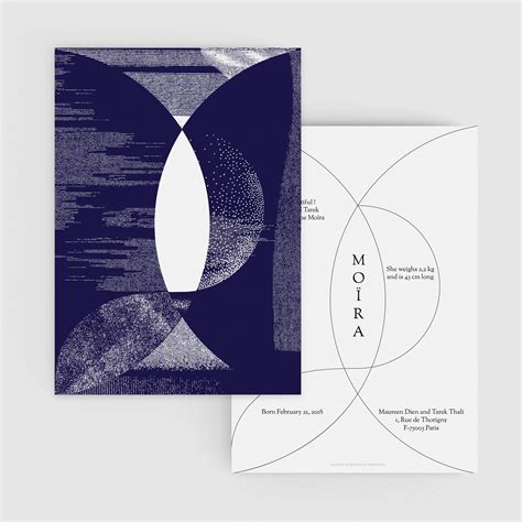
Exploring the realm of graphic design for announcements, the strategic use of negative space becomes a crucial element in crafting visually compelling yet unobtrusive visuals. Negative space, often seen as mere emptiness, serves a pivotal role in guiding the viewer's eye towards the core message by providing breathing room and avoiding overwhelming clutter. By skillfully balancing negative space with text and imagery, designers can create a harmonious layout that enhances readability and focus, allowing essential information to stand out without distraction. Carefully planned negative space can evoke emotions, from tranquility and elegance to spontaneity and boldness, making announcements not only informative but also aesthetically inviting.
Grid layout
Grid layouts in graphic design for announcements play a crucial role in organizing information while maintaining aesthetic appeal. They provide a structured framework that guides the viewer's eye through a hierarchy of content, ensuring that the most important details are easily accessible. Columns and rows create a balanced layout, allowing designers to systematically place text, imagery, and other design elements in an orderly fashion. Subdivisions within the grid can be strategically manipulated to create focal points or emphasize key messages, encouraging engagement through visual interest and concise communication.
Design elements
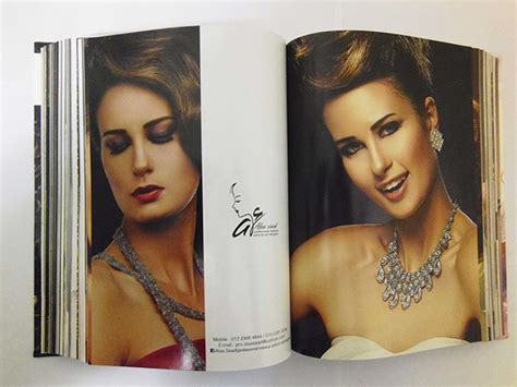
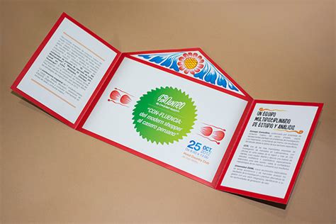
In the realm of announcement graphic design, the focal elements encompass a harmonious interplay of typography, color palette, imagery, and layout. Typography must be both eye-catching and readable, potentially utilizing a combination of bold and subtle fonts to create a visual hierarchy that guides the viewer's attention to the most critical information. The choice and application of colors should not only align with the brand's identity but also evoke the desired emotional response, whether through contrasting vibrant hues or soothing pastels. Strategic placement of imagery--be it illustrations, icons, or photographs--can add depth and context, complementing the textual message while ensuring the overall layout remains balanced and uncluttered to maintain a clear, purposeful design narrative.
Call to action
A compelling graphic design for an announcement should strategically utilize visual hierarchy to draw the viewer's attention to the call to action (CTA), making it the focal point of the design. Bold typography and contrasting colors should delineate the CTA, ensuring it stands out amidst any surrounding text or imagery. Subtle directional cues, like arrows or lines, guide the eye intuitively toward the desired action, embedding the desired response within the viewer's cognitive frame. The inclusion of interactive elements, such as QR codes or clickable buttons in digital formats, should facilitate an immediate response, enhancing engagement by offering a seamless pathway to further information or an event registration webpage.
Image placement
In crafting an impactful announcement through graphic design, image placement emerges as a crucial component of the visual hierarchy. Strategic positioning of imagery can guide the viewer's eye naturally through the layout, establishing a narrative that communicates the central message succinctly. Balancing the scale and alignment of images relative to text ensures clarity and emphasis, where images should serve both as focal points and supplementary elements that enhance the overall aesthetic without overwhelming textual information. Negative space, or the deliberate absence of content around images, further accentuates their importance while contributing to a cleaner, more professional look, making the announcement both engaging and digestible.
Typography style
Typography in announcement graphic design serves as the visual voice that sets the tone and urgency of the message conveyed. Designers often choose bold and attention-grabbing typefaces to ensure instant readability and impact, often employing sans-serif fonts for modern and clean aesthetics. Kerning and leading are meticulously adjusted to create a harmonious balance, guiding the viewer's eye to the primary call-to-action or critical information. Color choice plays a crucial role in typography by contrasting against the background to enhance legibility, while layering techniques may introduce depth and hierarchy within the text elements, creating a visually engaging experience without overpowering the intended message.









Leave a Reply
Your email address will not be published.