Graphic design for apps emerged as a critical element of user interface development as mobile technology rapidly advanced. Back in the day, app design was largely utilitarian, prioritizing function over form. Nowadays, however, innovative app design ideas flourish, offering a multitude of creative possibilities. Despite the technical complexities involved, app graphic design transforms abstract concepts into intuitive and engaging user experiences. Although some might initially perceive designing apps as daunting and purely technical, it is, in truth, an artistic pursuit filled with creative potential. Upgrade your design skills with the following app graphic design tips and craft your own captivating digital interface.
User Interface Design
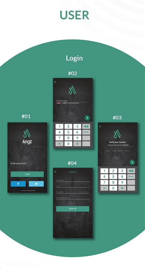
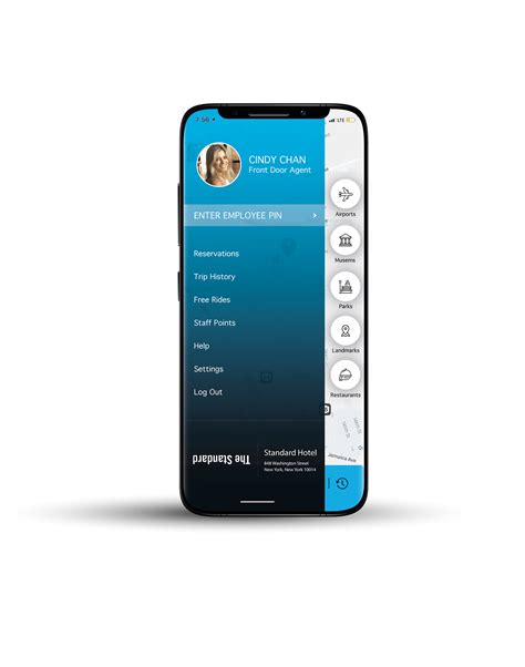
User Interface Design in app graphic design emphasizes creating visually appealing, intuitive, and seamless user interactions that meet the user's needs and expectations. Designers focus on aesthetics, ensuring colors, typography, and graphics are consistent and harmonious, aligning with the brand's identity while considering usability aspects, such as readability and visual hierarchy. They meticulously streamline navigation elements and interactive components like buttons, transitions, and menus to minimize cognitive load, enhance user engagement, and facilitate effortless task completion. Additionally, responsive design principles are employed to offer uniform performance across diverse devices and screen sizes, ensuring accessibility and an inclusive experience for a diverse user base.
Interactive Prototypes
Incorporating interactive prototypes in graphic design for apps serves as a critical tool for visualizing and refining user experience prior to final development. These prototypes allow designers to simulate user interactions, testing functionality and identifying potential issues early in the design process, which significantly reduces the risk of costly revisions later. Tools like Figma and Adobe XD facilitate this process by offering features that enable precise control over transitions, animations, and screen interactions, allowing stakeholders to experience an app's functionality in a tangible, visual format. Stakeholder feedback can then be rapidly integrated into iterative design stages, creating a more dynamic and responsive development process, ensuring the final product aligns closely with user needs and expectations.
Visual Hierarchy
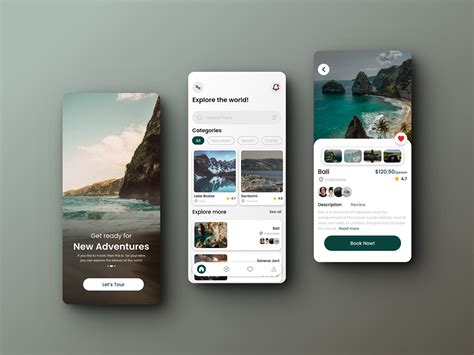
Visual hierarchy in app design meticulously organizes elements to guide users' attention effectively, creating a structured narrative that enhances the user experience. Designers employ contrasting sizes, bold typography, and strategic color usage to prioritize certain elements, making critical information like navigation buttons and calls-to-action immediately noticeable. This hierarchy often uses space and alignment to delineate sections, ensuring a digestible flow where primary content receives prominence while auxiliary information remains accessible but unobtrusive. Within interactive components, subtle animations and transitions can emphasize switches in focus, subtly maintaining a seamless yet engaging user journey throughout the app.
Typography Styles
In graphic design for apps, typography plays a crucial role in enhancing user experience and visual aesthetics. Selecting appropriate typography styles involves choosing fonts that align with the app's brand identity while ensuring readability across various screens. Serif fonts, known for their classic and authoritative feel, can be used sparingly for headers or titles, providing a touch of elegance and contrast in a predominantly sans-serif layout. Careful attention to kerning, line spacing, and hierarchy ensures that text remains legible and visually appealing, guiding users' attention seamlessly through the app's interface and reinforcing the overall design narrative.
Color Schemes
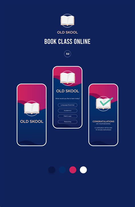
The choice of a color scheme in app graphic design is integral to user engagement and brand identity, impacting user interface intuitiveness and emotional resonance. Each color selected typically embodies specific attributes, such as blue tones evoking a sense of trust and reliability, while warm colors like red and orange can stimulate urgency or excitement. Effective color harmonization can enhance visual hierarchy, directing user attention to certain features or calls-to-action, and ensuring text legibility over different backgrounds, which is pivotal for ease of navigation. Designers often utilize tools like color wheel charts or digital palettes to create complementary, analogous, or triadic color schemes that align with the app's purpose and aesthetic, ensuring a cohesive and appealing user experience.
Iconography Design
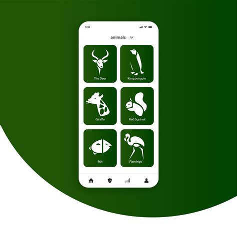
Iconography design for an app revolves around using graphic symbols to represent features, actions, and content in a way that is intuitive yet distinctively harmonious with the app's design language. These icons must transcend mere decoration, serving as an integral part of the user experience by facilitating immediate recognition and comprehension of function, which is achieved through the adept use of shapes, colors, and scales that align with both the app's aesthetic and the cultural context of its users. Designers often employ vector-based tools to ensure scalability and consistency, meticulously refining each icon to maintain clarity and legibility across various screen resolutions and sizes. In modern app environments, the trend leans towards minimalistic and flat designs, which not only enhance performance efficiency by reducing graphic complexity but also cater to the prevailing user preference for clean, straightforward interfaces free of extraneous detail.
User Experience Flow
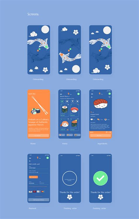
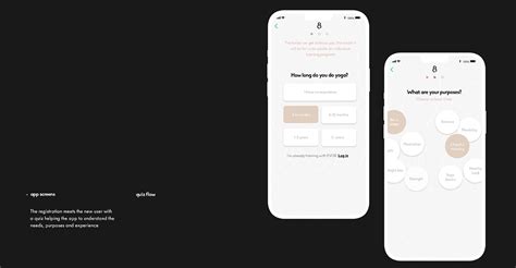
A crucial aspect of graphic design for applications lies in the creation of an intuitive user experience flow, which meticulously considers users' interactions and expectations. The process involves starting with wireframes to map out the app's structural layout, ensuring that navigation paths are straightforward and logical with minimal friction points. Visual hierarchy is meticulously crafted using typography, color, and spacing to guide users' attention seamlessly from one element to another, enhancing readability and ensuring key functions are easily accessible. Designers incorporate user testing feedback to iteratively refine elements, incorporating micro-interactions and animated transitions that enhance engagement while maintaining a smooth and cohesive navigational journey.
App Branding Elements
When considering app branding elements in graphic design, it's essential to create a cohesive visual identity that resonates with the app's core values and target audience. Typography plays a crucial role, demanding careful selection of fonts that enhance readability while reflecting the app's personality--whether modern, playful, or traditional. Another critical component is the color palette, which should not only be aesthetically pleasing but also invoke the desired emotions and connect with cultural associations, subtly guiding users' actions. Icons and logos must be meticulously crafted to ensure instant recognition and scalability across different screen sizes, providing a seamless and consistent experience that fortifies brand recall and loyalty.
Responsive Layouts
While designing a graphic layout for an app, the primary focus on responsive layouts entails a deep understanding of the diverse device dimensions and orientations the app will be viewed on. Each design element, from typography to images and user interface components, must be intricately scalable and adaptable, ensuring seamless usability and aesthetic harmony across devices. Breakpoints should be strategically implemented to accommodate different screen sizes, enhancing the consistency and function of the app. Scalable Vector Graphics (SVGs) and flexible grid systems serve as indispensable tools, allowing the app's design to fluidly adjust without compromising quality or user experience, maintaining a visually appealing and coherent interface regardless of the platform.
Wireframe Templates
Wireframe templates serve as the skeletal framework for app design, providing a visual guide that outlines the structure and layout of the interface. These templates are essential in the planning phase as they allow designers to map out the user experience by organizing content and functionality in a coherent manner. Wireframing involves using simple shapes like rectangles and circles to represent elements such as buttons, menus, and images, focusing on functionality rather than aesthetics. The use of standardized templates ensures consistent navigation and interaction patterns, which not only aids in stakeholder communication but also streamlines the process of prototyping and testing before moving into full-fledged design and development stages.





Leave a Reply
Your email address will not be published.