Graphic design made its mark during the 20th century as an essential tool in communicating artistic visions and concepts. Initially, graphic design for art was driven by a few distinct styles, whereas today, a myriad of graphic design approaches exist. At its core, graphic design for art enhances the presentation and structure of artistic content, adding layers of meaning and engagement. Although some may perceive this art form as overly technical or constrained, in truth, it offers boundless creativity and excitement--gaining more prominence than ever before. Elevate your artistic endeavors with these graphic design strategies and craft a masterpiece of your own.
Color theory
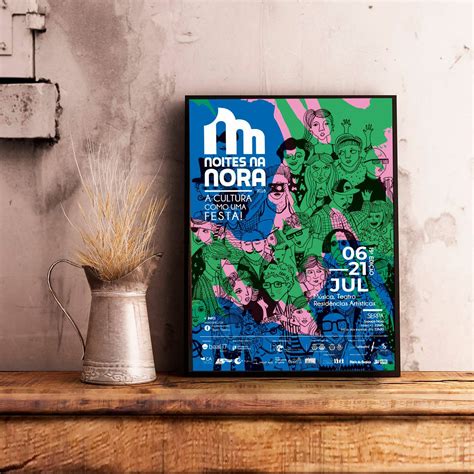
Color theory serves as a cornerstone of graphic design for art, providing a structured framework for understanding and manipulating color to evoke specific emotions and responses. Designers utilize the color wheel, broken into primary, secondary, and tertiary colors, to create harmonious palettes and contrast schemes that enhance visual messaging and storytelling. The strategic use of complementary colors, such as blue and orange, can draw viewer attention, while analogous colors, like blues and greens, create serene and cohesive designs. Understanding the psychological impact of colors--red's association with urgency and passion, blue's calming effect--empowers artists to tailor their work to communicate more effectively, influencing viewer perception and interaction with the design.
Visual hierarchy
Visual hierarchy in graphic design is the arrangement and presentation of elements in a way that implies importance, order, and emphasis, effectively guiding the viewer's eye through the content. Designers manipulate size, color, contrast, alignment, and spacing to establish relationships among visual elements, ensuring the viewer's attention naturally gravitates towards the most crucial information first. For example, larger fonts and bold colors might be used to highlight headlines, while subtler tones or smaller text sizes convey supporting information, creating a tiered visual narrative. By incorporating these techniques, designers ensure the audience can quickly comprehend the intended message, making the design both functional and aesthetically pleasing, while also directing the observer's emotional response and engagement with the artwork.
Typographic layout
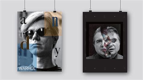
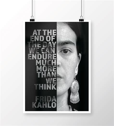
Typographic layout in graphic design art involves a meticulous arrangement of type to enhance visual appeal while effectively conveying information. Designers must consider various elements, such as font selection, hierarchy, alignment, spacing, and color contrast, to create a harmonious and engaging composition. Balancing readability with aesthetic value is crucial; designers often utilize a grid system to ensure structured and proportional layouts. Incorporating negative space allows the design to breathe, guiding the viewer's eye smoothly across the page, creating emphasis where needed, and allowing text to complement, rather than compete, with the accompanying imagery or artistic elements.
Grid systems
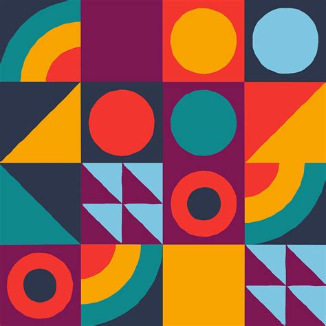
Grid systems serve as the backbone of graphic design, offering a meticulous structure that guides the placement of elements to establish harmony and coherence. These systems facilitate the organization of text, images, and other visual components, ensuring a consistent flow and alignment throughout the design, enhancing both readability and aesthetic appeal. Designers adept in grid systems can experiment with various grid setups, such as the modular, column, or manuscript grid, each serving different project needs while maintaining an invisible guiding framework. This approach not only aids in creating balance and unity within a composition but also enables the designer to break the grid intentionally to make bold statements and direct the viewer's attention, blending precision with creative flair.
Negative space
Negative space in graphic design is a powerful tool that utilizes the area around and between the subjects of an image to create a compelling visual narrative. By focusing on the empty spaces, designers can guide the viewer's eye, establish a sense of balance, and highlight focal points without overtly dominating the composition. This technique emphasizes minimalism, allowing for a clean and uncluttered aesthetic that conveys a more profound message than an overcrowded image. The strategic use of negative space can transform seemingly simple designs into complex works of art, lending depth and intrigue, encouraging viewers to engage in a visual exploration and uncover hidden subtleties within the piece.
Design composition
Design composition in graphic design for art serves as the structural underpinning that organizes visual elements into cohesive and compelling narratives. It necessitates a deft orchestration of space, balance, and hierarchy, where designers meticulously arrange textures, colors, shapes, and imagery to guide the viewer's eye in a deliberate manner. The principles--like the rule of thirds, balance, and focal point--appreciate how these elements work harmoniously or contrast sharply to evoke emotions and convey messages efficiently. Skilled graphic designers employ techniques such as scale contrast, symmetry versus asymmetry, and effective use of negative space, which not only enhance aesthetic appeal but also ensure clarity and impact in communication.
Art Deco elements
Graphic design inspired by Art Deco elements showcases a combination of geometric shapes, clean lines, and luxurious materials that reflect the opulence and innovation of the early 20th century. These designs often incorporate symmetrical patterns, bold colors, and metallic finishes like gold, silver, and chrome to elicit a sense of grandeur and sophistication. The use of stylized, elongated forms often draws inspiration from the technological advancements of the time, such as skyscrapers and automobiles, creating a futuristic yet elegant aesthetic. Intricate motifs such as sunbursts, zigzag patterns, and chevrons are prevalent, alongside exotic materials like ebony, ivory, and exotic woods, contributing to an overall visual language of both modernity and nostalgia.
Vector illustration
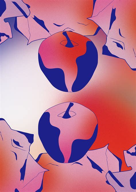
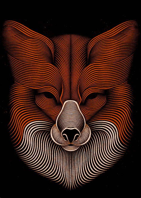
Vector illustration in graphic design utilizes mathematical equations and geometric primitives such as points, lines, and shapes to create scalable images. These illustrations maintain clarity and sharpness regardless of size, making them ideal for logos, icons, and detailed graphics that require precision and adaptability across various media platforms. Unlike raster graphics, vector images are not resolution-dependent, enabling designers to transform their creative vision seamlessly without compromising on quality. The versatility of vector illustrations is enhanced through the use of software tools like Adobe Illustrator and CorelDRAW, which provide a rich array of features for manipulating color gradients, layering, and complex path modifications, thus allowing intricate yet fluid artistic expression.
Gestalt principles
Gestalt principles play a crucial role in graphic design for art by emphasizing the perception of visual elements as whole structures rather than isolated components. These principles, such as similarity, proximity, closure, continuation, and figure-ground, guide the viewer's eye and create a sense of unity and order within the artwork. Designers use these principles to provide clarity, suggest hidden meanings, and evoke emotional responses by manipulating space, form, and composition to exploit the human brain's tendency to seek patterns and efficiencies in visual information. For instance, employing proximity can help group related information together, whereas closure allows viewers to fill in gaps, creating a cohesive and engaging piece even when critical information is implied rather than explicitly defined.
Digital collage
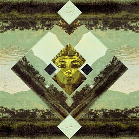
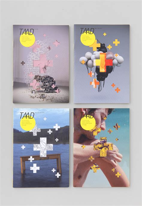
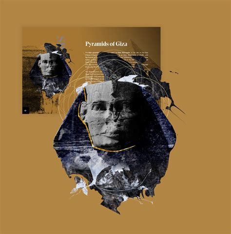
Digital collage in graphic design embodies a sophisticated interplay of various visual elements, meticulously curated and layered to create a cohesive and often surreal composition. Artists utilizing this technique harness digital tools to seamlessly blend photographs, textures, illustrations, and typography, transcending traditional boundaries to explore new realms of visual storytelling. The intricacy of digital collage lies in its ability to juxtapose disparate images in a harmonious manner, allowing designers to convey multiple narratives or abstract concepts within a single frame. Experimentation with color, scale, and composition becomes paramount, as these aspects must be finely tuned to evoke emotion and intrigue, creating a visually arresting piece that challenges the observer's perception and invites deeper reflection.









Leave a Reply
Your email address will not be published.