Graphic design for articles emerged as a crucial element during the digital revolution, enhancing the readability and appeal of online content. Back then, a few simple layouts dominated the scene, but now graphic design options are as varied as ever. Regardless of the specific layout or style, graphic design aids in breaking up information and keeping readers engaged. While it might initially seem technical or daunting, it actually offers a creative outlet and eye-catching possibilities--and it's currently seeing a major upswing in popularity. Elevate your content with the following graphic design tips and make your articles stand out.
Visual hierarchy
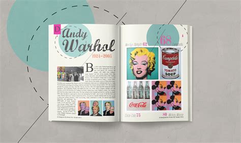
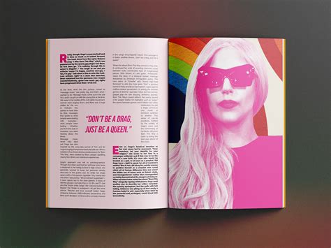
In graphic design for articles, visual hierarchy plays a crucial role in guiding the reader's eye to the most important elements, ensuring that the content is both engaging and easily navigable. Designers strategically use size, color, contrast, alignment, and typography to establish a clear visual path for readers, often starting with a compelling headline that stands out due to its bold typeface or prominent positioning. The effective use of whitespace around significant elements accentuates their importance and helps prevent the clutter that can overwhelm the reader. Images and graphics are also incorporated thoughtfully, placed near relevant text to create a cohesive story while emphasizing key points, ensuring the reader remains focused on the intended message without being distracted by superfluous details.
Color palette
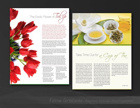
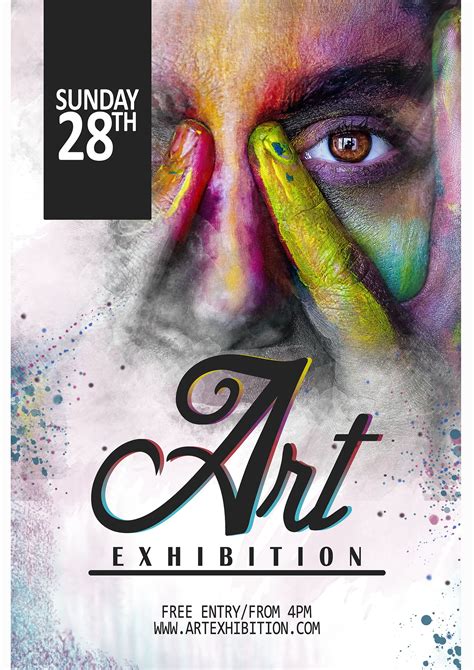
A carefully curated color palette is fundamental in graphic design for articles, as it significantly influences reader engagement and mood perception. Designers often select colors that align with the article's theme to create harmony, ensuring that the content's visual elements seamlessly blend and draw the reader's eye to key areas. Employing contrasting colors can enhance readability and highlight important sections, while analogous colors contribute to a cohesive and soothing aesthetic. The psychology of colors plays a critical role; for example, blue can evoke trust and calmness, while red might stimulate urgency, thereby subtly guiding the reader's emotional response and interaction with the article.
Typography layout
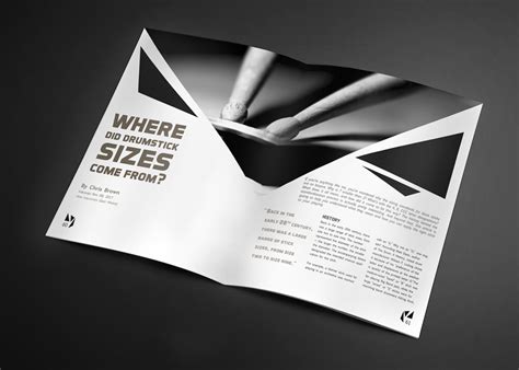
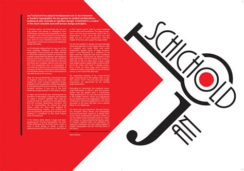
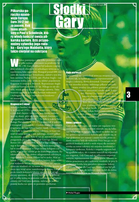
Typography layout in graphic design for articles involves meticulous attention to the alignment, spacing, size, and style of fonts to enhance readability and convey the intended tone. Designers often employ a hierarchy of text elements, utilizing different weights and sizes to guide the reader's eye through the content seamlessly. The choice of typeface, whether it be serif, sans-serif, or display fonts, plays an integral role in influencing how the message is perceived, making it crucial to select one that aligns with the article's subject matter and target audience. Kerning and leading adjustments further refine the visual harmony between the text blocks and white space, ensuring that the overall composition remains aesthetically pleasing while facilitating an intuitive reading experience.
Image composition
Image composition in graphic design for articles is a meticulous art that involves balancing visual elements to enhance the narrative while capturing the reader's attention. Designers utilize principles such as the rule of thirds, which divides an image into a grid to position key elements at the intersections, thereby creating dynamic tension and focus. Negative space is strategically employed to provide breathing room, allowing the main elements to stand out without overwhelming the viewer's senses, thus maintaining clarity and coherence. Additionally, the use of color theory and typography harmonizes the overall aesthetic, where the design draws the reader's eye fluidly through the composition, ensuring that the imagery complements the article's tone and content effectively.
Branding consistency
Branding consistency in graphic design for articles necessitates a meticulous approach to ensure a cohesive visual language that aligns with a brand's identity across all platforms. Designers must adhere to established brand guidelines rigorously, incorporating specific elements such as color palettes, typography, logo placements, and imagery that reflect the brand's core values and messaging. This cohesion fosters recognition and trust among the audience, presenting a unified front that reinforces the brand's presence amidst a sea of competing content. By carefully balancing creative freedom with these predefined elements, designers can craft visually engaging articles that resonate with the target demographic while maintaining the brand's distinct voice and style.
White space
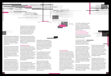
White space, often referred to as negative space, is a powerful element in graphic design for articles as it provides breathing room and structure without cluttering the visual hierarchy. This space allows the content to stand out, directing the reader's attention to focal elements such as headings, images, or key points which are framed by the empty space around them. Designers leverage white space to enhance readability and comprehension, encouraging a smoother and more enjoyable reading experience by preventing information overload. With strategically placed white space, articles can achieve a balanced aesthetic that evokes a sense of sophistication and simplicity, allowing for intuitive navigation through the textual and visual elements of the design.
Grid systems
Grid systems in graphic design play an essential role in organizing content within articles, providing a structured framework that guides the placement of elements such as text, images, and other visual components. The use of grids ensures consistency and balance throughout the layout, allowing designers to create visually appealing and coherent designs that enhance readability and engagement. By utilizing various grid systems, such as modular grids, hierarchical grids, or column grids, designers can maintain hierarchy and proportional relationships within the article, which aids in directing the reader's attention and improving the flow of information. Furthermore, grids offer flexibility while preserving aesthetic unity, preparing the design to adapt seamlessly across different devices and media, thus ensuring the article's cohesive presentation whether viewed on a printed page or digital screen.
Design elements
Graphic design for articles involves the strategic use of design elements like typography, color, imagery, and layout to enhance readability and engagement. Typography plays a crucial role by establishing hierarchy and guiding the reader's eye through varying typefaces, sizes, and weights, thus ensuring key points stand out. Color schemes must be chosen carefully to evoke the desired emotion and maintain brand consistency while ensuring text is legible against background hues. Imagery, including photography and illustrations, provides a visual break from text and helps convey complex ideas succinctly, while an effective layout ensures a balanced composition, directing the reader's focus and preventing cognitive overload.
Editorial graphics
Editorial graphics in articles serve as visual storytelling tools that guide readers through complex information, enhancing comprehension and engagement. Designers often craft these visuals with a careful balance of typography, color palettes, and imagery to ensure they align with the article's tone and subject matter. They meticulously consider the layout, leveraging whitespace and hierarchy to draw attention to key points, while interactive elements may be introduced in digital publications to allow readers to explore data or narratives more deeply. Editorial graphics not only add visual appeal but also play a critical role in breaking up text and providing readers with a mental break, ultimately making the content more digestible and retaining their interest throughout the piece.
Font pairing
Font pairing in graphic design for articles involves the strategic combination of different typefaces to enhance visual appeal and readability. Designers often balance serif and sans-serif fonts, letting the distinctive features of each typeface complement one another; serif fonts can convey tradition and reliability, while sans-serif fonts evoke modernity and simplicity. Emphasis on contrast guides this process, using variations in weight, size, and style to establish a clear hierarchy in text, ensuring headings, subheadings, and body text are easily distinguishable. A thoughtfully chosen font pairing can capture the article's tone and personality, reflecting the content's mood--be it formal and scholarly with fonts like Times New Roman and Helvetica, or casual and friendly with combinations like Georgia and Lato--thus engaging readers both aesthetically and intellectually.




Leave a Reply
Your email address will not be published.