Graphic design for beanies emerged as a creative outlet in the fashion industry, transforming these simple accessories into vibrant canvases. Previously, beanies served a utilitarian purpose, but now a myriad of graphic design ideas are waiting to be explored. Regardless of the concept, graphic design breathes life into beanies, allowing personality and style to shine through. While often perceived as merely functional or understated, beanies with graphic designs are anything but--they're expressive and trendy, and they're enjoying a significant surge in popularity. Elevate your fashion game with these graphic design concepts for beanies and design your own unique statement piece.
Beanie color palette
Graphic design for beanies primarily revolves around an artful integration of color palettes that not only enhance aesthetic appeal but also cater to the varying preferences of a diverse wearer demographic. This entails a deep understanding of color theory and seasonal trends, where designers meticulously choose complementary and contrasting hues to evoke particular moods or align with particular fashion movements. A winter collection might favor deep ochres, rich burgundies, and midnight blues to mimic the coziness and warmth typically associated with colder months. Meanwhile, a spring line could burst with lively pastels like mint green or coral, drawing inspiration from blossoming nature and the promise of renewed energy, each palette carefully curated to maintain harmony, encourage wearability, and ensure the beanie stands out as both a functional and fashionable accessory.
Logo placement
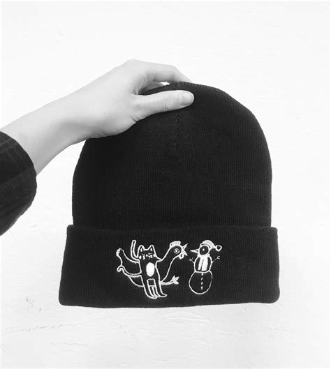
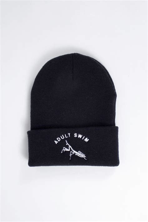
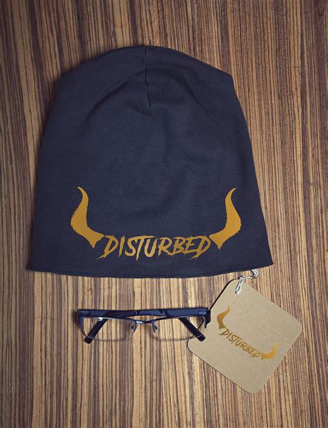
Logo placement on a beanie demands strategic consideration to balance visibility and aesthetics. The crown of the beanie provides a centered and symmetrical location where a logo can stand out most prominently. When placed on the edge or cuff, the logo benefits from the natural folding of the beanie, ensuring consistent visibility even in dynamic settings. Optimal logo size should maintain harmony with the beanie's proportional dimensions, ensuring that intricate details remain recognizable without overwhelming the overall design of the headwear.
Typography selection
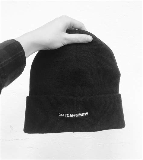
In graphic design for beanies, typography selection plays a pivotal role in conveying the desired message and aesthetic. The choice of font must align with the brand's identity, ensuring it resonates with the target audience's preferences and expectations. Serif fonts can impart a classic or sophisticated feel, whereas sans-serif fonts often provide a modern and clean look, making them suitable for minimalist or contemporary designs. The font size, kerning, and line spacing must be meticulously adjusted to ensure readability and visual balance, especially considering the curved surface of a beanie, which can distort or obscure text if not carefully planned.
Fabric texture details
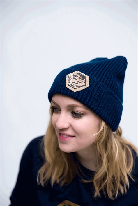
The fabric texture of a well-crafted beanie often illustrates a meticulous interplay of fibers, where each thread intertwines with precision to form a visually appealing and functional piece. Close inspection reveals a fascinating blend of synthetic and natural materials, perhaps wool or cashmere, that contribute not only to warmth but also to the beanie's tactile allure. The textural nuances, sometimes achieved through techniques such as ribbed knitting or cable patterns, create an intricate surface that captures light and shadow, adding depth and dimension to the accessory. The choice and execution of these details speak volumes about the designer's intent, aiming to balance comfort and style while ensuring the beanie stands as a testament to aesthetic and practical excellence in winter fashion.
Pattern design
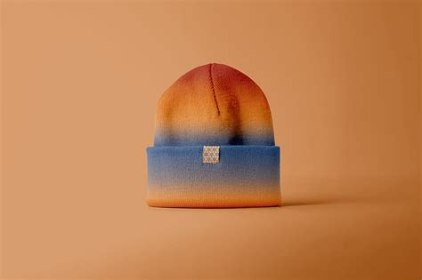
In crafting a graphic design pattern for beanies, it is imperative to blend functionality with stylistic expression, ensuring both aesthetic appeal and versatility across various contexts. This can involve incorporating geometric shapes interwoven with organic elements, which not only add dimension but also adapt fluidly to the curved surface of the beanie. The selection of color palettes plays a pivotal role, with gradients and contrasts that can highlight the intricacy of the pattern while maintaining a harmonious balance, considering seasonal hues or brand-specific color schemes. Textural effects, such as simulated knitting textures within the design, can enhance the tactile appeal and create a seamless fusion between the visual and the material aspect of the garment.
Brand identity consistency
When designing graphics for a beanie with a focus on brand identity consistency, it's crucial to integrate elements like color schemes, typography, and logos that align with the brand's overarching design ethos. A consistent color palette ensures that the beanie seamlessly fits into a broader collection or product line, reinforcing brand recognition and consumer confidence. Typography plays an essential role, where the chosen font style on the beanie should reflect the brand's voice, whether it is bold, playful, or sophisticated. The logo placement and size must be meticulously considered to maintain visibility and relevance without overshadowing other brand elements, creating a harmonious and unified visual experience that serves both aesthetic appeal and brand storytelling.
Stitching style
In the realm of graphic design for beanies, the stitching style plays a pivotal role in both aesthetic and functional aspects. Unique stitching patterns not only enhance the visual appeal but also contribute to the durability and comfort of the beanie. Selecting the right stitch, such as ribbed, cable, or seed stitch, can significantly impact the stretchability and fit, affecting how the beanie contours to the wearer's head. The intricate detailing in the stitching can also serve as a canvas for creativity, allowing designers to embed logos or patterns into the fabric, offering a personalized experience that resonates with brand identity while ensuring the piece stands out in a competitive market.
Design mockup
A design mockup for a beanie begins with selecting a template that fits the intended style and silhouette of the beanie, such as a cuffed or slouchy type. High-resolution images of fabric textures are utilized to emulate a realistic look, providing an authentic visual representation of the final product which helps clients visualize how their ideas translate into reality. Layering techniques in software like Adobe Photoshop or Illustrator allow for intricate details such as logos, patterns, and color variations to be precisely applied, maintaining the integrity and vibrancy of each design element within the constrained space of the beanie. Lighting effects and shadowing are incorporated for depth, creating a three-dimensional aspect to the mockup, which enhances the perception of how the beanie will drape and fold when worn, ultimately bridging the gap between digital representation and actual production.
Embroidery technique
When designing graphics for a beanie intended for embroidery, attention to detail is paramount to ensure clarity and precision upon production. The designer must consider the thickness of embroidery threads, as they greatly influence the final appearance; therefore, simplistic, bold designs often yield the most visually appealing results. Color selection requires careful thought since the limited color palette imposed by thread options can affect contrast and overall impact; designers may opt for solid colors or gradients that do not rely on subtle shifts. Additionally, the designer should account for the beanie's material texture, as uneven surfaces can distort intricate designs, necessitating strategic placement and sizing to maintain the integrity and legibility of the embroidery.
Visual balance
Creating a visually balanced graphic design for a beanie requires a meticulous attention to symmetry, color harmony, and proportion. The central design should serve as an anchor, which can be achieved by selecting a focal point that naturally draws the eye, such as a unique emblem or pattern positioned strategically. Colors should be chosen not just for aesthetic value but also for their balance, using complementary or symmetrical color schemes that enhance the overall coherence while maintaining contrast for visual interest. Ensuring that each element of the design maintains proportionality -- whether through geometric shapes, lines, or motifs -- contributes to an equilibrium that feels both intentional and harmonious, preventing any part of the design from dominating or feeling overbearing.






Leave a Reply
Your email address will not be published.