Graphic design found its footing in the early 20th century, transforming communication and aesthetics across industries. Initially, traditional print and poster design were at the forefront, but today, the possibilities for beginners are boundless. Graphic design now spans digital platforms, marrying creativity with technology. It may seem daunting at first, but graphic design is more accessible and enjoyable than ever--and it's experiencing a burgeoning wave of popularity. Elevate your creative journey with these beginner graphic design tips and start crafting your own visual stories.
Color Theory
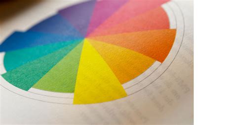
Color theory in graphic design is a foundational aspect that beginners must grasp as it encompasses the understanding of how different colors interact, influence perceptions, and convey messages. The primary colors--red, blue, and yellow--serve as the basic building blocks from which all other hues are derived, a concept critical for creating visually harmonious compositions. Complementary colors, which are located opposite each other on the color wheel, can be used to create vibrancy and serve as effective focal points, enhancing the aesthetic appeal of a design. Harmonious schemes like analogous or triadic provide balanced and cohesive palettes that can evoke specific emotions or themes, enabling beginners to craft compelling narratives through strategic color use.
Typography Basics
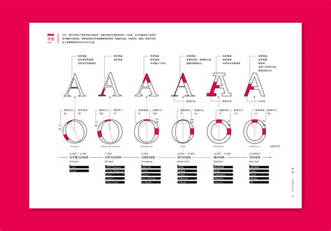
Typography is a fundamental aspect of graphic design that involves the artful arrangement and selection of typefaces to convey messages effectively. Beginners should start by understanding the distinction between serif and sans-serif fonts, with serif fonts possessing small projecting features that can evoke traditional or formal tones, while sans-serif fonts offer a modern and clean aesthetic. The hierarchy of type is crucial, incorporating varying font sizes, weights, and styles to guide the viewer's eye and emphasize key information, which can be achieved through a nuanced interplay of contrast and alignment. Attention to kerning and leading will enhance readability and visual harmony, where adjusting the spacing between individual letters (kerning) and the vertical space between lines of text (leading) allows for a balanced and aesthetically pleasing composition.
Balance and Alignment
Balance and alignment form the backbone of any successful graphic design, serving as critical guides for organizing visual elements cohesively. Balance refers to the visual stability achieved by distributing elements so that no part of the design feels heavier or overshadowed, whether through symmetrical arrangements that mirror elements on either side or asymmetrical compositions that rely on contrast or color to maintain equilibrium. Such intentional arrangements engage viewers by ensuring that their eyes move naturally across the design, highlighting important features without creating visual chaos or overwhelming the senses. Alignment, meanwhile, acts as the invisible thread weaving through the design, subtly drawing connections between different elements by strategically placing them with respect to edges or other guiding structures, aiding in readability and connecting disparate parts into a unified whole by keeping text and imagery harmonized.
Layout Design
In the realm of graphic design, a fundamental understanding of layout design is pivotal for beginners aiming to craft visually harmonious and effective creations. Beginner designers must first grasp the basics of composition, which involves the strategic organization of elements such as text, images, and shapes to create a coherent and visually engaging message. Mastery of grid systems is essential, as these invisible guides help maintain balance and alignment, ensuring uniform spacing and organization across pages. Furthermore, understanding the principles of visual hierarchy is crucial, as it directs the viewer's attention to the most important elements by manipulating size, color, contrast, and spatial relationships.
Branding Elements
Graphic design for beginners in the realm of branding requires an understanding of key elements such as logos, color palettes, typography, and brand imagery. A logo should represent the essence of a brand's identity, utilizing shapes and symbols that resonate with the brand's values; simplicity and memorability are crucial. Selecting a color palette necessitates comprehension of color theory, as different colors evoke varied emotions and associations, thus consistency across all brand materials ensures cohesive communication. Typography involves choosing fonts that align with the brand's tone, whether formal or casual, and integrating them seamlessly into visual designs to create a unified aesthetic; ideally, a combination of primary and secondary fonts enhances visual interest while maintaining clarity and legibility.
Graphic Design Software
Beginners venturing into graphic design should prioritize familiarizing themselves with key software tools, as these form the backbone of any creative process in the industry. Adobe Creative Suite, particularly Illustrator, Photoshop, and InDesign, is considered the gold standard, providing an array of functionalities that allow for vector graphics creation, photo editing, and layout designs respectively. However, for those seeking cost-effective alternatives, tools like GIMP, a free photo manipulation software, and Inkscape, which offers vector graphic design capabilities, provide robust feature sets similar to their paid counterparts. Meanwhile, Canva emerges as a user-friendly drag-and-drop platform that can ease beginners into the design world with its intuitive interface and vast library of templates and elements, making it accessible for quick, aesthetically pleasing visual content creation without steep learning curves.
Image Resolution
Image resolution is a fundamental aspect of graphic design that significantly impacts the quality and clarity of visual output. When dealing with digital images, resolution is measured in dots per inch (DPI) or pixels per inch (PPI) and essentially describes the detail an image holds. A higher resolution usually translates into sharper and more detailed images, crucial when printing as it ensures the artwork appears crisp and clean, without pixelation. However, beginners should be mindful of the trade-off between high resolution and file size, as excessively high-resolution files can become unwieldy, slowing down software performance and complicating workflows.
Visual Hierarchy
Visual hierarchy is a fundamental concept in graphic design that guides the viewer's eye by creating an organized structure within a design layout, allowing for clear communication of the message or information. Beginner designers should first grasp the importance of contrast, as it highlights key elements and helps in distinguishing between various levels of importance by adjusting size, color, and font weight. To establish flow and balance, the use of whitespace is crucial, as it draws attention to vital components while preventing the design from appearing cluttered or overwhelming. Consistent alignment and repetition contribute to a cohesive layout, serving to reinforce patterns that lead the viewer naturally from one element to the next, ensuring the intended narrative or message is delivered effectively.
Design Principles
Graphic design for beginners necessitates a solid understanding of fundamental design principles like balance, contrast, emphasis, rhythm, and unity, among others. Balance in design ensures that visual elements are evenly distributed either symmetrically or asymmetrically, which helps create a sense of stability and harmony within the composition. Contrast is crucial to making a design pop, drawing attention to specific elements by utilizing differences in color, size, shape, or texture; hence, a grasp of contrast aids in establishing visual hierarchy, guiding the viewer's eye to the most crucial parts of the design. Emphasis helps highlight certain aspects of the design to convey the intended message effectively, while rhythm establishes visual tempo through repeated patterns or elements, and unity ensures a cohesive and harmonious design by consciously applying similar visual elements across a layout, making each piece feel as though it belongs to the whole.
Creative Process
The creative process in graphic design begins with thorough research and understanding of the client's needs, target audience, and the brand ethos to inform the direction of the project. Beginners should embrace brainstorming sessions, sketching initial concepts and seeking inspiration from various sources, including nature, art, and existing designs, which can help in sparking unique ideas and visual narratives. Experimentation with different tools and software is crucial, as this allows one to play with typography, color schemes, and layout designs, thus providing a range of options to refine and iterate. Feedback from peers and mentors is invaluable in this iterative process, as it aids in identifying strengths and areas for improvement, ultimately enabling the creation of compelling and effective visual communication pieces.















Leave a Reply
Your email address will not be published.