Graphic design for backgrounds gained prominence as digital media became a staple of modern communication. Nowadays, graphic design for backgrounds plays a pivotal role in enhancing visual storytelling across platforms. Once seen as mere backdrops, today's background designs set the tone for engaging user experiences. Whether subtle or bold, these designs amplify the content they support, blending aesthetics with functionality. Though traditionally overlooked, background design is now recognized as a critical element in effective communication. Elevate your digital presence with standout graphic design backgrounds--explore the possibilities today.
Color Palette
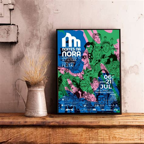
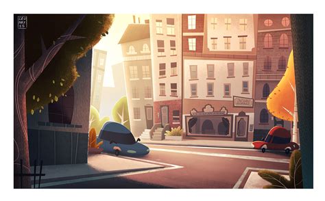
In graphic design, the color palette plays a pivotal role in establishing the overall mood and aesthetic of a background, demanding careful selection to evoke the desired emotions and enhance the design's narrative. Designers meticulously curate a harmonious ensemble of hues, considering complementary, analogous, or monochromatic schemes to achieve visual balance and synergy within the composition. The interplay of tones and shades can create depth and dimension, guiding the viewer's eye and influencing their perception of the content's hierarchy and message. Strategic use of color palettes can also reinforce brand identity, ensuring consistency and recognizability across various platforms by adhering to specific color guidelines while allowing subtle variations for creative expression.
Negative Space
A graphic design for a background focusing on negative space employs the strategic use of empty spaces to create a balanced and visually intriguing composition. Negative space, the area surrounding the main subject in a design, becomes an active component, guiding viewers' attention and providing a sense of serenity and openness. Delicate contrasts and harmonious proportions are utilized to form intriguing silhouettes and subtle narratives, drawing the eye into a rhythmic dance between foreground and background. Visual tension and symmetry are crafted using negative space to produce a design that feels grounded yet leaves room for imagination and interpretation, offering viewers an immersive and contemplative experience.
Typography Layout
Graphic design in terms of typography layout necessitates a precise and meticulous interplay between typefaces, size hierarchies, spacing, and alignment. Sans-serif typefaces often adhere to a minimalist aesthetic, while serif fonts give designs a classical edge, all contributing to the visual personality of a composition. Optimal typography layout dictates that text flows seamlessly, guiding the viewer's eye naturally from one element to another without hindrance, often achieved through strategic use of white space and alignment techniques. Kerning and leading adjustments ensure readability and balance, creating a harmonious relationship between text and imagery, defining the spatial hierarchy and ultimately delivering a cohesive visual narrative.
Visual Hierarchy
In graphic design for backgrounds, visual hierarchy plays a crucial role in guiding the viewer's attention and ensuring that information is processed in an intentional order. Designers use variations in size, color, contrast, typography, and placement to create a layered effect that draws the viewer's eye to the most important elements. A well-executed visual hierarchy can significantly enhance the readability and aesthetic appeal of a design, allowing users to quickly identify focal points and understand the intended message. Employing tools such as leading lines or strategic spacing can further emphasize the importance of certain design components, making the overall layout not only visually pleasing but also effectively communicative, often achieved by intuitively combining elements that balance and complement each other.
Texture Patterns
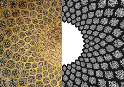
Graphic design can be immensely elevated by the use of texture patterns, adding a tangible dimension to visual experiences. Texture patterns can vary from intricate geometric designs to more organic, naturally inspired motifs, each serving to evoke different emotional responses and connotations. A deep understanding of layering techniques and color values is crucial, as these elements interact richly with texture to create depth and interest, often transforming a flat design into one that appears tactile. Designers meticulously choose textures to complement the narrative of a project, ensuring that texture patterns enhance the message, whether aiming for elegance through smooth and subtle gradients or invoking rustic charm with rugged, distressed finishes.
Symmetrical Balance
Symmetrical balance in graphic design for backgrounds involves arranging elements so they are evenly distributed on either side of an implied central axis, creating a sense of harmony and stability. This type of balance is achieved by mirroring elements, such as shapes, colors, and textures, to establish a cohesive and structured appearance that appeals to the viewer's innate preference for order. Designers often use symmetrical balance to convey formality, elegance, and timelessness in a composition, as this methodical alignment naturally leads the eye effortlessly from one side to the other, reinforcing the harmony. Furthermore, incorporating symmetrical balance involves carefully selecting elements with equal visual weight, such as choosing similar sizes and typographies, ensuring that neither side of the design overpowers the other, effectively maintaining equilibrium and facilitating visual flow.
Minimalist Style
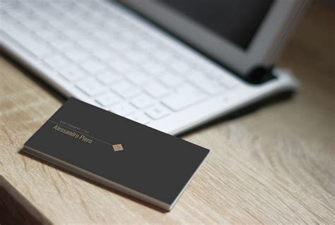
A minimalist approach to graphic design for backgrounds emphasizes simplicity and the use of space to create an impactful aesthetic. Dominated by neutral color palettes, such as shades of whites, grays, and blacks, minimalist designs often utilize subtle variations in tone and texture to add depth without overwhelming the viewer. Uncluttered compositions with ample negative space are meticulously employed, allowing the most important elements to stand out. Simple geometric shapes or single, bold lines are strategically placed, enhancing the background with a sense of balance and harmony while promoting a sense of calm and focus in the overall design.
Grid System
The grid system in graphic design serves as an essential framework allowing for the meticulous organization and alignment of visual elements, facilitating both aesthetic appeal and functional clarity within a composition. It operates by dividing a page into a series of columns and rows, providing designers a structured canvas to maintain consistency, balance, and proportion, which is crucial for visual harmony and efficient information flow. Different types of grids--such as manuscript, modular, and column grids--offer diverse frameworks suitable for various types of content and design projects, empowering designers to create layouts that are both dynamic and engaging. Mastery of the grid system not only streamlines the design process by providing a reliable guide for positioning elements but also offers flexibility within a controlled structure, ensuring that creativity can flourish without sacrificing order or accessibility.
Contrast Elements
In graphic design, contrast is a fundamental principle that enhances the visibility of elements in a composition, drawing the viewer's attention and ensuring clarity. Contrast can be achieved through various elements such as color, shape, size, texture, and typography. For instance, using a bold typeface against a subtle background or juxtaposing a vivid color against a muted palette creates a dynamic visual impact. Designers often pair light colors with dark ones or smooth textures with rough, emphasizing differences that guide the viewer's eye and emphasize the hierarchy within the design.
Focal Point
In graphic design, the concept of a focal point serves as the central element that draws the viewer's attention, effectively guiding their visual journey through the composition. Designers skillfully manipulate various design principles, such as contrast, color, size, and placement, to establish and accentuate this focal point, ensuring it stands out amidst the surrounding elements. By doing so, they create a visual hierarchy that not only captures attention but also enhances the overall narrative or message the design aims to convey. This intentional emphasis on the focal point helps anchor the viewer's gaze, leading their eyes naturally through the layout while reinforcing the design's underlying intent.






Leave a Reply
Your email address will not be published.