Catalogue graphic design gained prominence in the mid-20th century as a means to display product collections and entice buyers. Back then, a traditional approach was the norm, but nowadays, innovative catalogue design concepts flourish. No matter the style, successful catalogue design highlights key products and provides an engaging visual journey for the consumer. Though at first glance this design task may seem daunting and meticulous, in truth it is a creative and rewarding process--and it's currently experiencing a vibrant revival. Elevate your catalogue game with the following design tips and craft a masterpiece of your own.
Typography selection
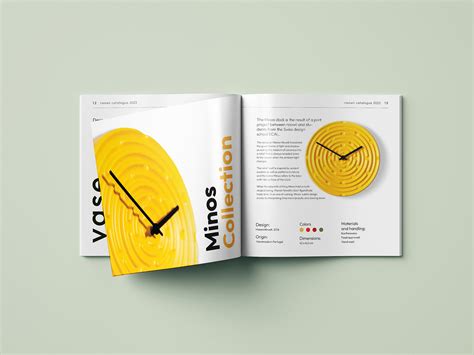
Effective typography selection in catalogue graphic design requires a meticulous consideration of readability, hierarchy, and brand identity. A designer must choose fonts that not only align with the brand's voice but also enhance the visual flow of information; sans-serif fonts often offer a modern, clean aesthetic ideal for body text, whereas serif fonts lend a traditional feel, facilitating a distinct hierarchy when used for headings or section titles. The interplay of font sizes, weights, and spacing must be strategically crafted to guide the reader's eye seamlessly through product descriptions and features, emphasizing key details without overwhelming the spread. Attention to color contrast is crucial to ensure visibility across varying backgrounds, using typographic variation as an expressive tool that complements the overall layout, thus transforming the catalogue into an engaging, cohesive visual experience.
Layout design
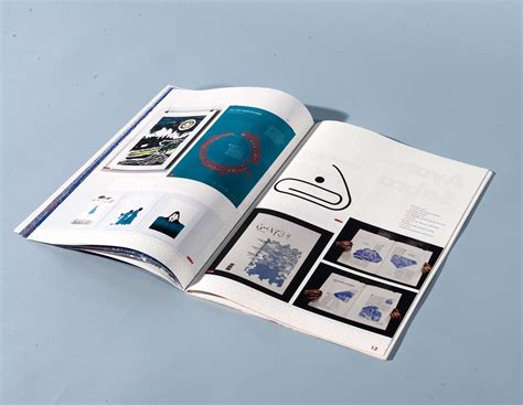
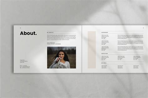
In creating a compelling catalog layout, it's essential to balance aesthetics and functionality, ensuring an intuitive and engaging user experience. A well-organized grid system forms the backbone of the layout, providing a consistent structure that guides the viewer's eye seamlessly through various sections. Attention to typography is crucial, with a clear hierarchy established through font size, weight, and style, enabling the reader to distinguish between headings, subheadings, and body text effortlessly. Employing a harmonious color palette not only reinforces brand identity but also helps in creating visual cues that highlight key elements, enhancing overall readability and ensuring that the catalog stands out in a crowded marketplace.
Color palette
When crafting a compelling catalogue through graphic design, the careful selection of a color palette plays a pivotal role in conveying the brand's message and affecting the consumer's perception. A harmonious color palette should consist of a primary color that dominates and aligns with the branding, accompanied by complementary hues that enhance its visual appeal and maintain balance, guiding the customer's eye naturally through the catalogue pages. The color choices should not only be aesthetically pleasing but also resonate emotionally with the target audience, potentially influencing purchasing decisions by evoking specific feelings or associations; for instance, cool blues often signify trust and professionalism, while vibrant reds can stimulate excitement and urgency. Consistency is crucial, so integrating these carefully chosen colors into every element--from text and backgrounds to borders and images--ensures coherence and creates a recognizable visual identity that echoes beyond the pages, fostering brand recall and engagement.
Visual hierarchy
Visual hierarchy is a fundamental principle in graphic design for catalogues, ensuring that information is organized in a manner that naturally guides the viewer's eye through the content seamlessly. Designers utilize a combination of elements such as size, color, contrast, and typography to establish a focal point that captures attention immediately. Larger, bolder fonts for headlines create an immediate visual impact, while subheadings and body text are styled to complement without overshadowing, often using less intense colors or smaller sizes. Utilizing white space strategically further enhances this hierarchy by preventing clutter, thus allowing key elements such as images or CTA buttons to stand out gracefully, leading consumers effortlessly through the narrative or product lineup intended by the designer.
Image placement
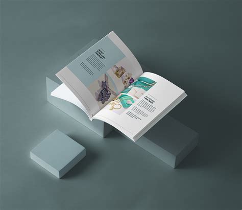
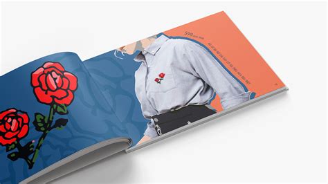
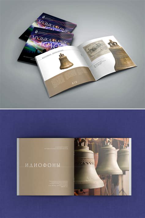
Image placement in catalogue design requires a strategic approach to ensure aesthetic appeal and effective communication. Strategic placement begins with understanding the narrative of the catalogue; imagery should be aligned with textual content to create a seamless flow, guiding the viewer's eye naturally from one element to the next. High-quality images that are well-positioned can accentuate the texture, color, and style of the featured products, necessitating balanced spacing and harmonious alignment to maintain visual interest without overwhelming the layout. Negative space plays a crucial role in enhancing contrast, allowing each image to stand out while contributing to an immersive and organized design that subtly directs consumer focus toward key items or promotions.
Graphic elements
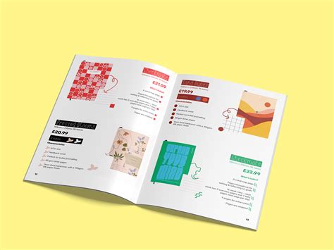
When designing a catalogue, graphic elements play a pivotal role in conveying the brand's message and facilitating user engagement. Utilizing coherent color schemes can enhance visual appeal and create a sense of harmony, making it important to select colors that reflect the brand identity. Typography must be carefully chosen to ensure readability while adding personality to the pages--it acts as a subtle narrative tool guiding the customer's journey through the catalogue. Incorporating high-quality, relevant imagery can evoke emotions or aspirations, thus serving to entice and inform the audience, while strategically placed borders and dividers can structure the content, providing a visual hierarchy that leads the viewer's eye naturally from one section to another.
Branding consistency
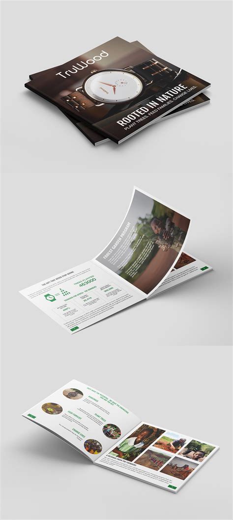
Creating a catalogue with branding consistency involves meticulously incorporating brand elements such as color palettes, typography, logos, imagery style, and overall design aesthetic throughout each page. The catalog must reflect the brand's identity by maintaining a cohesive visual language that resonates with the company's values and messaging, ensuring each component feels like a natural extension of the overall identity. Designers should adhere to predetermined brand guidelines, ensuring that every graphical element, including product placements, align with the established standards to foster brand recognition and customer trust. Consistent use of design elements not only aids in reinforcing brand loyalty but also enhances the customer's experience by providing visual coherence that guides the reader seamlessly through the catalogue's offerings.
Product photography
Capturing compelling product photography for a catalogue involves several nuanced considerations to effectively showcase items and entice potential buyers. Attention to lighting is paramount, with soft, diffused lighting often employed to eliminate harsh shadows and highlight intricate details of products. Choosing a suitable background plays a critical role as well, as neutral colors or a simplistic setting ensures that the item remains the focal point, adding a professional touch. Moreover, capturing multiple angles and incorporating lifestyle shots help create a comprehensive visual narrative that brings the product's features and potential uses to life, enhancing the connection with the viewer.
Print quality
Print quality in graphic design for catalogues is crucial for conveying the desired aesthetics and professionalism effectively. High-resolution images ensure crisp visuals, eliminating pixelation and providing sharp details that captivate the viewer. Choosing the appropriate paper type enhances perception, with options like glossy finishes offering vibrant colors and matte finishes providing a sophisticated touch suitable for different brand narratives. Color calibration between digital proofs and printed work remains essential to maintain the integrity of chosen hues, making color consistency a crucial factor in delivering a visually cohesive product.
Cover design
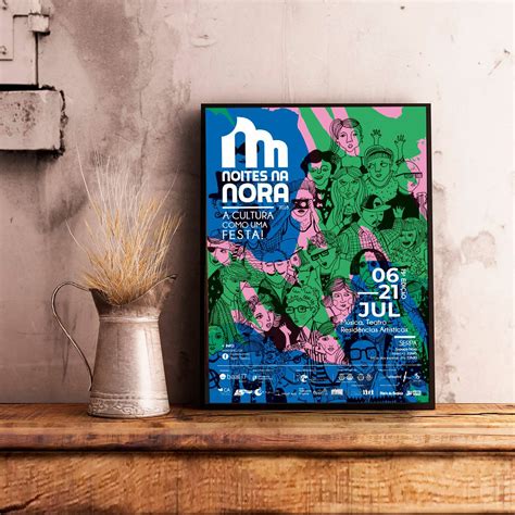
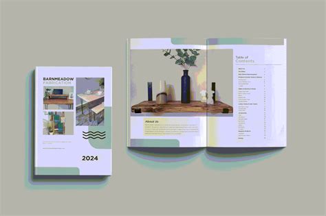
The cover design of a catalogue serves as the vital initial engagement point that must captivate and encapsulate the essence of the content within. An effective cover integrates striking visuals with thoughtful typography, ensuring a harmonious balance between imagery and text that resonates with the target audience. Designers often employ bold colors, high-quality imagery, and strategic whitespace to create an inviting and memorable aesthetic that not only enhances brand identity but also differentiates the catalogue in a competitive market. Additionally, incorporating tactile elements such as embossing, foil stamping, or unique textures can amplify the sensory experience, making the catalogue more likely to be picked up and explored further.


















Leave a Reply
Your email address will not be published.