Graphic design for certificates traces its origins back to a time when achievements were meticulously hand-lettered and adorned with intricate details. In recent years, however, the process has evolved dramatically, offering a plethora of styles and options that cater to diverse tastes and purposes. No matter the design approach, a well-crafted certificate remains a symbol of accomplishment, adding an element of sophistication to personal and professional milestones. While traditional certificates might seem formal and rigid at first glance, modern designs bring an opportunity for creativity and expression--and are experiencing a significant revival. Elevate your presentations with these graphic design tips for certificates and produce a unique and striking document.
Certificate Template
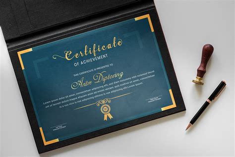
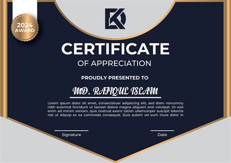
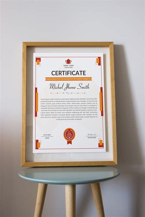
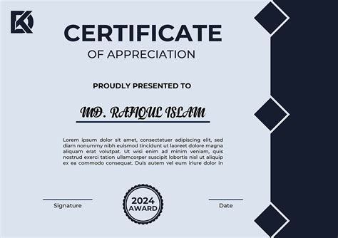
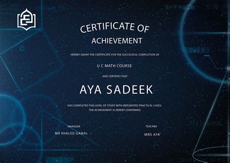
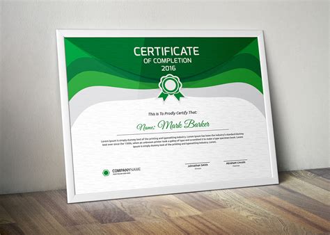
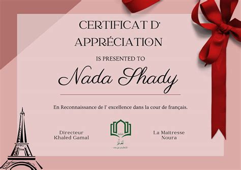
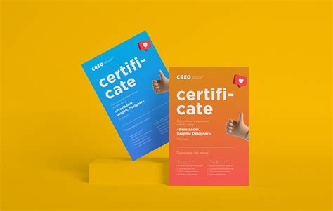
Designing a certificate template involves careful consideration of layout, typography, color, and imagery to encapsulate the purpose and tone of the accolade being awarded. The use of elegant and easily readable fonts, perhaps a combination of serif and sans-serif, can enhance the formal feel while ensuring clarity. Strategically employing color schemes, such as a refined palette of blues for professionalism or gold for prestige, can convey the significance of the certificate. Selected graphical elements, like borders or a subtle watermark, should enhance the overall design without overshadowing the central text, maintaining a balance between aesthetic appeal and functionality.
Design Layout
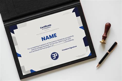
In graphic design for certificate creation, the design layout serves as the backbone that determines the aesthetic and functionality of the piece. Hierarchy is essential in directing the viewer's attention and ensuring that key elements such as the recipient's name, issuing organization, and purpose stand out clearly. Balancing negative space with focal design elements can provide clarity, preventing clutter while enhancing the overall readability and visual appeal. A well-thought-out use of typography and color schemes can evoke the appropriate formality or theme intended for the certificate, tying together the visual elements while ensuring each component resonates cohesively with the certificate's purpose and emotional tone.
Typography Selection
Selecting typography for a certificate involves considering both the aesthetic and functional aspects to convey prestige and formality. Serif fonts such as Times New Roman or Garamond are often favored for their classic and authoritative look, lending a sense of tradition and honor. Pairing a serif with a sans-serif font like Helvetica for secondary information can provide visual contrast and clarity, ensuring legibility. The hierarchy is crucial, with larger, bold text for the recipient's name and slightly smaller fonts for details like the award description and date, balancing elegance and readability to craft a distinguished and professional appearance.
Color Palette
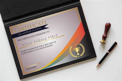
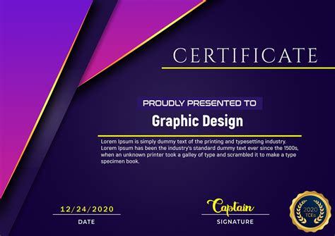
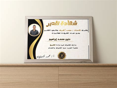
A well-chosen color palette for a certificate design communicates prestige, significance, and aesthetic harmony that aligns with the purpose and the institution bestowing it. Earthy tones like deep burgundy or navy might convey a traditional or academic excellence, whereas modern institutions might opt for sleek, monochromatic schemes focusing on gradients of grays complemented by a singular pop of color such as turquoise or teal to add a contemporary flair. These color choices must consider psychological impacts, ensuring the primary and secondary shades embody trust, accomplishment, and professionalism, subtly yet effectively guiding the viewer's eye across key textual elements like the recipient's name and the certifying body. Furthermore, the delicate balance between background neutrals and accent hues can accentuate embossing, gold foil detailing, or watermark features, enhancing the tactile and visual sophistication of the certificate.
Graphic Elements
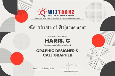
Graphic design for certificates involves a meticulous fusion of aesthetic appeal and formal structure, making each element pivotal in conveying elegance and validation. Typography is a primary graphic element, often chosen to reflect the certificate's purpose, whether it is celebratory or official, thus demanding a balance between readability and ornamental font styles. Borders and frames add a distinct boundary, guiding the eye towards the certificate's focal point while ensuring the design conveys a sense of completion and prestige. Background textures or subtle gradients provide depth without overshadowing the text or essential icons like logos, crests, or seals, which must seamlessly integrate into the design while reinforcing authenticity and brand identity.
Border Design
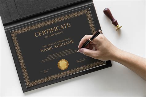
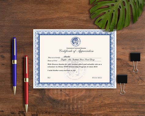
In graphic design for certificates, the border design serves as a vital element that enhances the aesthetic appeal and formality of the document. A well-crafted border not only frames the content elegantly but also reflects the prestige and significance of the award or acknowledgment. Intricate patterns, such as filigree or geometric shapes, can be employed to evoke a sense of tradition or modernity, depending on the desired style of the certificate. Additionally, the use of complementary color schemes and textures in the border design can draw the viewer's attention inward while balancing the overall composition and ensuring the certificate appears both professional and polished.
Background Image
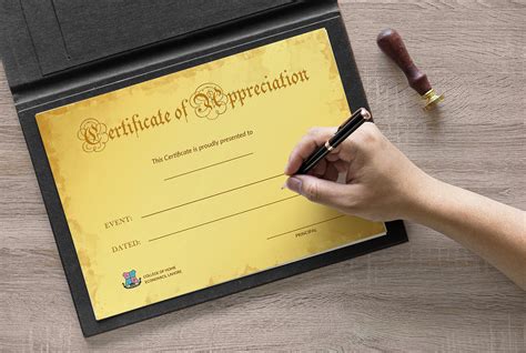
Background images in certificate designs play a pivotal role in setting the tone and elevating the aesthetic appeal of the document. Experienced designers often choose subtle textures or visually pleasing patterns to mimic the elegant characteristics of parchment or fine stationery, ensuring that the background complements rather than competes with the foreground text and elements. Utilizing elements like soft gradients, watermarks, or delicate, thematic motifs can add depth and sophistication, while maintaining the formal integrity required of certificates. Precision in layering and transparency is key, allowing the background to enhance the visual hierarchy, guiding the viewer's eye seamlessly from the recipient's name to the awarding organization's credentials, and ensuring that every design element is harmoniously integrated.
Font Style
Choosing the right font style for a certificate is crucial as it conveys the tone and significance of the achievement. Serif fonts such as Times New Roman or Georgia often exude a sense of tradition and elegance, making them ideal for formal recognitions like academic degrees or professional certifications. Sans-serif fonts like Arial or Helvetica impart a modern, clean, and approachable vibe, suited to contemporary awards or certifications in creative disciplines. Calligraphic or script fonts can add a personal touch, evoking a sense of prestige and uniqueness, perfect for achievements that celebrate individual artistry or craftsmanship.
Emblem Design
Creating an emblem design for a certificate involves a meticulous blend of symbolism and aesthetics to convey authority and prestige. The emblem should be a harmonious combination of shapes, colors, and typography, often featuring elements like laurel wreaths, shields, or scrolls to enhance its traditional and formal appeal. Each color must be selected purposefully, where gold often signifies excellence and achievement, while deep blue or crimson could imply integrity and honor. Fine-tuning typography is crucial, as serif fonts frequently lend a classic, scholarly tone that complements the emblem's overall narrative, making the certificate not only a document of achievement but a cherished artifact of the experience it represents.
Text Alignment
In graphic design for certificates, text alignment plays a pivotal role in creating an aesthetically pleasing and cohesive layout. Aligning text centrally can impart a formal and traditional feel, ideal for classical certificates that demand attention to hierarchy and order. Left alignment, however, offers a clean, streamlined look, frequently used to lend a modern touch, but it demands keen attention to margins to prevent an unintentionally staggered appearance. Careful consideration of line spacing and kernings, irrespective of the alignment choice, ensures readability and enhances the overall structure, making every element from the recipient's name to the signature line appear purposeful and well-integrated.












Leave a Reply
Your email address will not be published.