Graphic design for chocolate packaging became an essential part of the confectionery industry during the early 20th century, as brands vied for consumer attention on the crowded shelves. Back then, a handful of classic designs dominated the market, but today, the possibilities in chocolate packaging design are virtually limitless. Regardless of the approach, effective graphic design telegraphs the essence of the chocolate within, setting it apart and adding allure. While one might initially think of chocolate packaging as cliched and predictable, the truth is that it offers a canvas for creativity and innovation--and it is witnessing a significant evolution. Elevate your chocolate brand with the following design concepts and craft an irresistible package.
Chocolate packaging design
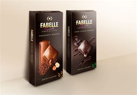
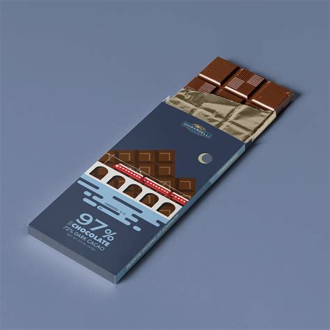
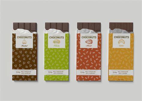
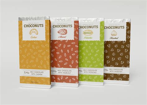
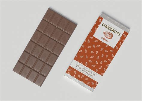
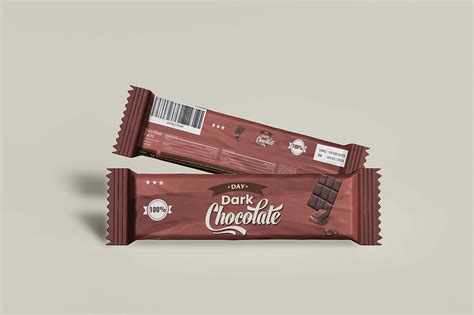
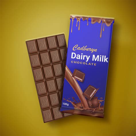
Chocolate packaging design is an intricate balance of aesthetics, functionality, and brand communication, requiring a deep understanding of both visual appeal and the psychology of consumer behavior. Designers must consider elements such as color, typography, and imagery, ensuring they not only captivate attention but also convey the product's essence and origin. The choice of materials plays a pivotal role, with sustainability and sensory experience often influencing selections to align with modern consumer values. Every detail, from embossing techniques to foil accents, is meticulously crafted to evoke the richness of flavor and indulgence, making the packaging an integral part of the chocolate's allure and overall experience.
Typography for chocolate labels
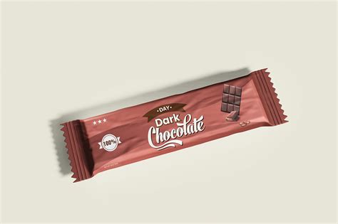
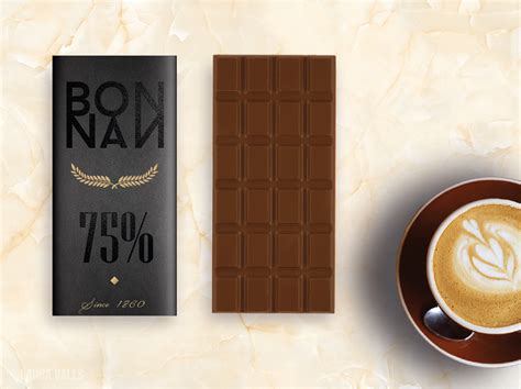
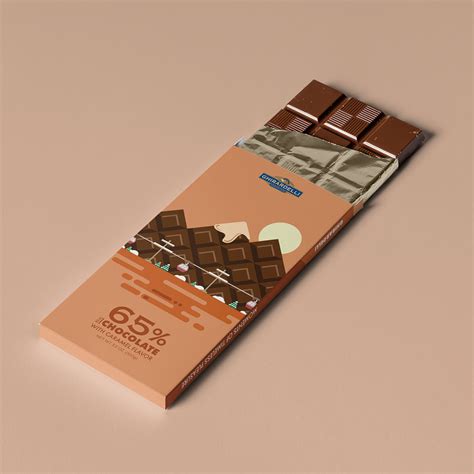
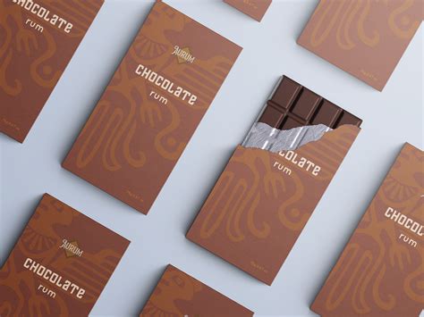
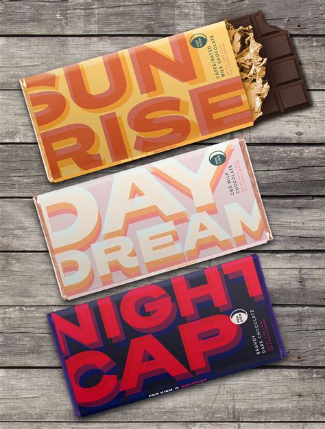
The typography for chocolate labels is a critical element that communicates the essence and allure of the product, often playing with rich, flowing scripts and bold, sumptuous fonts to evoke the indulgent and luxurious nature of chocolate. Designers frequently choose serif or handwritten typefaces with smooth curves to represent the decadence and elegance associated with high-quality chocolate, sometimes incorporating subtle curls or ligatures to mimic the fluidity of melted chocolate. The color palette of the text often complements the packaging's color scheme with choices like deep browns, golds, or whites to contrast against dark backgrounds, enhancing readability while maintaining a sophisticated and inviting aesthetic. To further entice consumers and reinforce brand identity, typographic elements are meticulously arranged with careful attention to hierarchy and spacing, often featuring the chocolate's origin, flavor, or cocoa percentage prominently to inform and attract discerning chocolate enthusiasts.
Color palettes for chocolate branding
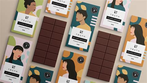
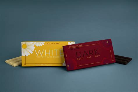
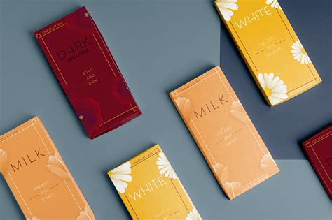
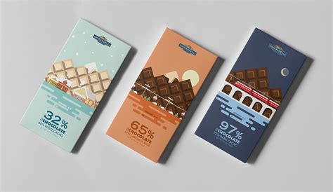
Creating a successful chocolate brand requires a meticulously chosen color palette that conveys feelings of indulgence, luxury, and warmth, thereby capturing the essence of the product. Rich hues of deep browns serve as the foundation, symbolizing the chocolate itself and evoking earthy undertones, which are often paired with golden or copper accents to imply premium quality. Pastels such as soft pinks or blues might be integrated to appeal to a more playful, whimsical demographic, suggesting a lighter, artisanal touch. Incorporating shades like burgundy or dark green can add a touch of sophistication and heritage, possibly tying into organic or ethically sourced product lines, while also ensuring the packaging stands out on a shelf cluttered with competing brands.
Chocolate brand logo design
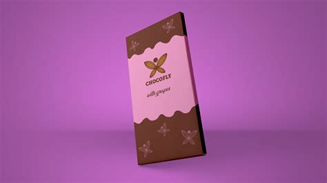
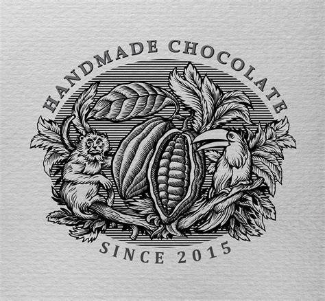
The design of a chocolate brand logo requires an intricate blend of elegance, simplicity, and emotional resonance to appeal to a wide audience while capturing the essence of indulgence intrinsic to chocolate. Typography often plays a pivotal role, utilizing smooth, flowing script fonts evocative of melted chocolate or bold serif fonts for a more traditional, luxurious impression. The color palette traditionally revolves around rich browns, creams, and occasionally deep reds or golds, encapsulating the luxurious nature of the product and conjuring sensory associations with taste and richness. Iconography, such as cocoa beans or chocolate bars, can be incorporated thoughtfully to reinforce the brand's story and origin, ensuring that the design communicates authenticity and artisanal quality, setting it apart in a crowded market.
Illustration styles for chocolate packaging
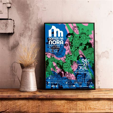
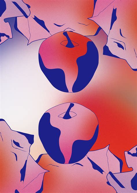
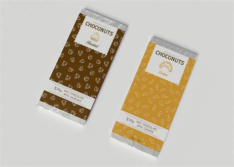
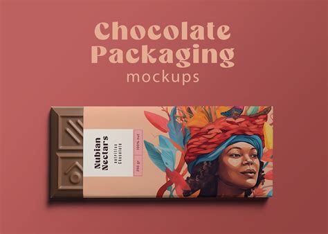
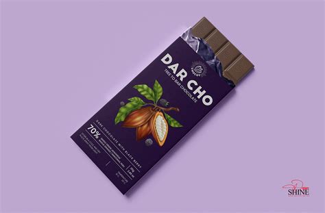
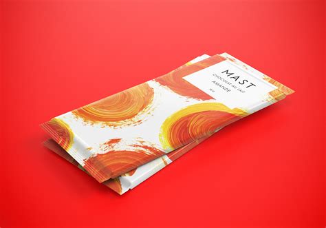
Illustration styles for chocolate packaging possess a majestic allure, often evoking the nostalgic beauty of vintage illustrations or the refined elegance of minimalistic modern art. Artisanal brands frequently delve into the rich tapestry of folk art, with intricate motifs and vivid colors that pay homage to the cultural heritage of cacao-producing regions. Others embrace the trend of whimsical, hand-drawn illustrations, where playful characters and imaginative landscapes transport the consumer to a world of enchantment, resonating with the emotional experience of indulging in chocolate. Bold geometric patterns and abstract interpretations on packaging serve as visual metaphors for the sophisticated taste profiles and complex layers within the chocolates, enticing connoisseurs who delight in both visual and gustatory explorations.
Chocolate box design concepts
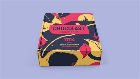
Chocolate box design concepts often revolve around the interplay of luxury and sensory indulgence, capitalizing on the rich history and cultural nuances associated with chocolate. Designers frequently utilize opulent materials such as metallic foils, embossed textures, and velvet finishes to convey a sense of elegance and refinement. Color palettes tend to draw from the warm, earthy tones of cocoa itself, sometimes contrasting with bold, vibrant hues or monochromatic schemes to create a visually striking appeal. Intertwining imagery of cocoa beans, geographic maps of cacao sourcing regions, and artistic interpretations of historical chocolate-making often adorn these boxes, serving not only as a marketing tool but also as a storytelling canvas that enhances the consumer's overall sensory and emotional experience with the product.
Visual identity for chocolate brands
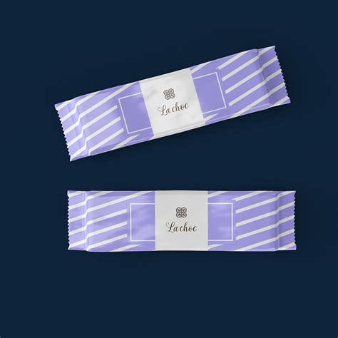
Visual identity for chocolate brands involves crafting a cohesive and alluring aesthetic that reflects a brand's essence, philosophy, and target audience. Color palettes often gravitate towards rich hues of brown, gold, and sometimes vibrant jewel tones; these hues evoke luxury, warmth, and indulgence. Typography plays a crucial role, balancing elegance with readability, where serif fonts may suggest tradition and craft while sans-serif can denote modernity and minimalism. Packaging designs, from wrappers to boxes, often incorporate intricate patterns or textures reminiscent of cocoa beans or exotic origins, expressing the narrative of the brand and creating an immersive sensory experience that goes beyond taste alone.
Chocolate product photography
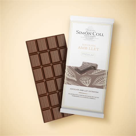
Chocolate product photography is an intricate aspect of graphic design that demands meticulous attention to detail and an understanding of how to evoke the rich, indulgent essence of chocolate. The photographer must master lighting techniques to highlight the glossy sheen and texture of the chocolate, using soft, diffused light to avoid harsh reflections while enhancing the depth and warmth of its natural tones. Composition plays a critical role, where strategic placement of the product against a minimalistic or themed background can amplify its allure and desirability, often incorporating complementary elements like cocoa beans, spices, or luxurious fabrics to suggest a story or theme. The final step involves post-processing to adjust color balance, contrast, and sharpness, ensuring the chocolate appears as delectable in the photograph as it would be in reality, while maintaining a harmony between natural appeal and polished elegance.
Chocolate marketing graphics
In the realm of chocolate marketing graphics, the emphasis predominantly lies in merging color theory and high-resolution imagery to evoke sensory pleasures, capturing the richness and allure of chocolate. Designers often use a luxurious color palette of deep browns, golds, and creamy whites that not only signify quality but also potentially increase consumer appetite as per color psychology studies. Intricately detailed textures, such as velvet smoothness or rich cocoa powder, are incorporated into packaging and advertisements to visually mimic the sensory experience of taste and aroma, thus creating an inviting aura. Additionally, the typography often mirrors the elegance and sophistication of premium chocolate brands, with script fonts or modern serif styles utilized to maintain a high-end aesthetic, meticulously designed to ensnare the consumer's gaze and ignite desire.
Sustainable chocolate packaging design
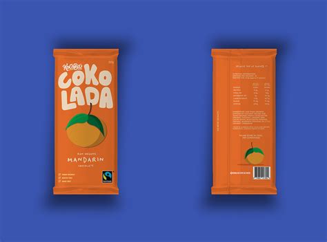
Graphic design for sustainable chocolate packaging focuses on minimizing environmental impact while enhancing brand identity through innovative materials and creative visual elements. Designers prioritize biodegradable or recyclable materials like paper, carton, and bio-plastic to replace traditional plastic packaging. Ethereal illustrations, earthy color palettes, and minimalist typography often dominate the visual style, subtly echoing the brand's commitment to environmental consciousness. Sustainable packaging design also incorporates functional elements such as resealable features or renewable energy-printed labels to further align with eco-friendly practices, ensuring that the aesthetic appeal of the packaging does not compromise functionality or the planet's wellbeing.





Leave a Reply
Your email address will not be published.