Graphic design for black T-shirts rose to prominence in the fashion world as a way to make bold, artistic statements. Initially, there was a predominant reliance on simple monochrome designs, but today, the spectrum of graphic design ideas for black T-shirts is vast and varied. The high-contrast backdrop of black fabric enhances vivid colors, intricate patterns, and striking logos, making each design pop with clarity and allure. Though one might assume that designing for black shirts is limiting, in truth, it's an exciting process brimming with creative possibilities. Elevate your wardrobe or brand with the following graphic design concepts tailored for black T-shirts, and craft your own wearable art.
Vector graphics
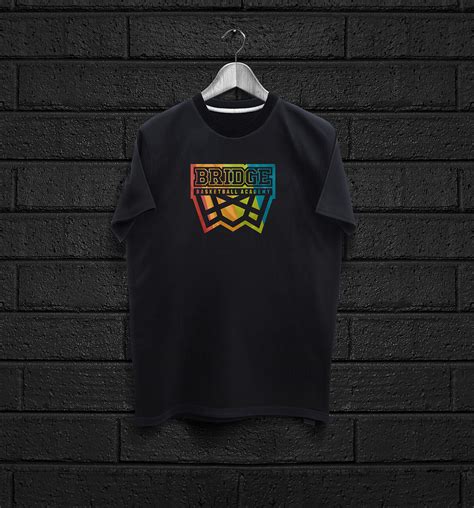
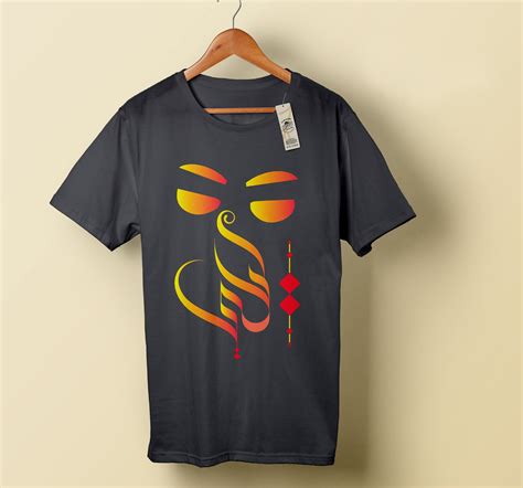
Creating a graphic design for a black T-shirt using vector graphics harnesses the precision and scalability offered by this medium, allowing for intricate and bold art that stands out vibrantly against the deep backdrop. A carefully chosen color palette, perhaps a combination of neon accents or metallic shades, can amplify the visual impact and contrast on the black fabric, ensuring that the design remains the focal point. The process begins with sketching and conceptualizing ideas that leverage geometric shapes, lines, and typography, which vector graphics excel at rendering with sharp, clean edges crucial for print clarity. Emphasizing dynamic symmetry or opting for an asymmetrical layout can also enhance visual interest, while the inherent flexibility of vectors provides the opportunity to iterate and refine the composition with ease, ensuring it maintains its integrity regardless of size variations on the T-shirt.
Typography designs
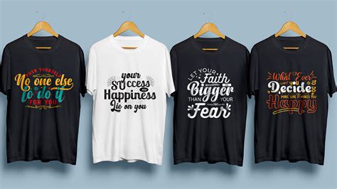
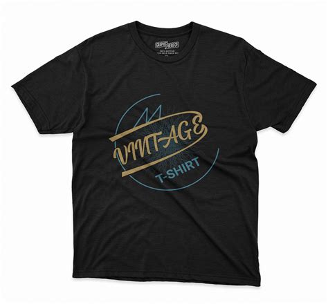
Typography designs for black t-shirts thrive on the balance between boldness and subtlety, using stark contrasts to capture attention and convey messages. Designers often utilize white or neon hues for lettering to ensure words pop against the dark background. Playful interactions between various font styles and weights make phrases stand out, each letter meticulously crafted to add depth and intrigue. Intricate kerning adjustments and captivating line breaks transform simple texts into provocative visual narratives, enhancing the storytelling element intrinsic to graphic tees.
Monochrome palette
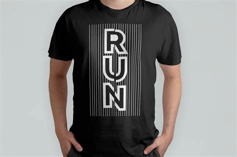
A monochrome palette for a black T-shirt design can evoke a strikingly elegant aesthetic through the contrast between depths of black, white, and various gray shades. The key lies in mastering the interplay of light and shadow; for instance, utilizing negative space strategically to let the black fabric act as a powerful component of the art. Patterns like intricate line drawings or bold geometric shapes, rendered in crisp white or subtle grays, can create a dynamic yet cohesive visual experience that captures attention without overwhelming the senses. Layering these elements can achieve a sense of depth and movement, offering a balance between simplicity and complexity that encourages the observer to appreciate the nuances of the design.
Negative space
Utilizing negative space in a graphic design for a black t-shirt allows the interplay of form and void to create an engaging visual impact. The designer might strategically position bold elements, like stark white geometric shapes or monochrome illustrations, on the black canvas to interact with the shirt's fabric, allowing the design to seemingly float or recede depending on the viewer's perspective. This technique entails careful consideration of how the negative space will define the contours and add depth or suggest a hidden image, such as using the shape of the void to evoke an animal or object subtly. Attention to the balance between positive and negative areas ensures the design remains dynamic, compelling the viewer to explore deeper layers visually interpreted by the juxtaposition of filled and empty space.
Print resolution
High-resolution graphics are crucial for black T-shirt designs to ensure crisp and vibrant prints that withstand the test of time. Designers should create artwork at a minimum of 300 DPI (dots per inch) for optimal clarity and detail, as this resolution ensures that each element of the design maintains its sharpness during the transition from computer screen to fabric. Utilizing larger canvas sizes in programs like Adobe Illustrator or Photoshop is essential to prevent pixelation, which can turn intricate design elements like thin lines or text into blurry smudges. It's also important to maintain the correct color profiles, such as CMYK, to achieve accurate color representation on the fabric and pay meticulous attention to the bleed and trim areas to ensure the design is perfectly centered and covers the desired T-shirt sections without unwanted cropping.
Screen printing
The process of screen printing on a black t-shirt necessitates a nuanced understanding of both contrast and color application to ensure vibrant designs. Unlike lighter fabric, black requires a preliminary white base layer 'underbase' to allow other colors to stand out vividly, akin to creating a canvas before adding detail. This technique involves using a specialized white ink with opaque qualities to prevent bleed-through and often necessitates a flash cure between the underbase and subsequent colored layers to solidify the base and prevent muddy outcomes. Intricate mesh screens with precise tension are essential for delivering fine detail, and the misalignment of any layer, even by a fraction, can disrupt the overall integrity of the design, underscoring the importance of meticulous registration.
Halftone patterns
The black T-shirt serves as the ideal canvas for a halftone pattern, allowing the intricate details and contrast of the design to stand out dramatically. By utilizing a series of dots varying in size and spacing, a halftone pattern can effectively create the illusion of shades and gradients without the need for additional colors. This technique not only provides a mesmerizing visual texture but also imbues the T-shirt with a retro, pop-art aesthetic that is both modern and timeless. A central motif, perhaps an abstract or portrait design, can be enveloped within the halftone, drawing the eye towards its dynamic interplay of depth, light, and shadow, making the garment not just a fashion statement but a work of art.
Design mockups
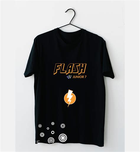
Black T-shirts serve as a versatile canvas for graphic designers seeking to explore bold contrasts and intricate details in their design mockups. The dark backdrop inherently highlights vibrant colors, making neon shades or metallic inks particularly striking choices that draw instantaneous attention. Designers often play with negative space to allow the black fabric to become an integral part of the design, crafting images or text where the T-shirt itself forms gaps or outlines. Additionally, texture becomes a pivotal element; beyond flat prints, experimenting with finishes like puff ink or embroidery adds both depth and tactile interest, effectively elevating the garment from a mundane shirt to a statement piece rich with visual and physical engagement.
Font contrast
Designing a black t-shirt with a focus on font contrast involves an intricate balance of color, size, and style to ensure that the typography stands out effectively. The use of a bold, perhaps serif typeface in a bright white or vibrant neon hue creates a striking visual impact against the dark fabric, emphasizing the message or logo. Layering techniques, such as shadow effects or outlines, can enhance this contrast further by adding depth and dimension, making the text appear more dynamic and engaging. Additionally, carefully considering the spacing and alignment of the text ensures that each element is visually harmonious and easy to read, even at a glance, while still maintaining the bold contrast that makes the design stand out on a solid black background.
Color separation
In graphic design for black t-shirts, color separation plays a critical role to ensure vivid and accurate prints. Designers meticulously dissect the artwork into individual components corresponding to each ink color, typically separating the colors into cyan, magenta, yellow, and black, or custom spot colors to match specific hues. This intricate process involves creating separate layers for each color element, utilizing software like Adobe Illustrator or Photoshop, which allows for precise alignment on the printing screens ensuring no color overlap or misregistration occurs. The design must also accommodate the unique challenge of printing on black fabric by incorporating an underbase layer of white ink, which acts as a primer to enhance the brightness and vibrancy of the overlying colors, ensuring the final product is both eye-catching and true to the original design vision.














Leave a Reply
Your email address will not be published.