Graphic design for accounting purposes emerged as a crucial tool during the digital transformation that swept through the financial world. Initially, there was a standard approach to conveying financial data, but today's graphic design ideas for accounting are plentiful and innovative. Regardless of the form they take, these designs strive to simplify complex financial information and bring a fresh aesthetic to reports and presentations. While at first glance, accounting visuals may seem reserved and straightforward, they can actually be dynamic and engaging--and are gaining traction rapidly. Enhance your financial communication with the following graphic design ideas tailored to the accounting field and make your data stand out.
Financial report layouts
Graphic design in accounting, particularly in financial report layouts, requires a meticulous balance between clarity and aesthetics to ensure that intricate financial data is both comprehensible and engaging. A well-structured layout incorporates visual hierarchy through the use of typography, color schemes, and spacing, facilitating an intuitive pathway for readers to navigate complex numerical information without being overwhelmed. Applying visual aids such as infographics, graphs, and charts can transform raw data into understandable insights, making significant trends and variances instantly recognizable while maintaining professional sophistication. Consistent branding elements, such as company logos and color palettes, should seamlessly integrate into these designs to maintain brand coherence and reinforce organizational identity, all while fostering trust and credibility among stakeholders.
Expense tracking infographics
Graphic design for expense tracking infographics in the accounting sector emphasizes clarity, accuracy, and functional aesthetics. Bold, contrasting colors can be employed to distinctly categorize different expense types, ensuring immediate visual differentiation for users aiming to swiftly analyze spending patterns. Incorporating intuitive charts like pie charts, bar graphs, and line graphs can further enhance the understanding of expense trends over time, providing accountants or business owners with a comprehensive view of financial outflows. Intelligent use of typography, such as selecting fonts that are both professional and legible, combined with strategic placement of essential data points, creates a balance between design and data, ultimately making complex financial information accessible and actionable for decision-making.
Budget visualization charts
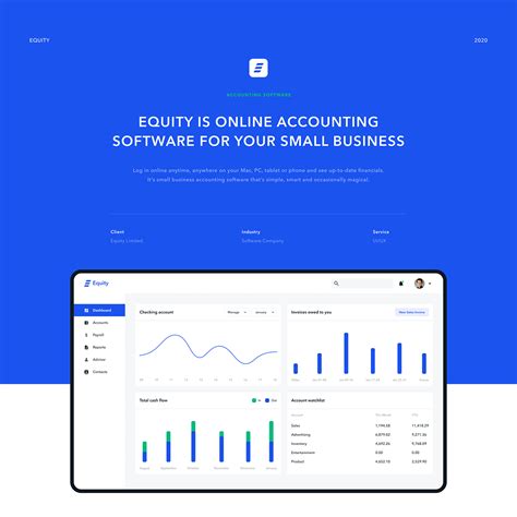
Graphic design techniques can revolutionize how budget visualization charts are perceived and understood in the accounting domain, prioritizing both aesthetics and functionality. Meticulously crafted, these charts employ industry-leading tools such as Adobe Illustrator and Tableau to transform numerical data into digestible, visually appealing graphics that enhance user engagement and comprehension. By utilizing a strategic mix of color theory, typography, and layout planning, designers can emphasize key financial metrics, draw attention to variance trends, and guide viewers through complex datasets with minimal cognitive overload. Dynamic elements like interactive dashboards and animated transitions further enrich the presentation, allowing users to customize views, explore scenarios, and ascertain insights with ease, ultimately facilitating more informed decision-making processes.
Accounting brochure design
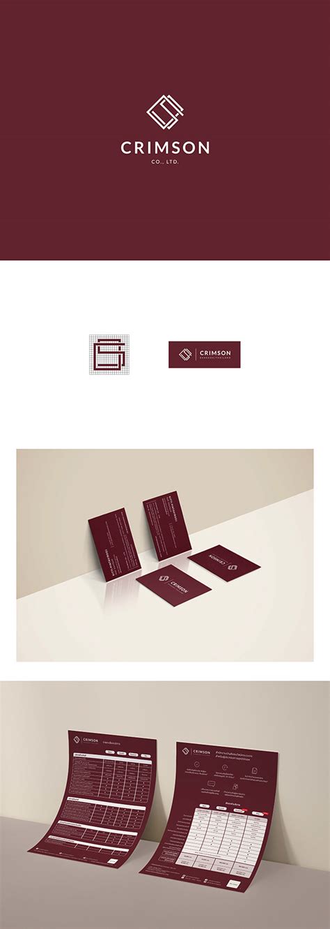
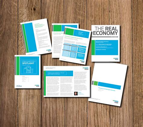
In crafting a compelling accounting brochure, attention to detail and a structured layout are paramount. A minimalist aesthetic, with a balanced use of space and a professional color palette, often reinforces the brochure's credibility and the firm's image. The incorporation of infographics simplifies complex financial information, making it digestible for prospective clients while maintaining an engaging design. High-quality typography should be consistently aligned with the branding, ensuring that sections such as services offered, client testimonials, and contact information are clearly distinguished to guide the reader seamlessly through the content.
Ledger design templates
Graphic design for accounting, particularly in the realm of ledger design templates, emphasizes clarity and functionality tailored to the precise needs of financial tracking. A well-designed ledger template incorporates a clean, grid-based layout that guides the user's eye effortlessly across key data points, using contrasting colors and typographical hierarchy to differentiate between categories, totals, and balances. Beyond aesthetics, the design strategically places elements such as headers, subheadings, and data entry fields to ensure swift data input and retrieval, reducing the risk of errors in financial management. Moreover, incorporating visual aids like icons and charts within these templates not only enhances memorability and usability but also supports a quicker cognitive understanding of complex financial datasets, ensuring accountants can parse and interpret financial information with minimal hassle.
Tax preparation guides
Tax preparation guides require precise and clear graphical elements, ensuring that complex information is easily digestible for accountants and clients. Designers often implement structured layouts, employing a grid system that allows for the logical organization of data, pictograms, and charts. Color palettes are typically subdued, with blue and green hues to convey professionalism and trust, while typography is chosen for readability, often a sans-serif font that guides the eye naturally through checklists and instructions. Infographics are strategically utilized to break down intricate tax processes, such as deductions or filing timelines, into visual journeys, facilitating comprehension and engagement for both seasoned accountants and novices alike.
Invoice template graphics
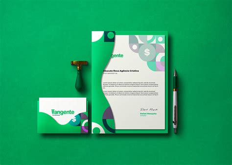
Graphic design for accounting, specifically for invoice template graphics, requires a meticulous approach to balance aesthetics with functionality. Designers must ensure that the template incorporates a clean layout, allowing for easy readability and seamless navigation throughout the document. Bold, contrasting colors can be utilized to highlight essential information like due dates and total amounts, while subtle gradients might add depth without overwhelming the content. Typography plays a critical role, demanding the selection of fonts that convey professionalism and clarity, further enhanced by strategic placement of logos and branding elements to reinforce corporate identity without distracting from the core financial details.
Audit presentation slides
Graphic design for audit presentation slides requires a strategic blend of clarity and creativity, ensuring that vital financial data is communicated effectively to stakeholders. Each slide should feature clean, professional layouts that facilitate easy navigation through complex information, employing a consistent color palette and typography associated with the company's brand. Icons and infographics can dramatically enhance comprehension by visually representing statistical data, making it more engaging and digestible to the audience. High-quality charts and graphs replaced by static tables can provide an immediate visual impact, transforming numerical data into a clear narrative that guides viewers through the audit findings' story.
Profit and loss statement graphics
Creating graphic designs for profit and loss statements in accounting requires a balance between clarity and aesthetic appeal, ensuring that financial data is both understandable and visually compelling. Designers often employ a combination of bar charts, line graphs, and pie charts to illustrate the various components of profit and loss, such as revenue streams, expenses, gross profit, and net income. Color-coding is frequently used to differentiate between positive and negative values, highlighting areas of financial growth or concern, and enhancing the immediate comprehension of the data presented. Typography plays a critical role, as well, with a preference for clean, sans-serif fonts that maintain readability across different sizes and mediums, thus allowing the viewer to focus on key figures without distraction, making the financial insights more accessible to stakeholders with varying levels of financial literacy.
Balance sheet illustration
Graphic design for accounting, with a focus on balance sheet illustration, intricately combines the precision of financial data representation with the aesthetic appeal necessary to make complex information digestible. Designers often employ a variety of techniques such as color coding, intuitive iconography, and dynamic layouts to clearly differentiate between assets, liabilities, and equity sections. Using modern design software allows for the embedding of interactive elements like drill-down capabilities and animated transitions, enabling users to explore financial data in a more engaging manner. Each element is carefully organized to maintain hierarchy and readability, ensuring key financial indicators stand out, and the overall design aligns with corporate branding to reinforce a unified professional identity.




















Leave a Reply
Your email address will not be published.