Graphic design for cafeterias emerged as a creative solution to enhance the dining experience and attract a diverse clientele. In earlier days, cafeteria design was fairly straightforward, prioritizing function over form, but today's innovative graphic design ideas are changing the game. Whether through colorful murals, enticing menu boards, or themed decor, graphic design breathes life and character into cafeteria spaces. At first glance, cafeteria design might appear purely utilitarian, but it holds great potential for creativity and engagement--and it's seeing a significant revival. Elevate the ambiance of your dining area with the following graphic design strategies for cafeterias and transform your space into a culinary destination.
Menu board design
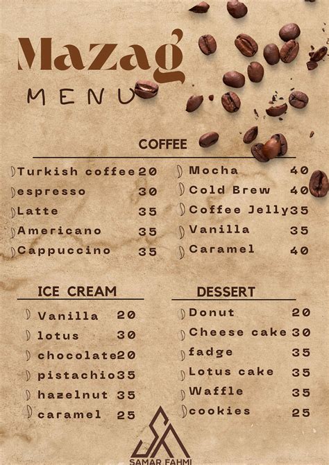
In creating a menu board design for a cafeteria, the integration of color, typography, and imagery needs to be meticulously harmonized to enhance both functionality and aesthetic appeal. Crisp typography is strategically employed to ensure readability from a distance, with fonts varying in size and weight to delineate categories and highlight specials or new items. The use of a cohesive color palette that reflects the cafe's brand identity not only aids in creating a warm and inviting atmosphere but also helps in organizing information in a visually appealing manner, guiding the customer's eye naturally through the menu. Imagery, whether through icons or photographs, should be thoughtfully selected and placed to evoke appetites and provide clarity on menu items, avoiding clutter while maintaining a sense of modernity and style, ultimately enhancing the customer's dining experience through effective visual communication.
Logo development
Developing a logo for a cafeteria demands a harmonious blend of aesthetics and symbolism that resonates with the cafeteria's unique essence and target audience. The designer should delve into the establishment's core values, culinary offerings, and atmosphere, translating these elements into a visual identity that communicates the brand's personality at a glance. Exploring typography becomes crucial, ensuring the style aligns with the food's nature - playful and modern for a contemporary booth or classic and elegant for a traditional, cozy spot. The designer also needs to consider color choices that evoke the intended emotional response, such as earthy tones crafted to suggest a warm, wholesome experience or vibrant hues reflecting an energetic, youthful environment, all while ensuring versatility across digital and print media for consistent brand recognition.
Brand color palette
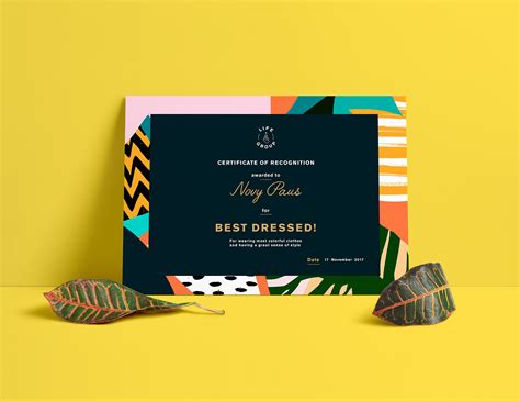
A cafeteria's brand color palette should reflect its ethos and target audience while evoking an inviting atmosphere conducive to dining and social interactions. For instance, earthy tones like warm beige or terracotta convey a sense of comfort and homeliness, reminiscent of wholesome meals and cozy nooks. Accents of vibrant colors such as orange or a lively green can infuse energy and appetite stimulation, providing a visual pop that attracts the eye and enhances brand recognition. Balance these shades with neutral elements like soft grays or off-whites to ensure that the overall ambiance remains relaxing and does not overwhelm diners, enabling a seamless and engaging visual identity across all touchpoints from menus to interior decor.
Signage aesthetics
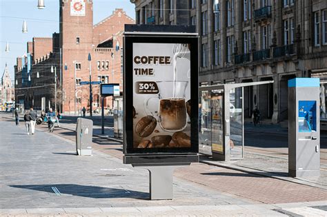
Signage aesthetics in a cafeteria setting play an intricate role in shaping the overall ambiance and guiding customer flow effectively. The use of typography is crucial, where font style and size must not only align with the cafeteria's brand identity but also ensure readability from varying distances and lighting conditions. Color palettes should be carefully selected to evoke desired emotional responses and create visual harmony with the interior architecture while contrasting enough to draw attention and provide clear directional cues. The strategic placement of signs, whether digital or static, must be tailored to enhance the customer journey from entry to cuisine selection, incorporating elements such as icons, arrows, and multilingual text to accommodate diverse audiences and optimize user experience.
Typography selection
Selecting typography for a cafeteria involves considering the brand's identity and the atmosphere one wishes to evoke. Bold, clean fonts can reflect modernity and energy, ideal for bustling urban settings or vibrant, youthful audiences. Serif fonts may conjure a sense of tradition and warmth, aligning well with an upscale or cozy, rustic theme where patrons enjoy leisurely dining experiences. Script or handwritten fonts can suggest a more personal, artisanal touch, inviting diners to feel at home and fostering a sense of familiarity and comfort that encourages repeat visits and positive word-of-mouth.
Wall graphics
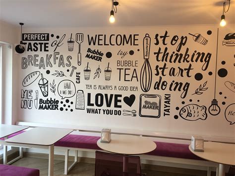
Wall graphics in a cafeteria setting can dramatically enhance the ambiance and customer experience, serving both aesthetic and functional purposes. The use of visual themes that reflect the culinary essence, such as vibrant illustrations of fresh produce or whimsical depictions of coffee beans, can create an engaging environment that stimulates appetite and curiosity. Strategically placed graphics, such as a large mural featuring local landmarks or cultural motifs, can evoke a sense of community and place, making the space feel welcoming and uniquely tied to its location. Additionally, incorporating interactive elements like chalkboard sections or QR codes embedded in the design invites patrons to participate or learn more about daily specials and the provenance of ingredients, establishing an informative and dynamic relationship between the space and its visitors.
Layout composition
In crafting a visually appealing graphic design layout for a cafeteria, it's essential to prioritize both aesthetic and functional elements, ensuring an inviting atmosphere that enhances customer experience. The layout should strategically arrange elements such as the menu board, promotional signage, and seasonal decor in a manner that guides the viewer's eye seamlessly across the space, using principles of alignment, contrast, and balance to create focal points and hierarchy. Employing contrasting colors and fonts helps in distinguishing important information like daily specials or discounts, while maintaining a cohesive color palette reinforces brand identity and aids in creating an ambient environment. Consideration of spatial harmony and negative space is crucial in avoiding clutter, allowing each element to breathe and enabling patrons to easily navigate both the visual and physical spaces, ensuring a pleasant and efficient flow from entry to order placement.
Print collateral
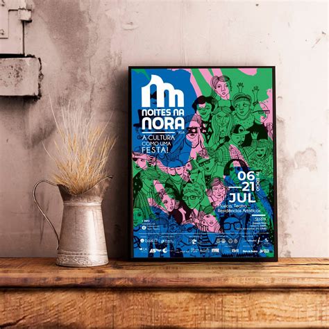
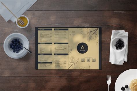
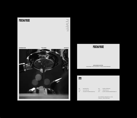
The print collateral for a cafeteria should encompass a range of visually appealing and functionally cohesive elements, ensuring they align with the cafeteria's brand identity and enhance the customer experience. Menus need to be designed with legibility and aesthetic appeal in mind, employing a strategic use of typography, color, and imagery to reflect the culinary theme and ambiance of the establishment. Signage, whether promotional posters or directional signs, should be consistently branded, utilizing strong visual hierarchies and clear messaging to guide and inform the patrons effectively. Loyalty cards, flyers, and table tent cards should not only serve their practical purpose but also act as extensions of the brand, with engaging graphics and thoughtful layout in order to establish a memorable connection with the customers.
Packaging design
Graphic design for a cafeteria's packaging design necessitates a comprehensive blend of practicality and aesthetics, ensuring that the branding reflects the ethos of the establishment and enhances the consumer's experience. The design involves strategic use of color palettes that evoke appetizing images and feelings, with warm tones often preferred to simulate the coziness of a welcoming dining experience. Typography must not only communicate the brand ethos succinctly but also maintain readability at various distances and on different types of packaging, from coffee cups to sandwich wrappers. The incorporation of unique design elements, such as logos or thematic patterns, needs to be carefully considered to ensure they remain consistent across diverse materials and surfaces, effectively establishing brand recognition even when viewed in bustling, busy environments like urban lunchtime crowds.
Marketing materials
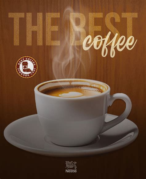
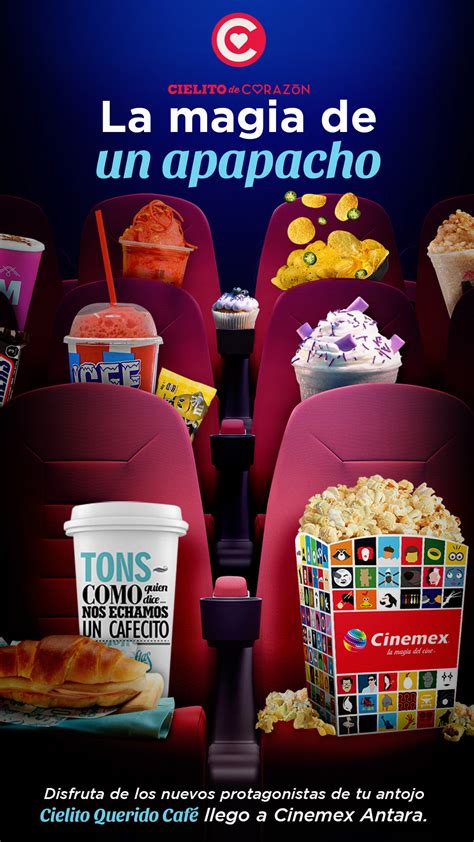
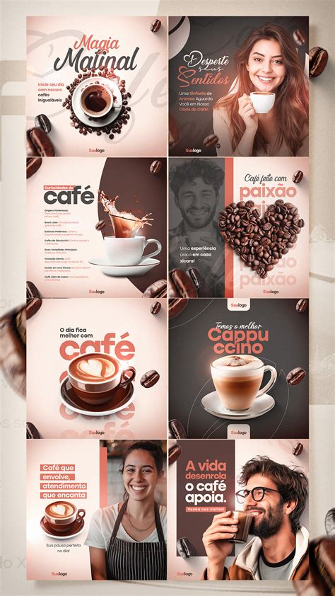
Graphic design for a cafeteria's marketing materials necessitates creating an inviting and cohesive brand identity that resonates with the target audience. This involves using warm color palettes, engaging typography, and attractive imagery that evoke the essence of the food and dining experience. Designers should consider crafting eye-catching menus, promotional flyers, posters, and digital content that showcase special offers in a visually compelling manner. Utilizing high-quality visuals and consistent branding across all materials ensures a memorable and enticing presentation that can captivate potential customers and enhance the cafeteria's market presence.







Leave a Reply
Your email address will not be published.