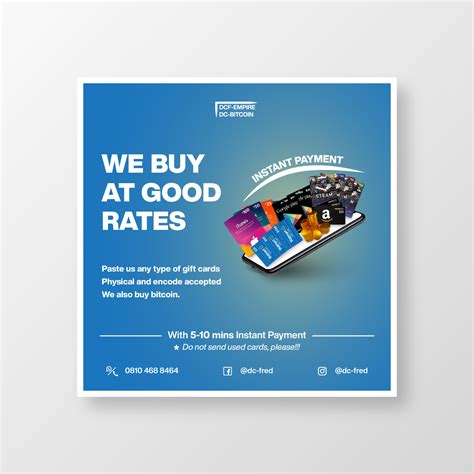
Banner graphic design emerged as a cornerstone of effective advertising during the digital age, adding vibrancy to the online and physical spaces alike. Originally, there was a standardized approach to banner creation, but now there's a vast array of possibilities to explore. Regardless of the style, banner graphic design captures attention and conveys messages with flair. Although some might initially view banner design as overly commercial or simplistic, in truth, it is an engaging and dynamic field--and it's currently experiencing an exciting evolution. Elevate your design venture with the following banner graphic design ideas and craft a standout piece.
Color palette
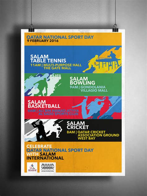
Selecting an effective color palette for a banner is crucial to its visual impact and communication clarity, as it sets the tone and mood for the content being presented. A harmonious combination of colors can draw attention and evoke specific emotions in the viewer, affecting their overall perception and engagement with the banner. Designers must consider the cultural meanings and psychological effects of colors depicted, as they differ widely across contexts and may influence the message's effectiveness. The color palette should complement the branding and purpose of the banner, ensuring that contrast is adequate for readability, yet subtle enough not to overwhelm the viewer, ultimately leading to a visually balanced and compelling graphic that effectively conveys its intended message.
Typography selection
Typography selection is a crucial component in the graphic design of a banner, significantly impacting readability, audience engagement, and overall aesthetic. Graphic designers must consider the banner's purpose, target audience, and the environment in which it will be displayed to choose the most effective font. Serif fonts convey tradition and seriousness, ideal for corporate or academic environments, while sans-serif fonts are modern and clean, suitable for tech or casual events. Typography hierarchy, through variations in size, weight, and color, guides the viewer's eye and emphasizes key messages, ensuring that the banner communicates its intended message efficiently.
Visual hierarchy
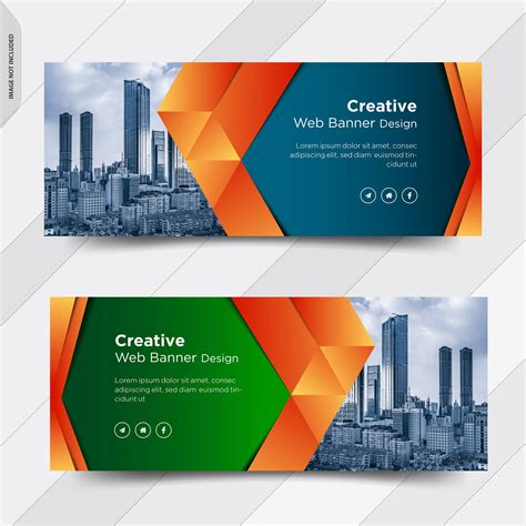
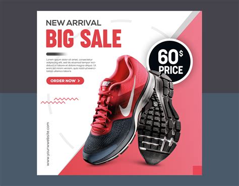
In graphic design for banners, visual hierarchy is crucial for guiding the viewer's eye to the most important elements first. Designers often use a combination of size, color, and placement to create a clear path for the eye to follow. A dominant headline, typographically bold and possibly in a contrasting color, tends to take precedence to ensure that the message is undiluted and instantly recognizable. Imagery is strategically placed, often overlaid with semi-transparent color blocks or gradients, creating zones of emphasis, as these elements work in tandem with typography to maintain balance and direct attention through the sequence of the secondary information.
Composition balance
Achieving composition balance in graphic design for banners requires a meticulous arrangement of elements to ensure visual harmony and focal clarity. Asymmetric and symmetric balancing techniques can be employed depending on the design objective; symmetric balance offers a formal aesthetic through mirrored, evenly distributed components while asymmetric balance brings dynamism using differing, yet visually weighted, elements. A grid system underpins the layout, guiding placement of typography, imagery, and negative spaces to maintain equilibrium and coherence. Color contrasts and scale variations further enhance balance, ensuring each segment of the banner draws viewer attention proportionally and contributes to the overall impact without overwhelming or underwhelming presence.
Negative space
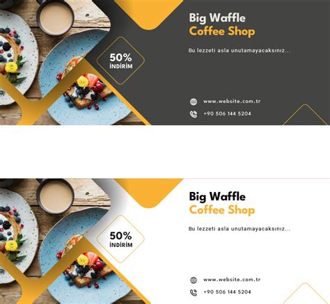
In graphic design, particularly for banners, the artful use of negative space creates a visually striking and effective composition, emphasizing the primary message without overwhelming the viewer. Negative space, often white or unoccupied areas, acts as a breathing room around visual elements, allowing them to stand out and engage the audience more effectively. Designers can manipulate the balance and proportion of negative space to guide the viewer's eye towards compelling focal points and important typography, enhancing readability and creating a sense of harmony. Incorporating negative space thoughtfully can transform a cluttered, chaotic design into an elegant and sophisticated composition, amplifying the banner's overall impact and ensuring the conveyed message resonates clearly and powerfully.
Branding elements
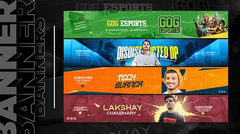
In graphic design for a banner, incorporating branding elements is crucial for maintaining brand consistency and recognition. A designer needs to ensure that the brand's logo is prominently and thoughtfully placed, usually in a strategic spot that captures attention without overpowering the overall composition. The color palette should align with the brand's established colors, reinforcing the brand's identity and evoking the desired emotions associated with those hues. Typography also plays a significant role, with font choices needing to mirror the brand's style guide, thus ensuring that the message is not only legible but also harmonizes with the brand's tone and personality.
Image resolution
Image resolution holds utmost importance in graphic design for banners, largely determining the clarity and visual appeal of the final product. High-resolution images ensure that the design maintains its sharpness and detail, even when viewed at a distance or enlarged to fit large-scale formats. Designers must select or create images with a resolution of at least 300 DPI (dots per inch) for print banners to avoid pixelation and blurry visuals, often opting for vector graphics when the possibility of resizing is crucial. Proper consideration of resolution also involves understanding the balance between image quality and file size, optimizing both to ensure smooth loading and print quality while maintaining aesthetically pleasing results.
Focal point
In crafting a compelling banner, the focal point acts as the anchor, capturing the viewer's attention immediately. The use of bold colors, along with striking imagery, can draw the eye to this critical area, ensuring it's the first thing noticed. For balance and cohesion, surrounding elements should be more subdued in design and color, subtly guiding the viewer back to the focal point; negative space can be a powerful tool in achieving this effect, creating a visual hierarchy. Thoughtful typography is crucial, with font size and style variances further emphasizing the focal point, while aligning harmoniously to avoid overwhelming the overall layout, sustaining visual interest and clarity.
Text alignment
Text alignment in graphic design for banners is a crucial element that enhances readability and overall visual appeal. Aligning text properly can direct the viewer's eye and create a sense of order and harmony. For instance, left alignment often conveys a formal and traditional tone, right alignment can introduce an element of modernity and unpredictability, and centered text tends to create symmetry especially in banners used for weddings or formal events. Designers should also consider the importance of white space as balanced text alignment coupled with adequate spacing can prevent the design from appearing cluttered, allowing the message to stand out clearly and effectively.
Grid layout
In creating a graphic design for a banner with a focus on grid layout, a designer must meticulously consider the structure that this framework brings, ensuring that all visual components are harmoniously aligned for optimal aesthetic appeal and readability. The grid serves as an unseen scaffolding where images, text, and even color blocks are placed with precision, inviting a balance between negative space and content that captures the viewer's attention naturally. Every grid line functions as a guide, facilitating the placement of typography, enabling consistent margins, and fostering a rhythm that guides the viewer's eye seamlessly across the banner. By adhering to the grid guidelines, the designer can maintain a uniformity that underscores the design's cohesiveness, subtly guiding the narrative the banner aims to convey through its visual hierarchy.










Leave a Reply
Your email address will not be published.