Graphic design for bakeries emerged as a key player in branding during the artisanal bread and pastry movement, which sought to highlight craftsmanship and quality. Back then, the approach was fairly straightforward, but today bakery graphic design options are plentiful and varied. Regardless of style, graphic design for bakeries serves to communicate the essence of the baked goods and entice the senses. While it might initially seem whimsical and niche, in reality, it is both strategic and adventurous--and has never been more vital. Elevate your bakery's charm with the following graphic design ideas and make it truly memorable.
Bakery branding
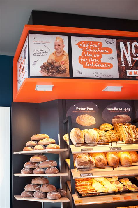
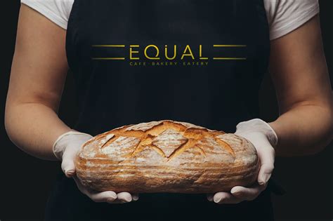
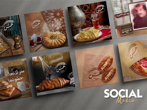
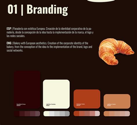
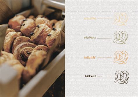
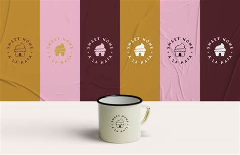
Effective bakery branding through graphic design requires a meticulous blend of visual elements that resonate with the essence of the bakery's offerings and its unique selling proposition. The use of warm, inviting color palettes, such as soft pastels or rich earth tones, can evoke the coziness and freshness associated with baked goods, while carefully crafted logos can encapsulate the bakery's identity, whether it's traditional or contemporary. Typography plays a critical role; choosing fonts that reflect the bakery's style, like elegant serifs for a classic patisserie or whimsical scripts for a modern artisan bakery, can enhance the brand's personality. Additionally, incorporating design elements that symbolize the bakery's specialities, such as wheat stalks for rustic bread or whisk motifs for pastry precision, can create a memorable visual experience that builds a strong emotional connection with potential customers.
Pastry packaging design
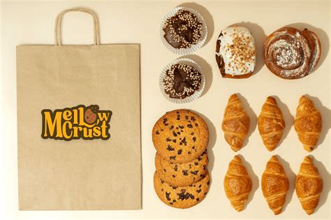
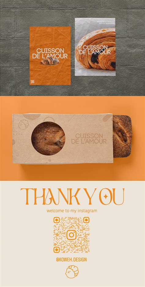
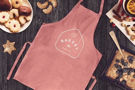
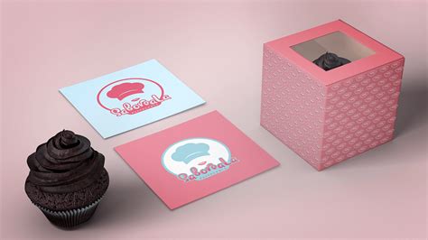
Pastry packaging design for a bakery demands a focus on combining aesthetic appeal with functionality to enhance the customer experience and reinforce the brand's identity. It involves the meticulous selection of materials that not only protect the delicate nature of pastries but also complement their artisanal quality through texture and finish, such as kraft paper for a rustic feel or transparent elements for a modern touch. Vibrant colors and elaborate typography can be employed to convey freshness and flavor, while strategically placed windows offer tantalizing glimpses of the treats inside, enticing shoppers and aligning with evolving consumer desires for transparency. Embellishments like foil stamping, embossing, or custom die-cuts add an upscale touch, turning the packaging into a sensory journey that begins before the pastry is even tasted, thereby forging an emotional connection that can inspire brand loyalty and repeat purchases.
Cake logo design
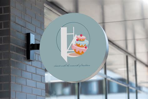
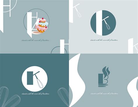
Creating a cake logo design for a bakery involves the careful consideration of various design elements that resonate with both the brand identity and target audience. A successful cake logo beautifully integrates delicious visual cues like icing swirls, tiered cakes, or artistic depictions of popular confectionaries, subtly infusing colors that evoke feelings of warmth, sweetness, and indulgence such as pastel pinks, rich browns, or creamy whites. Typography plays an equally crucial role, with choice fonts that evoke a sense of whimsy and elegance, such as script or hand-drawn styled typefaces, combining seamlessly with the imagery to form a cohesive design narrative. Texture can enhance the visual appeal, with artful use of digital brush strokes or embossing effects, aiming to create a tactile impression that mirrors the delightful experience of savoring freshly baked goods, while maintaining versatility for diverse branding mediums from business cards to large storefront signage.
Bakery menu layout
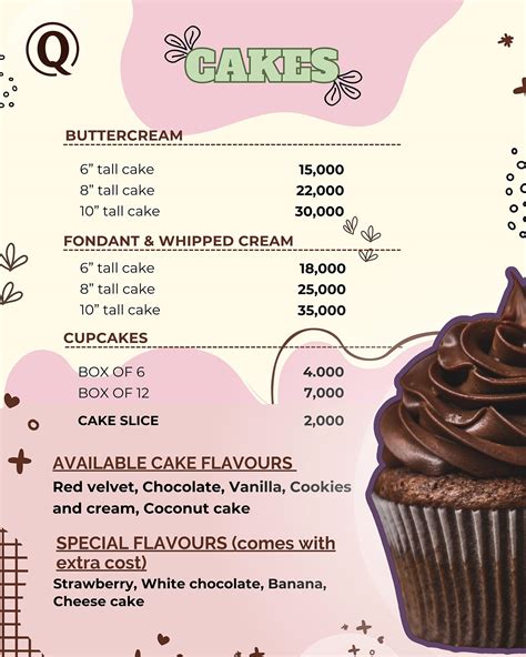
In crafting an engaging bakery menu layout, the choice of colors becomes pivotal as warm, earthy tones suggest freshness and homeliness, yet vibrant hues can immediately capture attention, invoking a sense of indulgence. Careful font selection is crucial; script fonts convey elegance and specialty, whereas sans-serif fonts ensure readability, providing a clean and modern look that accommodates the wide range of baked goods on offer. Imagery must serve to enhance the layout without overwhelming it. Thus, strategically placed, high-quality photographs of the bakery's specialties accentuate the menu's appeal by guiding the eye naturally, inviting customers to indulge in a sensory experience even before they indulge in the actual pastries.
Artisan bread labels
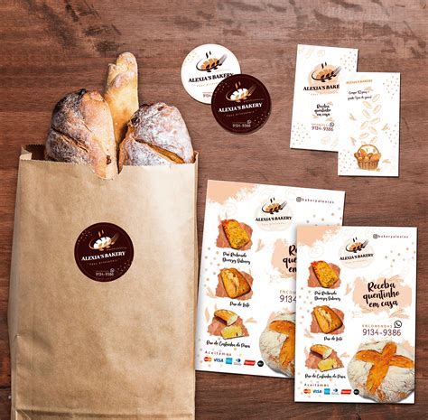
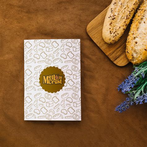
Artisan bread labels in graphic design require careful consideration of both aesthetic appeal and communication of quality. Sophisticated typography should evoke a sense of tradition, craftsmanship, and authenticity, often utilizing serif fonts that imply a link to the past. Earthy color palettes with muted tones can be employed to reinforce the wholesome, natural ingredients used in artisan baking while subtle textures such as kraft paper or rustic burlap patterns can enhance the tactile experience of the label. Imagery like hand-drawn wheat sheaves or bread motifs can provide visual cues that align with the artisanal nature of the product, while strategic placement of information such as ingredients, bake date, and origin story ensures that consumers are informed and enticed, creating a sensory journey that mirrors the bread's journey from farm to table.
Bakery window signage
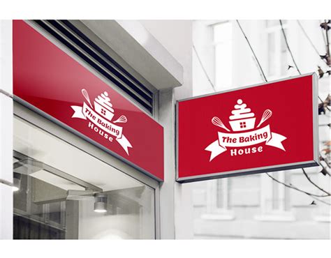
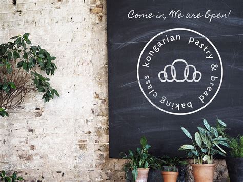
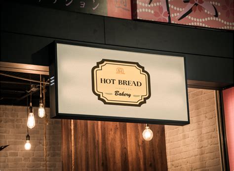
Designing a compelling bakery window signage requires an acute understanding of aesthetics and functionality, blending bold and inviting colors that echo the warmth and comfort of freshly baked goods. The typography should evoke a sense of artisanal quality, perhaps utilizing hand-drawn, cursive fonts that resonate with the traditional craftsmanship of baking. Lighting plays a critical role as well, with the strategic use of LED fixtures to illuminate the signage, making it irresistible both during day and night, thereby enhancing curb appeal and drawing in casual onlookers. Thoughtful incorporation of imagery, such as stylized icons of bread, pastries, or rolling pins, can further communicate the bakery's specialties, while ensuring that the overall composition remains uncluttered and easy to read from a distance.
Dessert box graphics
Designing graphics for a dessert box in a bakery can be an intricate process that requires attention to both aesthetics and functionality. The exterior of the box should visually tantalize the senses, using rich colors and subtle textures that evoke the sweetness and indulgence of desserts inside. Typography can play a crucial role, with playful fonts or elegant scripts that reflect the bakery's brand identity, possibly alongside a logo or tagline that reinforces quality and craftsmanship. The design should also consider practical elements such as displaying allergen information or storage instructions in a discreet but readable manner, which maintains coherence with the overall design while providing essential details to the consumer.
Patisserie promotional materials
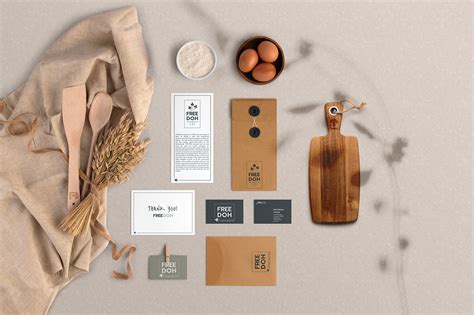
Creating patisserie promotional materials for a bakery requires a focused approach to capturing the essence of refined aesthetics and mouth-watering indulgence. The design should elegantly weave elements such as pastel color palettes, delicate graphic embellishments reminiscent of sugar lace or flourishes, and high-resolution imagery that showcases the patisserie's intricate craftsmanship and tempting textures. Typography must echo elegance and sophistication, possibly through serif fonts or script that harmonizes with the overall delicacy of the visuals. Strategically designed layouts can feature artistic placements of product photography to create focal points, enticing potential customers and reflecting the luxurious nature of the brand's offerings, which can then be further accented by tactile printing effects such as embossing or matte finishes, enhancing the tactile experience of the promotional materials.
Bakery website visuals
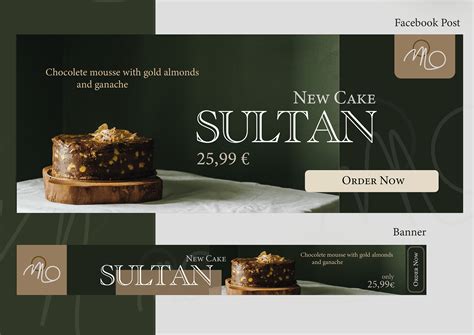
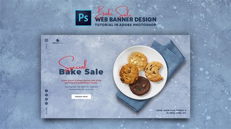
The visuals for a bakery website should be crafted with meticulous attention to detail, capturing the essence of warmth and artisanal craftsmanship inherent in baking. High-resolution images of freshly baked goods, displaying the texture and enticing qualities of crusty breads, flaky pastries, and decadent cakes, serve as the visual anchor. The color palette should incorporate soft pastels, evoking a sense of homeliness and sweetness, while fonts should balance between modern minimalism and rustic charm, ensuring the text complements rather than detracts from the images. Furthermore, the layout must be user-centric, with intuitive navigation that invites users to explore and engage, leveraging whitespace effectively to allow each visual element to breathe and tell the story of the bakery's unique offerings.
Cupcake flyer design
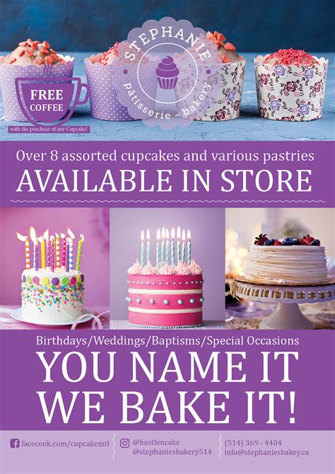
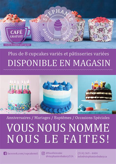
Creating an enticing flyer design for a bakery focusing on cupcakes requires a meticulous blend of vibrant imagery and strategic text placement to captivate the viewer's attention immediately. The flyer should employ a rich, pastel color palette that evokes the sweet, delightful nature of the treats, using colors such as soft pinks, creamy yellows, and gentle lavenders, mimicking the most popular cupcake flavors and frosting types. Centralize a high-resolution image of a beautifully decorated cupcake, ensuring that it's placed against a clean, uncluttered background to highlight its details, textures, and colors, making it the undeniable focal point of the design. Typography plays a crucial role, so incorporate a whimsical yet clear font for the bakery's name and more straightforward, sans-serif fonts for essential information such as location, contact details, and any ongoing promotions, maintaining a balance between artistic flair and readability.





Leave a Reply
Your email address will not be published.