Graphic design for yoga emerged to enhance the tranquil and spiritual essence of this ancient practice, especially as yoga gained widespread popularity in recent decades. Initially, there was a prevalent style that dominated the scene, but now, graphic design ideas for yoga are as diverse as the practice itself. Regardless of the approach, yoga-inspired design aims to create calming visuals and convey a sense of serenity and balance. While some might initially perceive these designs as overly simplistic or abstract, they are, in fact, thoughtfully crafted and deeply meaningful--and they're currently experiencing a renaissance. Elevate your yoga branding with the following graphic design concepts and develop a unique visual identity.
Yoga branding kits
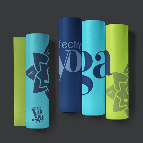
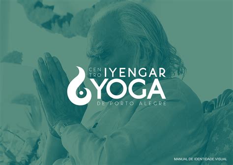
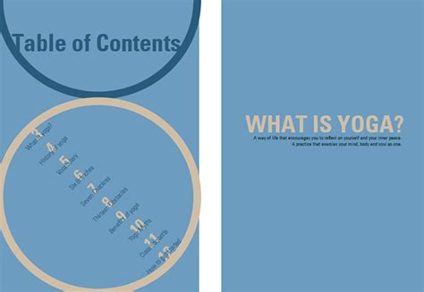
Yoga branding kits encapsulate the essence of tranquility and balance through meticulously crafted graphic design elements. They typically include logos, typography, color palettes, and marketing materials unified by a serene aesthetic, often featuring earthy tones like moss green, sand beige, or sunset orange. Designers incorporate symbolism intrinsic to yoga, such as mandalas, lotus flowers, or the flowing lines of a yin-yang, ensuring each element speaks to the holistic nature of the practice. The use of sans-serif fonts provides a modern, yet calming, touch, while gradients and textures might mimic natural fabrics or landscapes, enhancing the sensory experience and aligning the visual identity with the spiritual connection yoga seeks to foster.
Mindful color palette
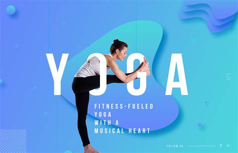
A mindful color palette for yoga graphic design focuses on creating visual serenity and stimulation through thoughtfully chosen hues that evoke tranquility and balance. Earthy tones such as soft greens, muted browns, and gentle blues can mimic the natural colors found in peaceful environments, fostering a sense of relaxation and harmony. Accent colors like warm oranges or subtle pinks can be used to inject energy and promote mindfulness, encouraging the viewer to be present in their practice. The use of gradients and gentle transitions between colors can further enhance the design's fluidity, reflecting the graceful flow of yoga and supporting the meditative qualities of the experience.
Typography for yoga
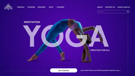
In creating graphic design for yoga, typography plays a crucial role in conveying the serene and calming essence of yoga. Choosing fonts that are smooth, flowing, and organic in style mirrors the fluidity and grace of yoga poses, establishing a visual harmony that resonates with yoga practitioners. Serifs and gently curving script fonts, reminiscent of the tranquil movements found in yoga routines, are particularly effective in evoking calm and balance when used in headings and quotes. Typography color palettes are chosen to reflect natural, earthy tones like muted greens, soft browns, and gentle blues, enhancing the connection between the viewer and the natural, grounded practice of yoga.
Tranquil design elements
Incorporating tranquil design elements in yoga graphic design involves a harmonious blend of soft colors, minimalist layouts, and nature-inspired motifs. Calming hues like pastel blues, gentle greens, and muted earth tones evoke a sense of peace, encouraging relaxation and mindfulness. Fluid typography with smooth curves and elongated forms mirrors the serenity of yoga movements, while imagery like lotus flowers, flowing water, and gentle breezes convey a sense of connection with nature. Negative space plays a crucial role, offering a visual breath that mirrors the pauses between yoga poses, allowing the transformation of simple design into a meditative experience.
Yoga pose illustrations
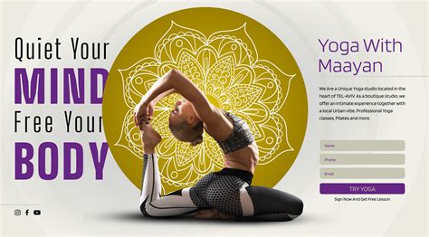
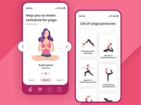
Creating graphic design for yoga, especially focusing on yoga pose illustrations, requires an intricate understanding of both the aesthetics of design and the therapeutics of yoga postures. The illustrations should seamlessly capture the essence and fluidity of each pose, emphasizing the balance between anatomy accuracy and artistic expression. Designers must pay attention to the grace in the lines and curves of the human form, highlighting elements such as chakras alignment, breath flow, and muscular engagement in a visually attractive manner. The color palette often draws from nature-inspired tones, providing a sense of calm and serenity, and should be utilized to evoke the subtleties of yoga's mind-body connection, immersing the viewer in both visual appreciation and the philosophical depth of the practice.
Earthy graphic layouts
Earthy graphic layouts for yoga aim to create a calm and grounded aesthetic, utilizing colors and textures inspired by nature. Rich browns, muted greens, and soft beiges form the primary palette, evoking the tranquility of forests and the stability of the earth. Textural elements such as rough-hewn surfaces, paper grain effects, and subtle organic patterns can be incorporated to reinforce the connection to natural materials. These designs often feature delicate, hand-drawn illustrations of botanical elements, mandalas, or fluid yoga poses seamlessly integrated to reflect balance and harmony intrinsic to yoga philosophy.
Calm design aesthetics
Graphic design for yoga with a focus on calm design aesthetics incorporates elements that nurture a sense of tranquility and mindfulness, often utilizing a serene color palette of soft pastels and earth tones such as muted greens, gentle blues, and warm neutrals. These colors are strategically chosen not only for their soothing effects but also to evoke the natural world, invoking a sense of grounding and peace. Typography plays a crucial role, where elegant, sans-serif fonts or delicate script types are preferred, ensuring that textual elements complement the visual calm rather than overshadow it. Imagery within the design often includes abstract or minimalist patterns resembling natural elements like leaves, gentle waves, or flowing lines, accompanied by ample negative space, all of which contributes to a balanced composition that encourages the viewer to pause, breathe, and find a moment of inner peace amidst a chaotic world.
Wellness lifestyle visuals
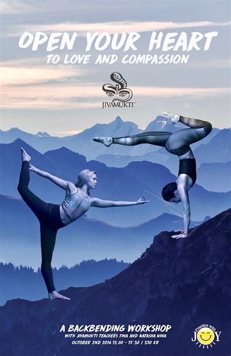
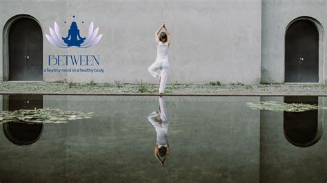
In the realm of graphic design tailored for yoga, incorporating wellness lifestyle visuals necessitates a delicate balance between tranquility and vitality. Designers must employ a color palette dominated by soothing earth tones like lush greens, serene blues, and calming neutrals, which evoke the natural environments typically associated with holistic well-being. Imagery plays a pivotal role, thus selecting visuals such as sun-drenched landscapes, gentle waves lapping at a quiet shore, or dew-kissed foliage can instantly transport viewers to a mindset of peace and mindfulness, encouraging a deeper connection with one's practice and overall health. Typography, ideally soft-edged and fluid, should mimic the graceful curves of yoga postures, further enhancing the aesthetic narrative of seamless harmony and the seamless flow of energy, quintessential elements of a wellness-focused lifestyle.
Peaceful logo designs
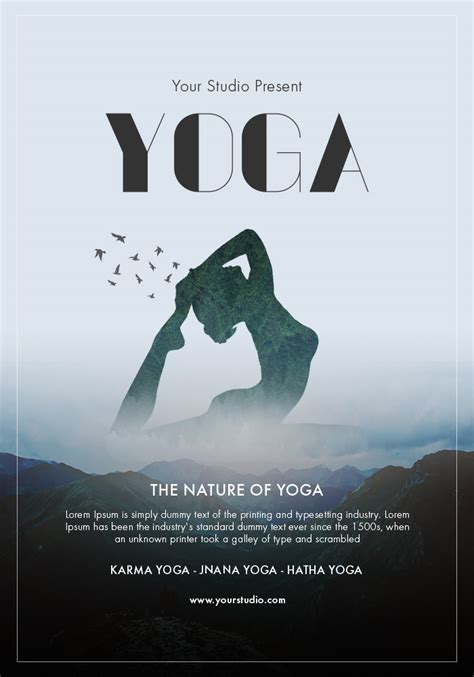
Graphic design for yoga, particularly in crafting peaceful logo designs, emphasizes simplicity and harmony using soft, natural color palettes such as pastels, earth tones, and muted shades. Designers often incorporate organic shapes and elements like lotus flowers, flowing lines, or mandalas that evoke a sense of tranquility and balance. Typographic choices lean towards serene, rounded fonts that complement the gentle imagery, often paired with minimalistic icons to avoid visual clutter. Incorporating elements like birds or gentle waves can further enhance the peaceful aesthetic, ensuring the logo fosters a sense of calm and mindfulness synonymous with yoga practice.
Serenity-inspired patterns
Graphic design for yoga that hones in on serenity-inspired patterns often embraces soft, flowing lines and natural, muted color palettes to evoke a sense of peace and tranquility. Images often incorporate organic shapes reminiscent of leaves, water waves, or gentle breezes, aiming to reflect the fluidity and grace typical of yoga movements. Typography in such designs usually features elegant, cursive fonts that mirror the graceful curves found in the elements of nature. The strategic use of negative space often serves to enhance the feeling of openness and calmness, giving the viewer's eye ample room to rest and absorb the message of serenity.











Leave a Reply
Your email address will not be published.