Graphic design for finance emerged as digital technologies began transforming the financial sector, introducing clarity and engagement into traditionally dry subjects. Initially, the approach was limited, but today, graphic design ideas for finance are rich and varied. Regardless of the style, graphic design in finance aims to simplify complex information and make it accessible to audiences. Although finance might seem overly technical and unapproachable, good graphic design infuses creativity and clarity, making it an invaluable tool in the industry. Enhance your financial presentations with the following graphic design ideas and elevate your communication.
Financial report layout
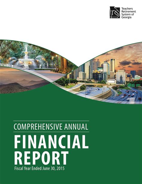
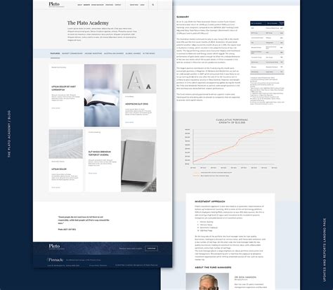
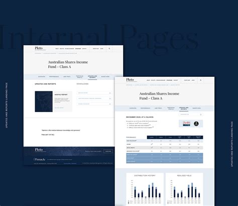
Crafting an effective financial report layout requires a meticulous blend of aesthetics and function to convey complex data with clarity and precision, utilizing typography strategically to emphasize key figures and sections while maintaining hierarchy and readability. Employing a consistent color palette serves to differentiate various data categories, making visual navigation intuitive and enhancing retention of information amongst stakeholders. The integration of data visualization tools such as charts and graphs not only aids in breaking monotony but also transforms intricate numerical data into digestible insights, thereby fostering an engaging and comprehensible narrative throughout the report. Furthermore, ensuring all elements are aligned and spaced appropriately contributes to a clean, professional look, fortifying the report's credibility and authority in the eyes of its audience.
Data visualization techniques
Graphic design within the finance sector fundamentally relies on advanced data visualization techniques to translate complex datasets into visually digestible formats, enabling investors, analysts, and stakeholders to swiftly interpret significant trends. Techniques such as heat maps facilitate the comparison of performance metrics across different entities, charting nuances with color gradients that intuitively highlight deviations. Candlestick charts, renowned for their application in stock market analysis, provide intricate details about opening, closing, high, and low prices over a set period, crafting a narrative that communicates market sentiment and potential price movements. Infographics and dashboards, often infused with interactivity, enable real-time data manipulation and personalized analysis, offering users a platform to dynamically engage with financial data, enhancing decision-making accuracy.
Investment infographic design
Investment infographic design involves blending visual creativity with financial data accuracy to create visually compelling narratives that simplify complex investment concepts. Designers utilize a combination of typography, color palettes, charts, and iconography to transform raw data into easily digestible visual formats. By applying principles of visual hierarchy and balance, they guide viewers' attention to critical information while ensuring clarity and engagement. Infographics often include elements like timelines, flowcharts, and comparative graphs, which not only enhance comprehension but also facilitate strategic decision-making by presenting data-driven insights in a cohesive and appealing manner.
Stock market charts
Graphic design for finance, particularly focusing on stock market charts, requires a meticulous attention to data accuracy and visual clarity. Chart types such as candlestick, line, and bar charts are typically used to represent price movements and trends over time. Each chart must be carefully color-coded to distinguish between various market conditions, such as bullish or bearish trends, thereby enabling users to quickly assess financial information. Incorporating interactive elements like tooltips and hover states enhances user experience by providing detailed insights when analyzing complex datasets, while leveraging modern design principles ensures the charts are both aesthetically pleasing and functionally effective.
Corporate budget presentation
In crafting a corporate budget presentation for a financial context, graphic design must meticulously balance clarity and professionalism. Utilizing muted color palettes like navy, slate gray, and deep green can evoke a sense of trust and seriousness, crucial for conveying financial data. Incorporating elements like charts, graphs, and infographics optimized for readability enhances the audience's comprehension of complex budget figures, while sans-serif typographies such as Helvetica or Arial ensure text remains clean and legible. Careful spacing and alignment, alongside strategically placed callouts or icons, can guide viewers through the presentation seamlessly, emphasizing key data points without overwhelming them with excessive visual stimuli.
Banking service brochures
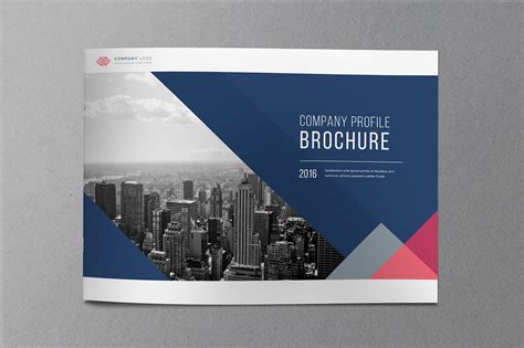
Graphic design for banking service brochures involves a meticulous balance between visual appeal and informative clarity, tailored to meet stringent financial regulations and customer expectations. Designers must employ a sophisticated color palette, often with blues and greens to symbolize trust and stability, while carefully choosing typography that underscores professionalism, such as serif or modern sans-serif fonts. High-quality images and vector illustrations of financial services, like ATMs, credit cards, or digital banking apps, are integrated to visually communicate offerings and enhance customer engagement without overwhelming the content. Infographics and charts play a critical role in simplifying complex financial information, providing a concise and easily digestible snapshot of services or benefits, while maintaining a seamless look with ample white space and consistent alignment to guide the reader's attention instinctively through the brochure.
Asset management branding
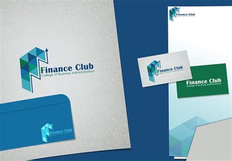
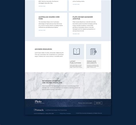
Asset management branding in graphic design necessitates a calculated fusion of trust, sophistication, and reliability, achieved through specific design elements that appeal to an affluent clientele seeking robust financial stewardship. Color palettes often leverage deep blues, greens, and golds to convey stability and wealth, while minimalist layouts ensure clarity and professionalism, reflecting the precision demanded in financial management. Typography choices typically blend traditional serif fonts with clean sans-serifs, embodying a balance between heritage and modernity, and reinforcing clear communication channels with stakeholders. Symbolism is crucial: intricate, yet understated iconography, like upward arrows or stylized graphs, suggest growth and foresight, creating an intangible yet intrinsically powerful connection to aspirational financial futures in the eyes of discerning clients.
Economic data infographics
Creating compelling economic data infographics requires a nuanced understanding of both finance and design principles, facilitating a clear communication of complex economic indicators such as GDP growth, inflation rates, and unemployment statistics. Precision in data representation is key; utilizing bar graphs, pie charts, and line graphs effectively can enable viewers to easily grasp the trends and make informed interpretations. The choice of color palettes should enhance readability, with contrasting hues to differentiate various data sets, while typography should be clear yet sophisticated, with an emphasis placed on the hierarchy to guide viewer's attention seamlessly across key information. Incorporation of interactive elements such as hover effects and clickable icons can engage users, allowing them to explore data more deeply without overwhelming them, thereby transforming static data into an immersive educational tool.
Revenue growth charts
Revenue growth charts in graphic design for finance demand meticulous attention to accuracy and clarity. Each chart must be crafted to visually convey complex data trends with precision, employing strategic use of color, line thickness, and scale to highlight growth patterns and significant data points. Graphic designers often incorporate advanced software tools to ensure that data visualization is both aesthetically appealing and functionally informative, providing stakeholders with a clear understanding of revenue trajectories. The integration of interactive elements such as hover-over tooltips or clickable data points can facilitate deeper user engagement, enabling users to explore underlying data sets and draw actionable insights with ease.
Financial dashboard design
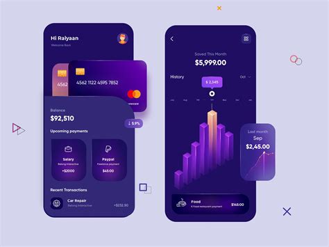
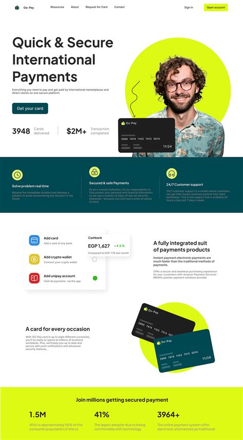
Financial dashboard design in graphic design for finance necessitates an intricate balance between aesthetics and utility, ensuring that complex data is both accessible and comprehensible at a glance. Designers must prioritize clarity, which often involves the strategic use of white space, a cohesive color palette to denote different financial metrics, and intuitive iconography for swift user navigation. The application of data visualization techniques such as charts, graphs, and heat maps is critical, allowing users to quickly identify trends, outliers, and performance indicators without wading through raw data. Advanced features like real-time data updates and customizable layouts further enhance the dashboard's functionality, catering to diverse user needs while maintaining a streamlined interface that prevents cognitive overload.




















Leave a Reply
Your email address will not be published.