Graphic design for Android was propelled into the spotlight with the rapid advancement of mobile technology, offering users a visually stunning experience right at their fingertips. Initially dominated by a few staple concepts, today's Android graphic design is a vibrant landscape teeming with diverse and innovative approaches. Its core mission is to enhance user interactions and make digital interfaces more engaging and intuitive. While some may perceive mobile graphic design as overly technical or rigid, it is in fact a dynamic and creative field that is continually evolving. Elevate your projects with these Android graphic design insights and transform your applications into visual masterpieces.
Material Design guidelines
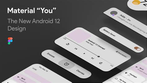
Material Design, established by Google, serves as the cornerstone for crafting intuitive and harmonious interfaces across Android devices, ensuring a seamless user experience marked by its distinctive design language. It emphasizes the utilization of grid-based layouts, responsive animations, and depth effects such as lighting and shadow, which not only enhance visual hierarchy but also aid in navigation and usability. Typography in Material Design becomes pivotal, offering a clear and readable interface, where choices reflect the function and importance of various elements, and colors are carefully selected from a nuanced palette that respects accessibility standards. Components and patterns, such as cards, buttons, and navigation drawers, harmonize to create a cohesive design ecosystem, each element's purpose carefully defined to guide the designer in establishing consistency and predictability across applications.
Android UI patterns
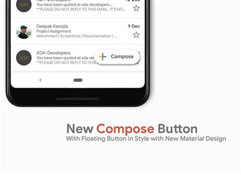
Graphic design for Android necessitates a keen understanding of its UI patterns, which are essential in ensuring a seamless user experience. The Material Design guidelines provide a robust framework, emphasizing the use of bold colors, responsive animations, and intentional typography that aligns with the functional aesthetics of Android's ecosystem. Designers need to focus on elements like the Bottom Navigation Bar, Floating Action Button, and various Card layouts, which promote user familiarity and intuitive interaction, thereby enhancing task efficiency on the platform. Understanding the adaptive layout capabilities of ConstraintLayout allows designers to create interfaces that are not only visually appealing but also optimally responsive across a diversity of screen sizes and orientations in the Android environment.
Adaptive icon design
Adaptive icon design on Android is a nuanced art that requires a balance between aesthetic principles and technical considerations to ensure harmony across different devices and interfaces. The designer must first create a foreground and a background layer, each meticulously crafted to ensure the icon maintains its visual integrity regardless of the shape dictated by the device's mask, be it circular, square, or something in between. Special attention must be paid to contrasting elements using color, space, and texture, ensuring that the icon remains distinguishable and vibrant on a variety of backgrounds, especially where themes might alter the operating system's color palette. Designers must also consider the line weight, scalability, and shadow effects to maintain a professional appeal and ensure functionality within the constraints of Android's dynamic adroitness in rendering icons across an array of screen sizes and resolutions.
XML layout resources
In Android development, XML layout resources serve as a foundational element for designing intuitive and responsive graphic interfaces, providing a structured way to define the appearance and arrangement of UI components. Designers leverage XML for its declarative syntax, enabling them to specify precise attributes like width, height, margins, and padding for various widgets without delving into the more complex Java codebase. XML layouts also support dynamic adaptability, allowing developers to implement different layouts for various screen sizes and orientations by utilizing directory qualifiers, thereby enhancing the UX across a multitude of devices. Styling capabilities through XML, such as themes and styles, allow for a consistent look and feel, reinforcing brand consistency and making iterative design enhancements both straightforward and efficient.
Drawable resources
Graphic design for Android heavily emphasizes the utilization of drawable resources, which serve as a critical component in creating visually appealing and efficient applications. Drawable resources encompass a vast array of image assets, such as bitmap files, XML shapes, and vector graphics, tailored to provide scalable and resolution-independent imagery suitable across a diverse range of Android devices. Designers meticulously create vector drawables, given their scalability and minimal storage footprint, enhancing both aesthetics and performance while ensuring crisp imagery on high-resolution displays. Furthermore, the effective use of nine-patch drawables grants developers the flexibility to stretch images without losing quality, particularly for UI components like buttons and backgrounds, thereby fostering a sophisticated and responsive design language adaptable to numerous screen sizes and orientations.
Vector asset creation
Vector asset creation for Android applications involves crafting scalable graphics that retain quality across all screen sizes and densities using tools like Adobe Illustrator or Sketch. Designers must strategically utilize shapes, strokes, and fills to form visually cohesive and adaptable icons and illustrations that adhere to material design principles, ensuring a seamless look within the Android ecosystem. Meticulous attention to detail is vital, particularly when considering path complexity and layer management, because each element must contribute to a clean and intuitive user interface without consuming excessive computational resources. Finally, exporting these assets in Android-optimized formats such as SVG or XML is crucial, as it ensures compatibility while facilitating efficient rendering by the system's graphic engine.
Density-independent pixels
Density-independent pixels (dp or dip) serve as a critical unit of measurement in graphic design for Android, facilitating UI elements that maintain consistent physical dimensions across various devices. These units allow designers to create visually harmonious applications by abstracting device-specific pixel densities, which vary significantly between different screens. This is achieved by using dp rather than traditional pixels, where 1 dp is equivalent to 1 physical pixel on a 160-ppi screen, enabling automatic scaling of visual components in precise correlation with the screen's pixel density. As a result, this ensures that users experience interfaces that are proportionately and aesthetically balanced, regardless of device resolution or display size, making dp an indispensable facet for designers focused on cross-device compatibility.
User interface elements
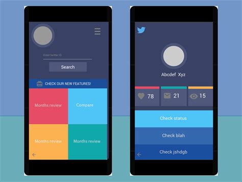
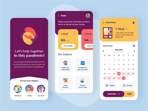
Graphic design for Android user interface elements requires a nuanced understanding of material design principles to ensure a cohesive and intuitive user experience. Designers must meticulously consider the layout, color palette, typography, and iconography, maintaining consistency throughout the application. Each UI element, such as buttons, sliders, and navigation bars, should be designed to be easily recognizable and responsive, providing clear visual feedback to the user's interactions. Attention to detail in animations and transitions can significantly enhance the fluidity of the interface, ensuring that the application not only looks visually appealing but also operates seamlessly for users navigating through various functionalities.
Layout constraint systems
Layout constraint systems in graphic design for Android revolve around providing a flexible, intuitive way to create responsive UI by leveraging the ConstraintLayout. This system allows designers and developers to define position and sizing of the UI components relative to other elements, guidelines, or parent containers rather than sticking to a rigid, procedural approach. Constraints serve as rules that dictate how a UI element should behave across different screen sizes and orientations, ensuring the interface is not only aesthetically coherent but also functionally adaptive for a wide range of devices. Designers benefit from the visual editors provided in Android Studio, which supplement this system by giving immediate feedback and making complex layouts easier to prototype and finalize, reducing the likelihood of runtime errors on varying device configurations.
Custom view components
Creating custom view components for Android graphic design entails an understanding of both the canvas drawing and view layouts, which allows developers to craft unique, interactive interfaces tailored to specific design needs. Developers harness the power of the Canvas API to draw custom shapes, lines, and text, providing a level of personalization beyond standard Android components. Implementing custom views involves extending the `View` or `ViewGroup` classes and overriding methods such as `onDraw()` and `onMeasure()` to ensure that custom components respond correctly to screen sizes and user interactions. These components can feature complex animations, dynamic content changes, or specialized input handling, leveraging tools like Paint, Path, and AttributeSet to achieve visually compelling and functional designs that engage users on a deeper level.







Leave a Reply
Your email address will not be published.