Anime-inspired graphic design emerged as an art form in the post-war era, capturing the vibrant culture and creativity of Japan. At its inception, there was a singular artistic style that reflected the essence of anime; nowadays, a vast spectrum of anime graphic design styles flourishes. These designs encapsulate the bold characters and dynamic scenes that define the genre, infusing visual excitement into any project. Initially perceived as niche and eclectic, anime graphic design is indeed versatile and innovative--and it's experiencing an unprecedented wave of popularity. Elevate your creative projects with the following anime graphic design tips and carve out your own unique style.
Character design sheets
Character design sheets in anime serve as a blueprint, capturing the intricate details essential for animators to maintain consistency across episodes. These sheets often depict characters from multiple angles, showcasing their attire, hairstyles, facial expressions, and any unique accessories or tattoos that define their personality. Every element, from the texture of the fabric to the subtleties of a character's emotional range, is meticulously documented to ensure animators can convey the intended traits without deviation. Through these sheets, animators can explore a character's evolution, allowing for modifications in posture or attire that evolve alongside the storyline, thus enhancing the narrative's depth and viewer engagement.
Dynamic posing techniques
Dynamic posing in anime graphic design involves capturing a sense of motion and vitality by carefully manipulating body posture and perspective. Artists often exaggerate limb movements and torsion to create a sense of energy and fluidity, a technique that draws heavily from principles of gesture drawing. Foreshortening is employed to enhance depth, giving characters a striking three-dimensional impact that leaps off the page, making them appear as though caught mid-action. The use of angled compositions and dramatic lighting further accentuates these poses, allowing the character's vitality to resonate with viewers, often leading the eye dynamically across the artwork.
Color palette selection
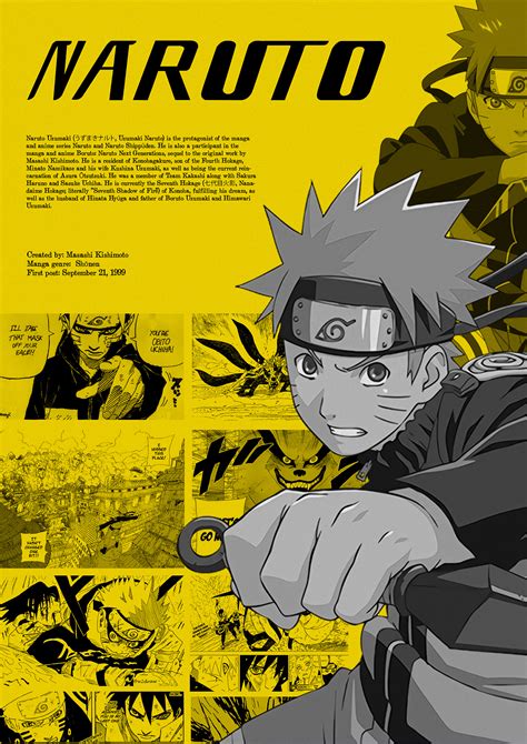
Choosing a color palette for anime graphic design involves understanding the emotional tone and narrative theme of the work. A vibrant, pastel palette might evoke a whimsical, lighthearted atmosphere, suited for slice-of-life or romantic genres, where emotions such as joy, nostalgia, or simplicity are highlighted. Alternatively, darker hues, along with muted or monochromatic schemes, could enhance the intensity or mystery of more dramatic or dystopian stories, creating an immersive atmosphere that emphasizes the gravity of the character's journey or narrative tension. A designer must be keenly aware of how different colors interact and convey cultural connotations within the anime genre, leveraging colors to subtly guide the audience's emotional response and underscore key story elements or thematic undertones.
Background detail integration
In anime graphic design, background detail integration is a meticulous process that seamlessly blends intricate environments with the animated characters, ultimately creating a cohesive visual narrative. Artists strive for harmony by employing a refined balance between foreground elements and richly detailed backdrops, ensuring that neither aspect overshadows the other. They employ techniques such as depth layering, where foreground elements are subtly contrasted against background details through variations in shading, color palette, and saturation, achieving a multidimensional depth. Additionally, employing consistent thematic elements such as repeating motifs or textures throughout the background crafts a unified atmosphere that not only enhances the storyline's emotional impact but also immerses the viewer in an animated world brimming with tangible depth and Engaging Context.
Facial expression charts
Graphic design for anime often involves crafting intricate facial expression charts to convey a wide range of emotions, crucial for character development and storytelling. These charts serve as a roadmap for animators, detailing subtle nuances in facial features that reflect emotions such as joy, anger, sadness, or surprise, which are foundational to the visual narrative of an anime. The design process demands acute attention to proportion, symmetry, and the cultural nuances of expression, as each variation in a character's eyes, mouth, eyebrows, and overall facial structure can significantly impact the audience's connection to the character. Designers often employ a mix of traditional and digital techniques, combining hand-drawn sketches with sophisticated software, to create expressions that are both universally relatable and specific to the anime's stylistic context, allowing viewers to engage emotionally with the characters and their journeys.
Line art consistency
Line art consistency in anime graphic design is crucial for maintaining visual coherence and elevating the overall aesthetic of the artwork. The precision of lines dictates fluidity and character integrity, often achieved through meticulous line weights that highlight form definition and dynamic movement. Artists meticulously adjust the thickness and thinness of lines to impart a sense of depth and hierarchy, ensuring that primary figures stand out against the environment without losing their harmonized relationship with the scene. Mastery of line art involves the strategic balance between bold outlines for emphasis and delicate strokes for subtlety, fostering a seamless narrative flow and captivating viewer engagement.
Visual storytelling elements
Graphic design in anime often leverages visual storytelling elements to immerse the audience in a richly constructed narrative universe and convey complex emotions without dialogue. Colors are meticulously chosen to reflect the mood and tone of a scene; vibrant palettes often enhance dynamic action sequences, whereas muted hues emphasize melancholy or introspection. Composition plays a crucial role, with the framing and arrangement of characters and scenery guiding the viewer's eye to the narrative focal points. Symbolism frequently enriches the visual narrative; subtle details like a character's posture or the presence of a particular object become laden with meaning and foreshadowing, enhancing the depth and interconnectedness of the story's thematic elements.
Animation frame sequencing
Animation frame sequencing in anime is a meticulous process that involves the arrangement of a series of hand-drawn or digitally created frames to produce fluid motion and bring characters to life. This sequence requires careful planning and timing to ensure smooth transitions from one movement to the next, often employing the use of key frames where significant poses are defined and in-between frames, where the subtler nuances of motion are developed. The storied Japanese technique of 'sakuga' highlights the importance of creative freedom in these sequences, allowing animators to exaggerate timing and movement to enhance emotional impact and storytelling. Artists must balance stylistic expression with technical precision, using tools like 'timing sheets' or 'exposure sheets,' which dictate the duration each frame appears on screen, ensuring consistency and the intended pace, ultimately culminating in a seamless visual narrative that captivates the audience.
Texture mapping techniques
In anime graphic design, texture mapping techniques are crucial for adding lifelike details and depth to characters and environments, enhancing the visual storytelling. Artists frequently utilize UV mapping, which entails wrapping a two-dimensional texture accurately onto a three-dimensional model, ensuring that intricate designs like clothing patterns or facial features adhere to the model's surface without distortion. To achieve realistic and dynamically lit scenes, normal mapping is employed, manipulating light reflection on a flat surface to give the illusion of complex surface details, like fabric folds or skin pores, without increasing polygon count. Specular mapping is another technique that impacts how light interacts with surfaces, playing a pivotal role in creating realistic shaders for metallic objects, wet materials, or shiny surfaces, thereby adding an additional layer of depth to the anime's graphical representation.
Typography in subtitles
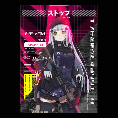
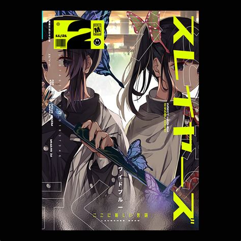
Typography in anime subtitles plays a significant role in the viewer's experience, offering both functional and aesthetic elements that can greatly enhance or detract from the storytelling. The choice of font, size, and color for subtitles must be simultaneously legible and unobtrusive, allowing viewers to quickly absorb dialogue without diverting attention from the animation itself. Designers often select fonts that resonate with the anime's visual style, be it a vibrant and playful typeface for a bubbly slice-of-life show or something more somber and understated for a gritty, dramatic series. Additionally, subtle features like drop shadows, outlines, or semi-transparent background boxes are strategically employed to ensure text visibility across diverse backgrounds, maintaining a seamless fusion between the animated environment and on-screen dialogue.




Leave a Reply
Your email address will not be published.