Graphic design for backdrops came into prominence during the golden age of cinema, transforming plain stages into immersive visual experiences. At that time, there was a prevalent style, but now backdrop design ideas are diverse and plentiful. Whatever the theme, backdrop graphic design enhances the mood and tells a story beyond the characters. While initially this design aspect might appear purely decorative or secondary, it is in fact essential and innovative--and is currently enjoying a significant revival. Elevate your presentations or events with the following backdrop graphic design ideas and craft one of your own.
Color palette
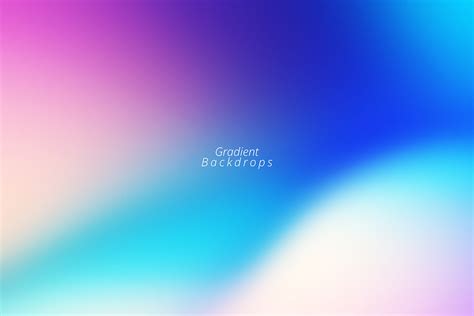
A masterfully designed backdrop takes full advantage of a carefully curated color palette, which is paramount in setting the tone, mood, and theme of the space it inhabits. The choice of colors must harmonize and evoke the intended emotional response from the viewer, whether it be calmness through soothing blues and greens, or dynamism with vibrant reds and oranges. Utilizing varying shades and subtle gradients within the palette creates depth and interest, allowing focal points to emerge and guide the viewer's eye across the design seamlessly. Attention to contrast ensures that the text or detailed elements of the backdrop stand out, creating a balance between background texture and foreground elements while maintaining a cohesive visual experience.
Visual hierarchy
Visual hierarchy in graphic design for a backdrop plays a crucial role in directing attention and conveying a clear message. Designers often implement size, color, contrast, and spacing to create a structured pathway for viewers' eyes to follow. Larger and bold elements, such as headlines or focal images, are usually positioned at the top in order to immediately grab attention, whereas smaller details or secondary information like text or logos may be placed strategically towards the bottom or edges. A harmonious balance between elements using color schemes that contrast and yet complement each other ensures that the viewer's gaze travels through the design intuitively, enabling the core message to be easily absorbed and understood within moments.
Negative space
Employing negative space in graphic design for a backdrop yields a sophisticated and minimalist style that captivates the viewer's attention through contrast and balance. The strategic use of negative space not only highlights the primary elements but also creates an illusion of depth and motion, making the composition appear more dynamic and engaging. By allowing the white and vacant areas to naturally guide the eye towards the focal points, the designer can emphasize content without overwhelming the senses, thus enhancing the communicative strength of the design. Furthermore, this approach encourages simplicity and elegance, permitting the message or theme to resonate more powerfully by providing room for interpretation while maintaining visual harmony.
Typography layout
A backdrop designed with an emphasis on typography layout requires a keen understanding of font hierarchy, spacing, and visual impact. The primary focus should be on selecting a typeface that resonates with the event's theme while ensuring legibility at a distance. Large, bold headlines serve as the focal point, capturing attention immediately and setting the tone for the viewer's experience. Juxtaposed against minimalist backgrounds, the strategic use of negative space guides the eye to secondary text elements, such as event details or slogans, maintaining a harmonious balance that communicates the intended message with clarity and aesthetic appeal.
Image resolution
Designing a backdrop demands careful consideration of image resolution to ensure clarity and visual appeal across varying viewing distances. High resolution is paramount, often requiring images to be at least 300 dpi (dots per inch) for optimal print quality, ensuring that every detail is crisp and professional on large-scale productions. Pixels per inch (PPI) needed for displays often change according to the intended format, with larger displays necessitating higher resolutions to prevent pixelation when viewed up close. Professional designers must also be mindful of file formats and compression techniques, balancing file size with resolution to maintain image integrity without compromising loading times or print feasibility.
Brand consistency
In creating a graphic design for a backdrop with a primary focus on brand consistency, designers must meticulously ensure that every element aligns with the established brand identity. This involves using the brand's color palette, typography, and iconic imagery or logos, which collectively create a visual language that audiences immediately recognize and associate with the brand. Designers should pay keen attention to the balance and scale of these components, ensuring that they are neither overwhelming nor distracting, while also considering the spatial dynamics of the backdrop to maintain a coherent appearance from various viewing angles. Additionally, subtle cues like texture and contrast might be used to evoke the brand's personality and values, offering a seamless extension of the brand's narrative into the physical space and reinforcing its presence at any event or gathering where the backdrop is utilized.
Texture elements
The backdrop's graphic design intricately weaves an interplay of texture elements, capturing the tactile richness and visual complexity sought in sophisticated visual presentations. The base layer employs a subtle, yet mesmerizing, gradient that shifts almost imperceptibly, creating a dynamic surface where light seems to dance and play with the hues, invoking a sense of depth and expansiveness. Overlaying this foundation, a patchwork of textures unfurls: rough-hewn burlap's raw, organic appeal juxtaposes against smooth, silken threads that glimmer like liquid metal under pointed lighting; meanwhile, the coarseness of embossed leather sections adds heft and gravitas to the composition. Tiny whispers of iridescent mica flecks scattered sporadically across the surface catch stray light, drawing the eye inwards toward focal points, creating pockets of intrigue that invite closer inspection and engagement.
Background patterns
A backdrop with a focus on background patterns can serve as a stunning visual centerpiece, creating an immersive environment for various events. When designing such a backdrop, it's crucial to consider the harmony between color palettes, pattern repetition, and scale to ensure they complement and enhance the overall ambiance. Intricate geometric patterns can provide a modern and structured aesthetic, while organic and fluid shapes evoke a more relaxed and natural atmosphere. Textures also play an essential role, where incorporating elements like faux finishes, gradients, or layered patterns can add depth and dimension, making the backdrop not merely a background but an integral part of the event's storytelling.
Lighting effects
Graphic design for a backdrop with a focus on lighting effects involves manipulating various elements to create a visually engaging scene that enhances the intended atmosphere. The strategic use of gradients, flares, and dynamic shadows helps establish depth, mood, and dimensionality, turning an otherwise flat design into an immersive experience. By incorporating color theory principles, such as complementary or analogous color schemes, the designer can accentuate specific areas to guide the viewer's eye to focal points or create a sense of movement. This interplay of light and shadow not only emphasizes textures and shapes but also allows for the addition of reflections and refractions, giving the backdrop a more realistic or surreal quality depending on the thematic requirement, whether for event staging, photography, or digital interfaces.
Composition balance
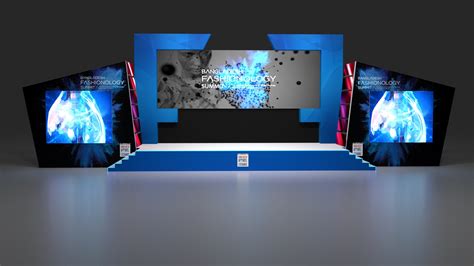
Composition balance in graphic design for backdrops requires a deliberate arrangement of elements to ensure harmony and visual stability. Designers often leverage symmetry by centering the main focal points and distributing additional elements evenly on either side, creating a mirrored effect that is both soothing and visually appealing. Asymmetrical balance, on the other hand, can be achieved by positioning a larger element on one side and counterbalancing it with several smaller elements or using whitespace strategically, which not only maintains equilibrium but also adds dynamism and interest to the design. Color and texture play pivotal roles as well, where designers must carefully select and place hues and patterns that complement each other without overwhelming the viewers, allowing them to absorb the scene with ease while subtly guiding their eyes through the intended visual pathway.



















Leave a Reply
Your email address will not be published.