Graphic design for beauty products emerged as a powerful tool during the surge of consumer culture in the 20th century, transforming the way products were perceived on shelves. Back then, the approach might have been straightforward and consistent, but today, the spectrum of graphic design ideas is vast and diverse. Regardless of the style, graphic design for beauty products captures the essence of the brand and elevates its appeal to audiences. Although at first glance, this design discipline might appear purely aesthetic and polished, it is, in fact, deeply strategic and dynamic--currently riding the waves of innovation. Enhance your creative process with the following graphic design techniques and craft outstanding beauty product visuals of your own.
Product packaging design
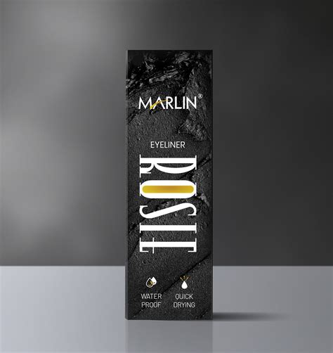
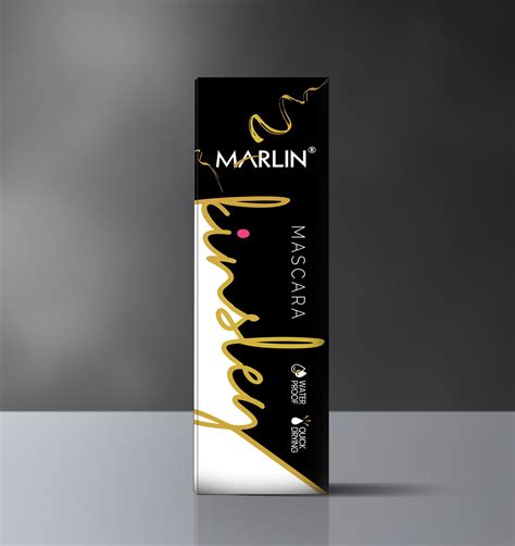
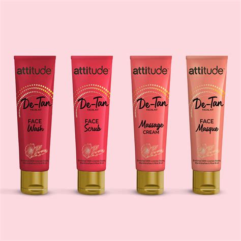
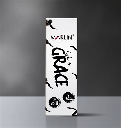
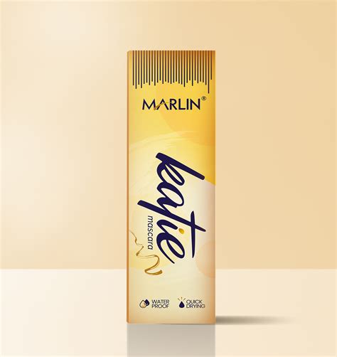
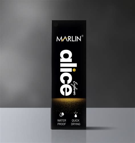
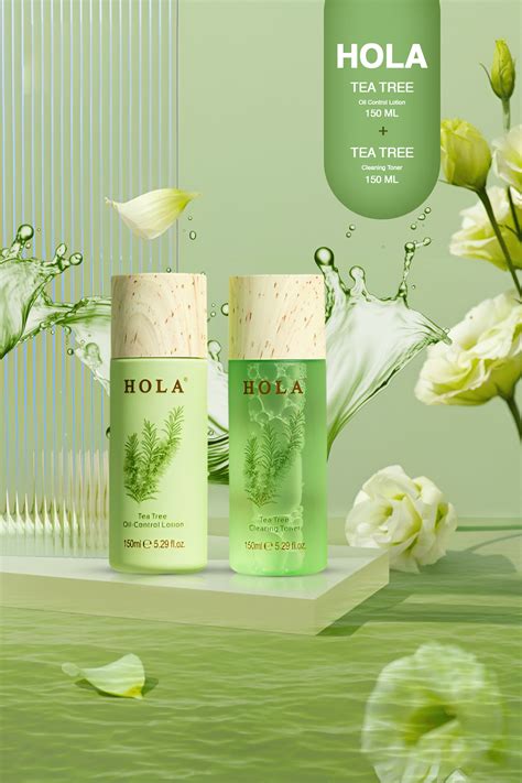
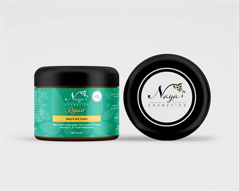
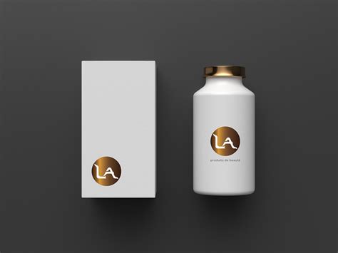
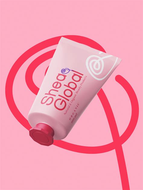
In the realm of graphic design specifically aimed at beauty product packaging, designers must intricately balance aesthetics with functionality, ensuring that the outer facade conveys the brand's ethos while alluring potential consumers. Each element, from typography and color scheme to material choice and structural design, plays a crucial role in differentiating a brand within the fierce competitive market. Subtle textures and innovative shapes can evoke a tactile experience that complements olfactory and visual sensations--essential for products that promise sensory indulgence. Moreover, sustainability now factors significantly into packaging design, pushing brands to seek out eco-friendly materials and minimalist designs that reduce environmental impact without sacrificing allure and luxury.
Visual branding elements
Visual branding elements for beauty products play a crucial role in shaping consumer perception and engagement. The choice of color palette often orchestrates emotional responses, with soft pastels exuding calmness and luxury, while vibrant hues invoke excitement and youthful energy, enhancing the product appeal. Typography further delineates brand identity, where serif fonts might suggest tradition and elegance, sans-serif can imply modernity and simplicity, and script typefaces imbue a sense of femininity and sophistication. The interplay of imagery, from high-resolution close-ups to abstract representations, supports storytelling and aligns with the brand's narrative, creating a cohesive visual language that resonates across various platforms and packaging, reinforcing the brand's unique proposition in the crowded beauty market.
Color palette selection
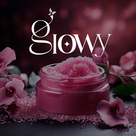
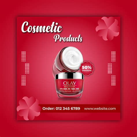
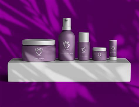
Color palette selection in graphic design for beauty products is crucial as it significantly impacts consumer perception and brand identity. Designers often gravitate towards hues that evoke a sense of luxury and sophistication, such as deep plum, rich gold, or sultry emerald for high-end brands, while opting for soft pastels and earth tones for more natural, eco-friendly products. The color scheme must harmonize with the product's intended mood and message, whether it's calming and rejuvenating or bold and invigorating, as it plays a vital role in influencing shoppers' emotions and drawing their attention amidst a sea of competitors on retail shelves. Designers also consider cultural connotations and regional preferences, ensuring the palette resonates with the target demographic without unintended negative associations, creating a cohesive visual narrative that enhances the overall brand experience and fosters customer loyalty.
Typography choices
In the realm of beauty product packaging design, typography plays a pivotal role in conveying brand identity, product quality, and consumer appeal. The choice of typeface can evoke specific emotions and associations; for instance, sans-serif fonts often communicate modernity and simplicity, making them a favored choice for minimalist or luxury beauty brands. Serif fonts, with their classic and elegant strokes, might be chosen to suggest tradition and high-end craftsmanship. Moreover, the weight, size, and spacing of the type can enhance readability and attract attention on crowded retail shelves, while decorative or script fonts can add a touch of uniqueness and femininity, thus underscoring the product's allure and distinguishing it from competitors in a saturated market.
Layout composition
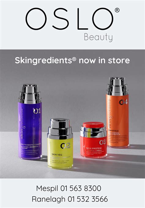
In designing graphics for beauty products, the layout composition plays a critical role in elevating the brand's allure and communicating the product's essence effectively. Balancing elements such as color schemes, typography, and imagery requires a keen sense of aesthetics, ensuring that every component aligns harmoniously with the brand's identity. Employing techniques like the golden ratio or the rule of thirds can help create a visually appealing structure, guiding the viewer's eye naturally across the design while highlighting the product features or benefits. Additionally, strategic use of white space is crucial, as it not only enhances readability but also adds sophistication, allowing the product to be the focal point amidst a beautifully orchestrated composition.
Marketing imagery
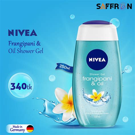
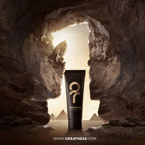
In the realm of graphic design for beauty products, marketing imagery serves as a crucial touchpoint that melds aesthetics with persuasive appeal. Every element, from color palettes to typography, is meticulously chosen to evoke an emotional response aligned with the brand's identity and consumer aspirations. Photographs are not merely depictions but are often airbrushed and styled in ways that accentuate the product's allure, highlighting textures and hues that appeal to sensuous desires. These visuals must resonate across a variety of platforms, demanding adaptability and innovation while maintaining a consistent narrative that lures potential buyers into a world of luxury, efficacy, and self-enhancement.
Label design details
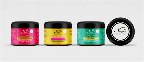
In the realm of beauty products, the intricacies of label design play a pivotal role in capturing consumer attention and conveying the essence of the brand. Designers meticulously consider color palettes that align with the emotional appeal of the product, often opting for pastels or metallics to evoke purity, luxury, or vibrancy. Typography is another critical element, with elegant serif or modern sans-serif fonts creating an immediate impression of sophistication, reinforcing the brand's identity while ensuring readability. Additionally, strategic placement of information such as ingredient lists, usage instructions, and brand logos must be harmonized with graphic elements like delicate floral patterns or minimalist geometrical shapes, thus creating a balanced visual hierarchy that guides the consumer's eye and enhances shelf appeal.
Brand style guide
A brand style guide for beauty products encapsulates a cohesive visual and verbal language that reflects the identity and ethos of the brand, ensuring consistent application across various platforms and media. It meticulously outlines typography selections that embody the elegance or vitality intrinsic to the product's nature, incorporating font pairings that can range from sophisticated serifs to friendly sans-serifs, aligning with the brand's personality. The guide dictates an evocative color palette, carefully curated to evoke desired emotions and reinforce brand recognition, whether through soothing pastels for a calming effect or bold, vibrant tones for a dynamic, youthful appeal. It also specifies imagery guidelines, emphasizing high-quality, aspirational images that resonate with the target audience, along with the correct usage of logos and design elements such as iconography, which together forge a unique visual narrative that enhances product allure and communicates trust and excellence.
Print material aesthetics
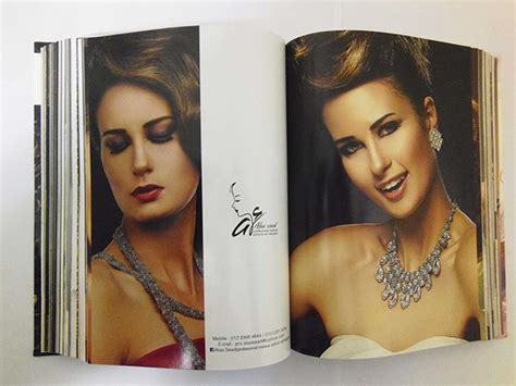
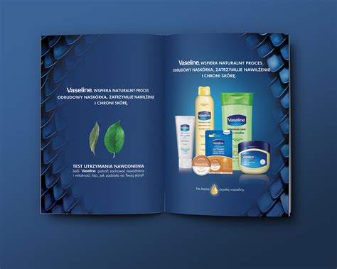
In designing print materials for beauty products, the visual elements are meticulously curated to marry elegance with functionality, ensuring that the allure of the product is immediately evoked through design. Typography is chosen for its ability to convey sophistication; often serif fonts are used to evoke a sense of classic elegance, while sans-serif fonts may be preferred for a modern, minimalist approach. The color palette plays a crucial role, with hues often inspired by nature or the ingredients used within the products, gently faded pastels or rich earth tones might be employed, each carefully selected to speak to the brand's ethos and the emotion it desires to evoke in potential customers. Imagery in print design is typically high-resolution and styled to accentuate the brand's core values; whether it be through lifestyle portraits that depict aspirational yet relatable beauty, or close-up product shots that highlight texture and quality, each image is methodically chosen and edited to forge a visual conversation that captivates and informs the target audience.
Digital ad visuals
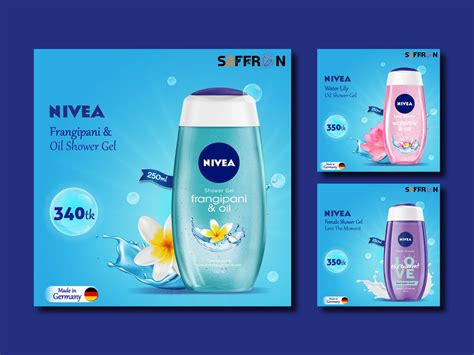
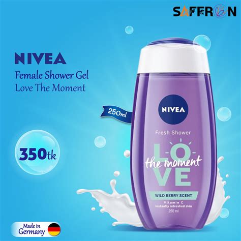
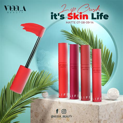
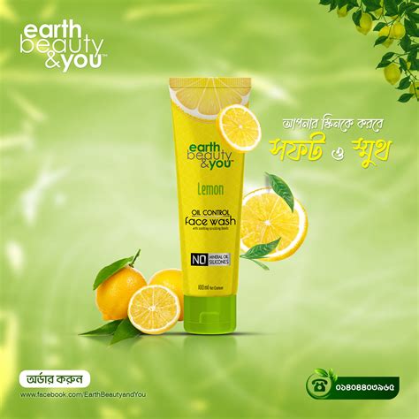
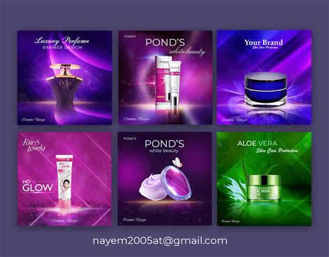
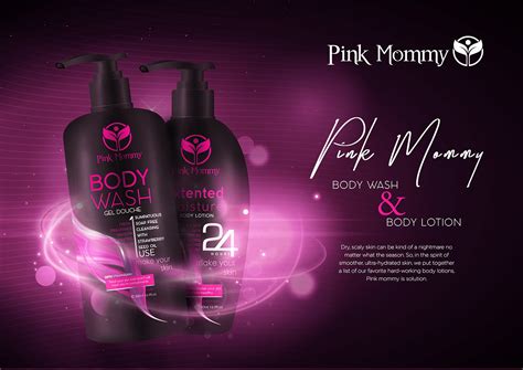
In the sphere of graphic design for beauty products, digital ad visuals must prioritize capturing the essence and allure of cosmetic offerings through detailed visual storytelling. Vibrant color palettes, typically mirroring the hues found within the product itself, enhance the appeal and are strategically employed to evoke specific emotions that resonate with the target audience. Typography plays a vital role, often selected for its stylish elegance or bold minimalism, ensuring the brand message remains clear and engaging while subtly aligning with broader brand identity. High-resolution imagery, coupled with meticulous attention to lighting and composition, highlights product textures and finishes, thus providing a tangible sense of quality and luxury that tempts potential consumers in an increasingly virtual marketplace.



Leave a Reply
Your email address will not be published.