Graphic design for billboards took off during the advertising boom of the 20th century, transforming cityscapes into vibrant visual narratives. Back then, a few prevailing styles dominated the scene, whereas today, a plethora of billboard design strategies captivate audiences. Regardless of the approach, billboard graphic design aims to catch the eye and convey messages swiftly and effectively. At first glance, designing for billboards might seem daunting and limited, but in truth, it is dynamic and inventive--gaining renewed energy in today's digital age. Elevate your creative projects with the following billboard design tips and craft a standout display of your own.
Visual hierarchy
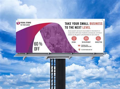
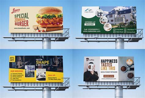
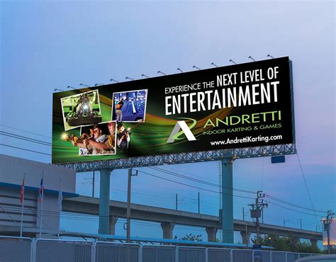
A billboard demands an immediate visual impact, where the art of visual hierarchy becomes a linchpin as it dictates the viewer's experience and the information they absorb. Placing the most critical elements such as a captivating headline or a central image at the top or in the center is crucial, ensuring they grab attention first amidst the often cacophonous background of an urban setting. Strategic use of size, color, and contrast further enhances this hierarchy, directing the viewer's eye with a natural flow from the key message to supplementary details like contact information or call-to-action, thus creating an effortless understanding of the communication within mere seconds. Legibility is paramount, and incorporating a limited color palette or sans-serif fonts ensures clarity, while negative space around critical elements helps to reinforce their dominance, reducing visual clutter and allowing the message to breathe, thereby ensuring that the billboard not only captures attention but also leaves a lasting impression.
Color contrast
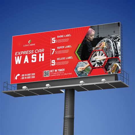
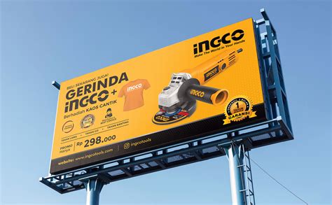
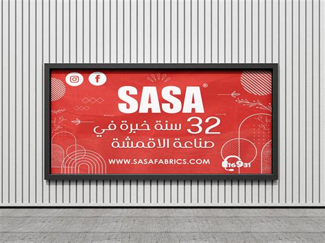
A billboard's primary function is to captivate attention instantly, so utilizing color contrast effectively becomes indispensable for delivering a clear and compelling message. Strong contrasts between colors such as complementary pairs, like blue and orange or red and green, not only make the text and imagery stand out against the background, enhancing legibility and drawing the eye swiftly to essential information. Strategic color choices can also evoke emotions and reinforce brand identity, with bold, vibrant hues conveying excitement or urgency, whereas softer, contrasting pastels might evoke calmness and sophistication. Balancing saturation and brightness ensures that the billboard remains visible and engaging under varying lighting conditions, factoring in the natural environment and intended viewing distance to optimize both aesthetic appeal and functional communication.
Focal point
In the realm of billboard graphic design, establishing a compelling focal point is paramount to capturing and retaining the viewer's attention amidst a sea of competing visual stimuli. The focal point must be strategically positioned, typically occupying a central or slightly offset location within the composition, to naturally guide the eye towards the primary message or imagery, benefiting from the Gestalt principles of design. Achieving this involves a nuanced balancing of visual components such as contrast, scale, and color, with one element deliberately emphasized over others to ensure immediate recognition and memorability, often requiring iterative design processes and empirical validation through audience testing. A clear focal point ensures that the communication remains impactful, cutting through the potential clutter and distraction of the billboard's environment, allowing the core message to resonate effectively within the estimated six to seven seconds a driver has to process outdoor advertising.
Typography balance
Typography balance in billboard graphic design involves a meticulous coordination of various type elements to ensure legibility and visual appeal from a distance. Designers must consider not only the size and weight of each typeface used but also the spacing, hierarchy, and color contrast to create a harmonious composition that attracts attention yet conveys the intended message quickly. The choice of typefaces should complement each other, balancing bold and subtle styles to guide the viewer's eye effectively across the billboard. Creative strategies such as using sans-serif fonts for minimalist modern looks or serif fonts for more traditional or sophisticated designs allow designers to match the typography with the primary brand message while maintaining an equilibrium between text and imagery on the billboard.
Grid alignment
Grid alignment in billboard design orchestrates visual harmony by organizing elements into structured, consistent rows and columns. This method ensures each component occupies an intentional space, creating a seamless flow that naturally guides the viewer's eyes across the vast expanse of the billboard. Designers harness this technique not only to maintain balance and proportion but also to enhance readability and facilitate quick comprehension of the message amid rapid passerby movement. In this expansive medium where time is limited, precise grid alignment optimizes visual impact, allowing key information to be absorbed almost subconsciously while ensuring brand elements remain cohesive and memorable amidst visual noise.
Message clarity
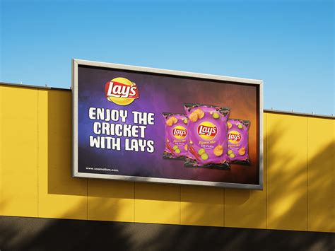
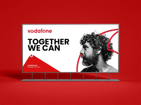
Billboards require immediate impact with minimal words to ensure clarity, making visual hierarchy crucial. The primary message should be prominently placed, often using bold, large fonts to draw the viewer's eye immediately, contrasting strategically against a harmonizing background to prevent distraction. Imagery, if used, should be high-resolution and directly relevant, acting as a visual shorthand that complements the message rather than competing with it. Limiting text to a maximum of seven words, utilizing negative space effectively, and selecting colors that offer maximum visibility in outdoor settings ensure that the message is understood instantly, even at high speeds or from a distance.
Brand identity
Creating a billboard that effectively communicates brand identity involves an intricate understanding of visual communication elements and the brand's core message. A designer must ensure that the colors, typography, and images used are consistent with the brand's existing visual identity, thereby reinforcing brand recognition at a glance. The placement of brand elements requires precision to maximize visibility and readability from a distance, often demanding bold, high-contrast visuals that capture attention immediately. The challenge lies in delivering a succinct yet impactful message that resonates with the target audience, conveying not only the brand's essence but also its values and promises in a fleeting moment as people speed by.
Image resolution
High image resolution is crucial for billboard graphic design, as it ensures the clarity and sharpness of visuals that must captivate viewers from significant distances. Images used in billboard design typically require a resolution of 300 DPI or higher, ensuring that even under close inspection, every detail remains crisp and professional. Large format designs, like billboards, necessitate working with vector graphics whenever possible to maintain integrity during scaling processes, thus eliminating pixelation issues that are common when resizing raster images. Designers must pay close attention to the image file types and sizes used, as optimizing images without sacrificing quality is essential for fast loading times and seamless printing in high-resolution formats, which are pivotal for a striking advertisement.
Negative space
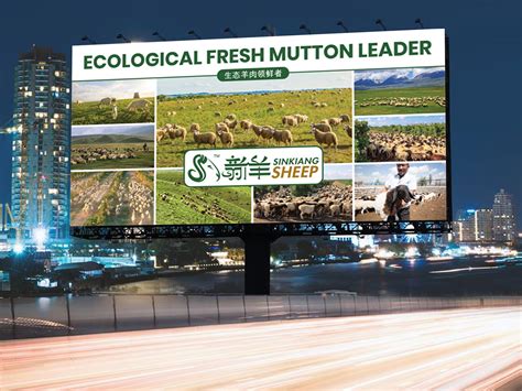
Negative space, a powerful tool in billboard design, serves to emphasize the message by using the empty space around and between the main elements, thus allowing the visual to breathe. Clever utilization of negative space can create striking imagery that captures attention, subtly guiding the viewer's eye towards the core message or product. By strategically organizing text, logos, and images within the empty areas, designers can ensure that billboards remain legible and impactful from a distance, even at high speeds, making the information both digestible and memorable. The simplicity derived from negative space also aids in brand recognition, as it gives the audience the opportunity to focus on the essential elements without distraction, thus reinforcing the message effectively.
Audience engagement
Creating a billboard design focuses on audience engagement requires understanding the target demographic and visually appealing aesthetics that captivate attention from a distance. Bold, contrasting colors should be used to make the design stand out amidst the clutter of outdoor advertising, ensuring visibility and memorability. Minimal text that conveys a strong, clear message is vital due to the short interaction time; the typeface must be legible from afar, avoiding intricate fonts that could hinder readability. Interactive elements, like QR codes or simple call-to-action prompts, can enhance engagement by encouraging passersby to interact further with the brand via their smartphones, creating a seamless transition from offline to online engagement.


















Leave a Reply
Your email address will not be published.