Graphic design for calendars was popularized in the late 20th century as people sought to combine functionality with artful expression. Back then, there was a single style that dominated calendar aesthetics, but today, the array of design ideas is vast and varied. Regardless of the style or theme, designing a calendar merges practicality with creativity, adding a personal touch to organizing daily life. While at first glance, designing a calendar might seem mundane or overly traditional, it is actually an exciting process that offers endless opportunities for artistic innovation. Elevate your space and stay organized with these inspiring graphic design ideas for your next calendar creation.
Color palette selection
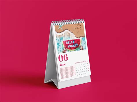
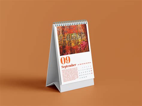
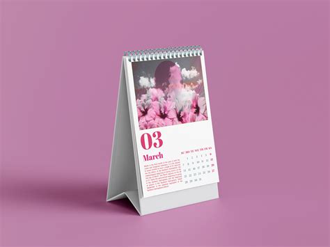
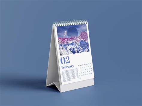
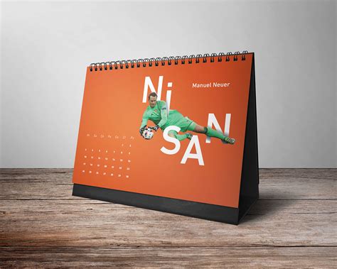
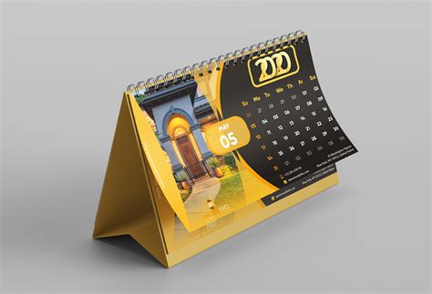
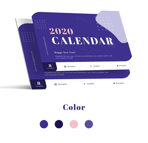
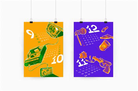
When designing a calendar with a focus on color palette selection, the choices are pivotal in evoking the desired emotions and setting the thematic tone for the year. The designer must consider how the colors will interact with each other month by month, creating a harmonious flow that guides the user seamlessly through the seasons. Utilizing cool colors like blues and greens can offer a calming influence for months associated with winter and spring, while warm hues such as oranges, reds, and yellows can invigorate and energize during the summer and autumn. Additionally, the incorporation of gradient blends or contrasting colors can highlight important dates or transitions, enhancing aesthetic appeal while maintaining functionality and coherence throughout the calendar.
Typography layout
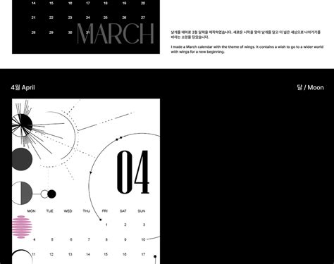
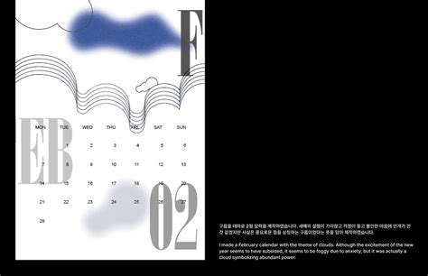
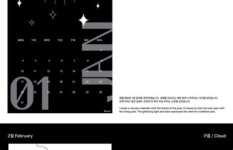
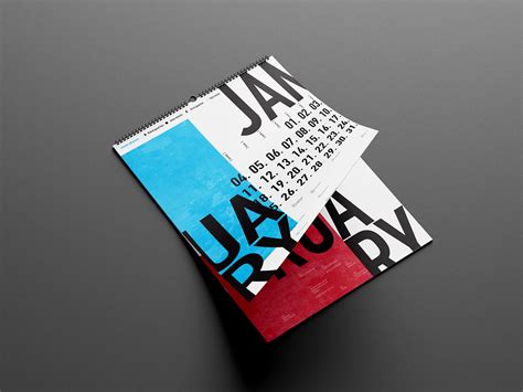
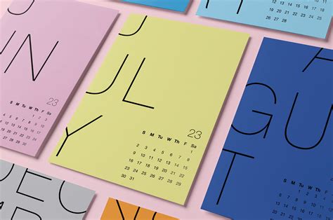
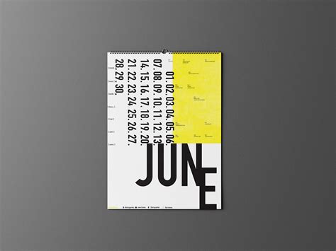
Graphic design for calendars emphasizes the intricate art of typography layout, which requires a harmonious blend of legibility and aesthetic to ensure both functionality and visual appeal. Each typeface is meticulously chosen, reflecting the calendar's theme; serif fonts might evoke a sense of tradition and elegance, while sans-serif fonts offer modernity and cleanliness. Hierarchical structures in typography enable easy navigation throughout the calendar, with larger fonts highlighting important dates and smaller fonts providing supplementary information, such as holidays. The spacing, alignment, and color palette further enhance readability and cohesiveness, transforming the calendar into not just a tool for organizing time but also a compelling piece of visual art that can captivate and engage its audience throughout the year.
Image resolution
Creating a calendar that features high-quality images requires meticulous attention to image resolution, as it fundamentally influences the clarity and crispness of printed visuals. High-resolution images, typically around 300 DPI (dots per inch), are essential to ensure that each month's depiction maintains its vibrancy and detail when transferred from digital screens to physical pages. Low-resolution images, on the other hand, may cause pixilation or blurriness, which detracts from the aesthetic allure of the calendar, diminishing both user experience and perceived professionalism. Image resolution directly affects the effectiveness of visual communication, underpinning the necessity for graphic designers to utilize appropriate software tools to check and optimize image quality, ensuring that the calendar not only captures attention but also maintains its allure over time.
Grid alignment
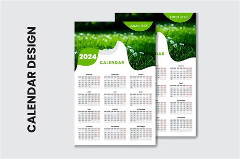
Grid alignment in calendar graphic design emphasizes organized visual structure and enhances readability by arranging elements symmetrically and consistently. Designers meticulously align text, images, and shapes within the grid, ensuring that each day, week, and month occupies a precise space, facilitating easy navigation and comprehension for users. This alignment not only supports aesthetic balance but also contributes to user experience, making the calendar intuitive and accessible, as the eye naturally follows the clean, linear paths created by the grid. Moreover, this method allows for seamless integration of different information such as holidays, events, or notes without overwhelming the user, achieving a harmonious blend of function and form in the design.
Bleed area specification
In the realm of graphic design for calendars, meticulous attention to the bleed area specification stands paramount. This layer of design consideration ensures that all critical design elements, such as images, text, and borders, extend at least 0.125 inches beyond the designated trim lines. Such precision prevents any unintended white borders or cuts that may arise during the physical trimming process, thus preserving the aesthetic integrity of the calendar. Designers often work within industry standards requiring a bleed area around the entire perimeter, which aids in achieving a seamless edge-to-edge finish that enhances the overall visual appeal and professionalism of the final printed product.
Icon consistency
Icon consistency in calendar graphic design ensures a cohesive, harmonious visual experience, making the user's interaction more intuitive and seamless. Each icon used should not only be uniform in style, size, and color palette but also express the brand's identity, ensuring recognition across different platforms and scales. Choosing a design system such as a grid-based approach for alignment, rounded or sharp corners, and a consistent stroke weight can aid in maintaining uniformity and balance throughout the different calendar views, whether daily, weekly, or monthly. Attention to details like shadows, gradients, and spacing further enhances this consistency, creating an undistracted interface where users can effortlessly focus on planning instead of deciphering visual elements.
Date font size
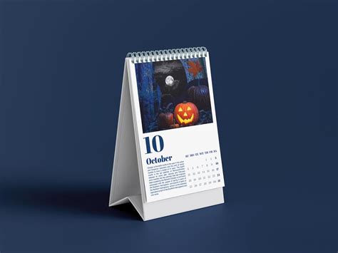
In designing a calendar, choosing the appropriate font size for the dates is pivotal to ensuring both functionality and aesthetics are balanced. Dates must be prominent enough to catch the viewer's attention while not overpowering other design elements, requiring a meticulous balance between readability and visual hierarchy. A larger font size enhances visibility and legibility, especially crucial for users reliant on quick-glance accessibility, but should not overshadow special days or themed illustrations often embedded in calendars. The interplay of font size with contrast color choices and spacing is key to maintaining a clean look, providing a holistic approach that enhances user experience and supports the calendar's overall purpose of efficient time management.
Visual hierarchy
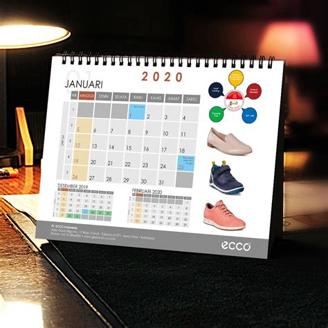
Visual hierarchy in calendar graphic design is paramount for effectively conveying information and guiding the viewer's attention. Designers often employ a combination of size, color, and position to establish a visual priority, ensuring that the most critical elements, such as the month and important dates, stand out and are immediately recognizable. Larger, bolder fonts might be used for the month, contrasting with subtler text for weekdays and numbers, while color coding can indicate holidays or special events, allowing users to quickly scan for relevant information. Positioning elements strategically is also crucial, often placing significant items like days of the week along the top row where people naturally start reading, ensuring that the layout flows logically and is easy to navigate, thus enhancing comprehension without overwhelming the user.
Template uniformity
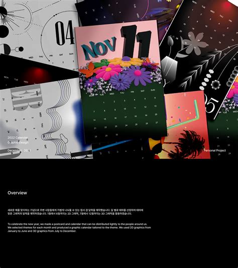
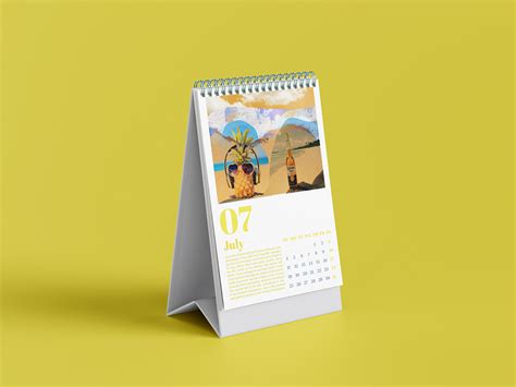
Creating a graphic design for a calendar with an emphasis on template uniformity involves meticulously crafting a cohesive visual theme throughout all the months. Each page should be designed to seamlessly integrate consistent elements such as typography, color palettes, and layout structures, ensuring that each month's design echoes the preceding ones, yet still allows for subtle variations that reflect the uniqueness of each time period. This uniformity requires a harmonious balance between predictable design components, such as grid systems and spacing, and the creative flexibility to incorporate themed illustrations or photographs that resonate with seasonal or thematic events associated with each month. The end result is a calendar that offers a visually satisfying experience, making the transition from one page to the next both smooth and engaging, while enabling the viewer to immediately identify the calendar's brand or theme at a glance.
Printing specifications
When designing a calendar for print, it is essential to consider printing specifications meticulously to ensure the best quality outcome. The file should be set up in CMYK color mode because it is optimal for any printed material, and ensure it is at least 300 DPI to guarantee crisp, clear images. Bleed is crucial in calendar design; typically, an extra 0.125 inches is added on all sides, allowing for the design to be printed to the very edges of each page without risk of white trim showing. Paper stock choice also significantly impacts the final product's appearance and durability, with glossy finishes providing vibrant image display while matte finishes lend an elegant touch and are easier to write on, demanding careful selection based on the intended use and audience preference.







Leave a Reply
Your email address will not be published.