Graphic design for catering emerged as an essential tool to elevate the dining experience during the digital age, where visuals are paramount. Once, there were limited templates and styles, but now catering graphic design ideas are plentiful and diverse. No matter the direction, graphic design in catering aims to capture the essence of culinary art while enhancing customer engagement. Although initially perceived as merely functional, it has become a vital element of presentation and brand identity--and is currently experiencing a renaissance. Enrich your culinary endeavors with the following catering graphic design concepts and craft your own unique visual story.
Menu design templates
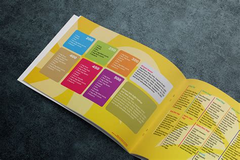
Graphic design for catering, specifically the creation of menu design templates, requires a harmonious blend of aesthetics and functionality to craft visually appealing yet practical menus that capture the essence of the catering service. Designers must carefully consider the thematic elements associated with the event type, whether it be a rustic wedding, a corporate event, or a festive holiday gathering, ensuring that colors, fonts, and imagery resonate with the intended ambiance. A well-designed menu must also ensure readability and information hierarchy, directing the diner's attention seamlessly from one section to another, often utilizing whitespace strategically to prevent overcrowding and enhance visual appeal. Incorporating branding elements subtly within the template ties back to the caterer's identity, reinforcing brand recognition and establishing a lasting impression with clients, all while maintaining the adaptability of the design to accommodate changes in menu offerings or event-specific personalization.
Food photography layout
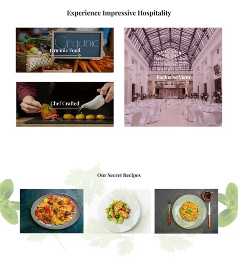
Food photography layouts in catering graphic design require meticulous attention to composition, lighting, and color to effectively capture and convey the essence of a culinary experience. Each photograph should harmoniously combine elements like the arrangement of dishes, garnishes, and props, creating a visual narrative that emphasizes the freshness and appeal of the food. The lighting should be crafted to highlight textures and details, casting soft shadows and creating contrasts that draw the viewer's eye to the most appetizing aspects of each dish. Color schemes should be chosen to complement the food's natural hues, ensuring a cohesive and inviting presentation that evokes the desired emotional response from the target audience.
Branding identity package
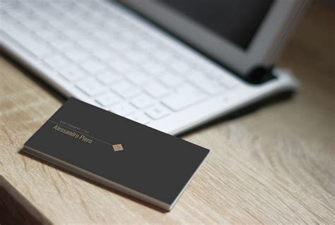
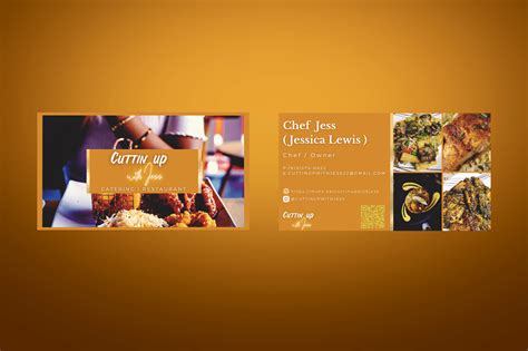
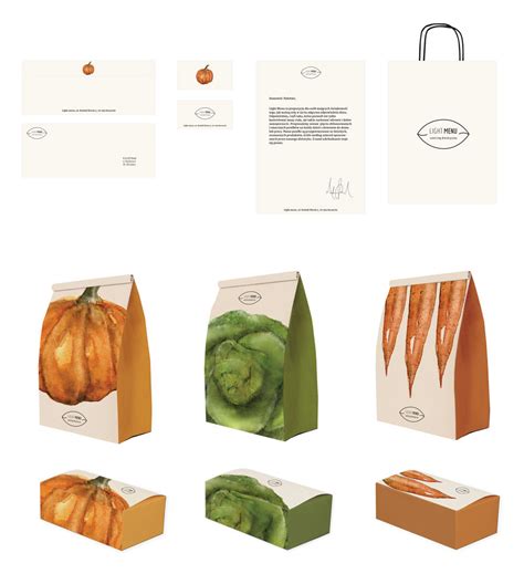
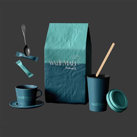
Creating an effective branding identity package for a catering business involves a meticulous understanding of the visual elements that best reflect the culinary style and target audience. The logo serves as the central emblem, often inspired by the premium ingredients or cultural influences of the menu, set in a color palette that evokes appetizing and welcoming sensations. Typography should be chosen to complement the logo, conveying the tone--be it elegant, rustic, or contemporary--through font weights and styles that ensure legibility and consistency across mediums. Additional graphic elements, such as iconography drawn from kitchen tools or cuisine motifs, further reinforce the brand's narrative, appearing on business cards, menus, uniforms, and digital platforms to create a cohesive, memorable experience that appeals to both the eye and the palate.
Restaurant logo creation
Creating a restaurant logo for a catering business involves an intricate understanding of both the culinary offerings and the brand identity it seeks to convey, requiring a harmonious blend of elements that appeal visually and conceptually. Designers must start by considering the color palette, which often reflects the cuisine's essence; warm tones suggest comfort and hospitality, while green hues can evoke freshness and health. Typography selection plays a pivotal role in defining the restaurant's ambiance, with serif fonts inferring tradition and sophistication, whereas sans-serif types project modernity and approachability. Imagery and icons, such as utensils, plates, or perhaps abstract representations of food, serve as subtle nods to the catering aspect, needing careful balancing so they enhance rather than overwhelm--ultimately crafting a logo that sticks in memory and stands as a timeless representation of the dining experience offered.
Catering brochure graphics
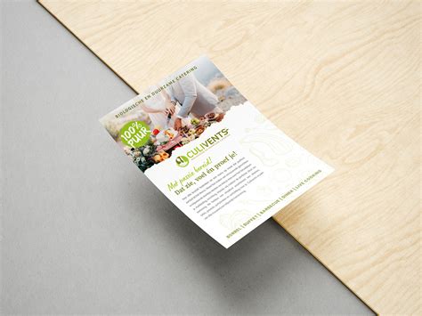
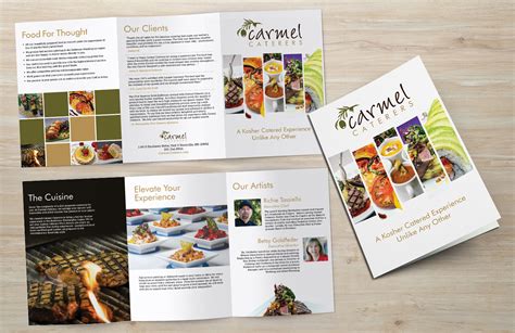
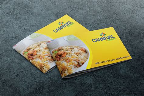
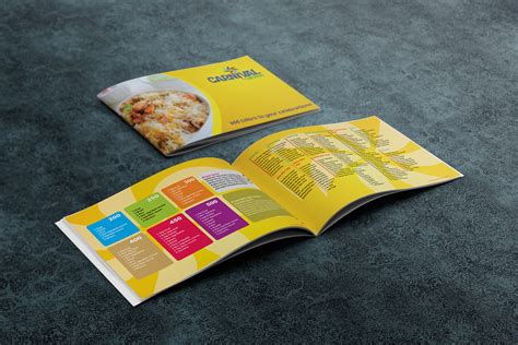
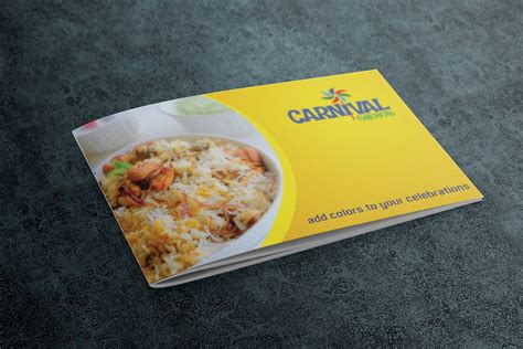
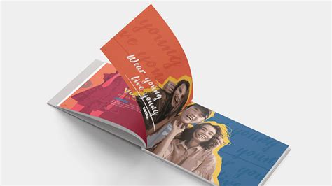
The creation of catering brochure graphics requires a strategic blend of appetizing imagery and aligned typography to convey a sense of culinary delight and professionalism. Each image must be meticulously chosen to ensure it reflects the diversity and richness of the menu offerings, from vibrant salads to sumptuous desserts, creating an immediate visual appeal that can captivate the client's attention. Typography plays a critical role; it must be both elegant and approachable, with headlines in bold, eye-catching fonts to highlight special offers or chef's specialties, while secondary text remains readable but sophisticated, providing detailed descriptions and contact information effortlessly. A harmonious color palette should echo the brand's identity--soft, earthy tones can suggest freshness and organic origins, while bold and bright colors might hint at bold, exotic flavors, all seamlessly integrated to lead the viewer's eye through a narrative of irresistible culinary experiences.
Custom event signage
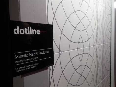
In the realm of catering, custom event signage plays an indispensable role in enhancing the overall aesthetic and functional appeal of an event. Each piece of signage, whether it be menus, directional signs, or decorative displays, serves as both a branding element and an atmospheric enhancer that aligns with the event's theme and the catering service's brand identity. Designers meticulously choose typography, color palettes, and graphics that not only capture the attention of guests but also guide them seamlessly through various offerings and spaces, creating an immersive and cohesive experience. Moreover, the interplay of materials--ranging from elegant acrylics and rustic woods to modern metals--adds a tactile and dimensional quality, ensuring that the signage is not merely informative but also a memorable part of the overall visual narrative.
Table tent card design
In the realm of graphic design for catering, crafting an enticing table tent card is crucial for effectively conveying a culinary brand's identity while capturing the diners' attention. The design should ideally integrate elegant typography with a harmonious color palette, resonating with the ambiance of the dining environment to enhance the overall aesthetic appeal. Essential information, such as menu highlights or promotions, should be strategically positioned, utilizing whitespace to avoid clutter and improve readability, thereby creating a visually compelling narrative. Incorporating high-resolution images of signature dishes with subtle textures or elements reflective of the establishment's theme can further evoke sensory anticipation and enrich the dining experience.
Beverage label aesthetics
Graphic design for catering services, particularly in beverage label aesthetics, involves a nuanced understanding of visual storytelling to captivate potential customers and convey a brand's essence. Designers meticulously select color palettes that evoke specific emotions and appetite appeal, such as rich, earthy tones for artisan teas or vibrant, energetic hues for craft sodas, carefully considering typography; typefaces need to balance readability with an expressive personality that aligns with the brand's image. Texture plays a crucial role as well, with some labels employing tactile elements like embossed lettering or matte finishes to add a layer of sophistication and premium quality perception. Imagery and iconography must skillfully reflect the beverage's ingredients or origin, creating an inviting and authentic narrative that resonates with the target audience while maintaining coherence across various packaging formats, ensuring the product stands out effortlessly amidst a cluttered market.
Social media graphics for catering
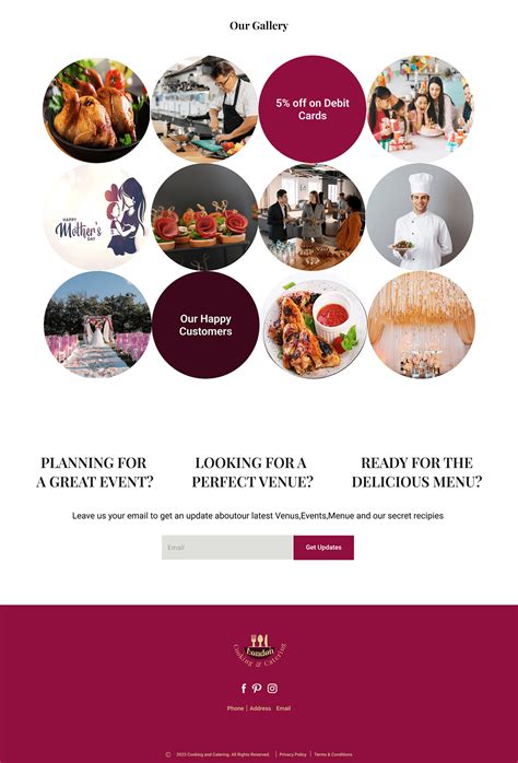
In the realm of catering, social media graphics play a pivotal role in enticing potential clients by showcasing mouth-watering visuals and captivating design elements. The color palette should reflect the brand's identity while evoking appetizing sensations, perhaps through warm tones that mimic the rich hues of gourmet dishes. Typography must be chosen wisely; modern serif fonts exude sophistication, whereas handwritten fonts could convey a personalized touch, enhancing the perception of bespoke service. These graphics should incorporate strategic framing to spotlight culinary creations, supported by subtle overlays and call-to-action elements guiding viewers to further engage with the company's offerings, thus transforming digital platforms into dynamic showcases of culinary artistry.
Promotional poster design
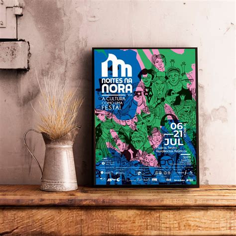
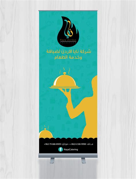
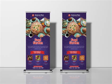
Creating a promotional poster design for a catering service requires an understanding of visual hierarchy and appropriate use of typography, color schemes, and imagery that aligns with the brand identity. The layout must ensure that key information such as the company name, contact details, service highlights, and call-to-action are prominently displayed, capturing the viewer's attention swiftly and conveying the message concisely. Creative use of textures, thematic icons, and a strategic blend of colors can evoke the desired emotion and elicit the appetite of prospective clients, making the offer irresistible. Incorporating high-quality images of elegantly plated dishes, along with graphics showcasing the versatility and personalized experience the catering service provides, can further enhance the appeal and professionalism of the promotional material.







Leave a Reply
Your email address will not be published.