Graphic design for candles has experienced a renaissance in recent years, shifting from mere functionality to an art form that enhances the sensory experience of candle use. Historically, candle labeling was simple and practical, aimed solely at indicating scent and burn time. Nowadays, however, the field of graphic design for candles has expanded into a terrain where creativity and branding intertwine elegantly. No matter the style, the goal remains the same: to capture the essence of the candle through visual storytelling. This design evolution not only amplifies the allure of the candle itself but also enriches the ambiance of any space it graces. Whether it's minimalist labels or intricate illustrations, the potential is endless. Explore the following graphic design inspirations to illuminate your own creative process.
Candle label design
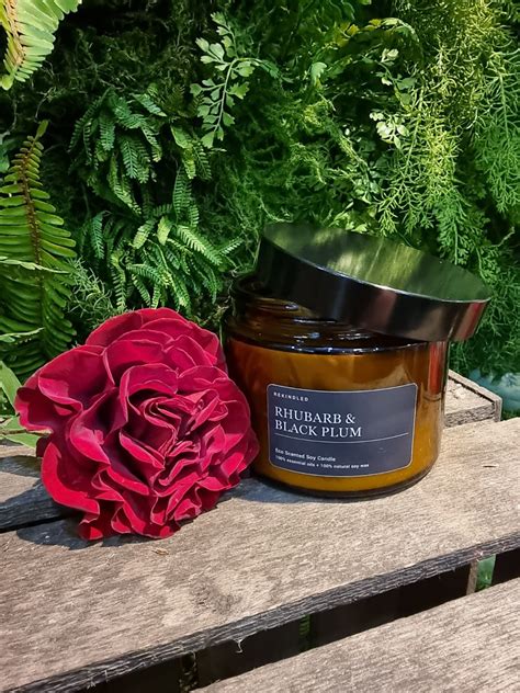
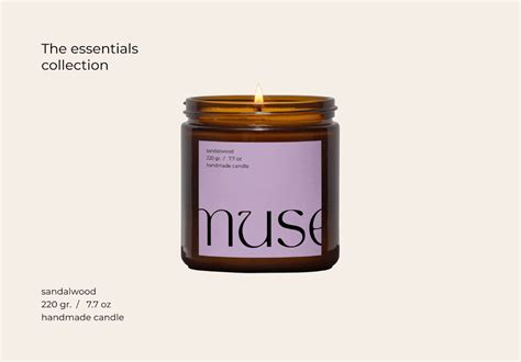
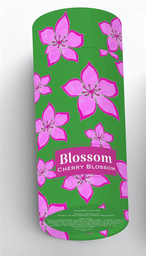
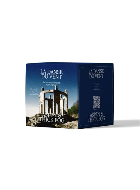
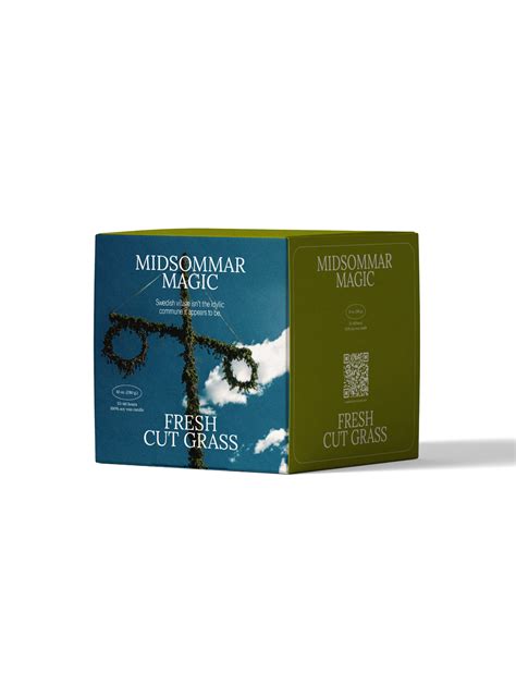
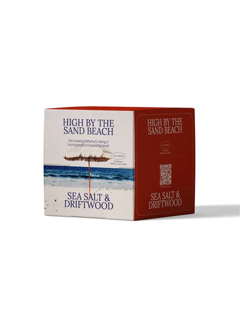
Candle label design plays an instrumental role in conveying the essence and appeal of the product, blending visual aesthetics with informative content to create a memorable experience for the consumer. Designers carefully select typography, color palettes, and imagery that resonate with the candle's fragrance, mood, or theme, while also ensuring the label is easily readable and compliant with industry regulations. The tactile quality of the label, whether matte, glossy, textured, or embossed, adds another layer of sensory engagement, inviting consumers to touch and examine the candle closely. Attention to detail, like the integration of subtle graphic elements or hand-drawn illustrations, further enhances the label's uniqueness, setting the brand apart in a competitive market and nurturing a stronger emotional connection with the buyer.
Packaging aesthetics
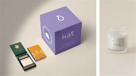
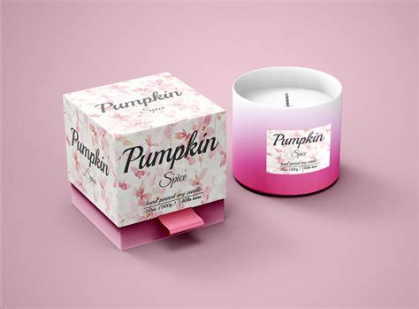
Packaging aesthetics for candles involve an intricate balance between visual appeal and functional design, capturing the essence of a brand while complementing the sensory experience of candle burning. Designers often gravitate towards tactile materials such as embossed papers or textured fabrics that enhance both the luxury and artisanal nature of the product. Typography plays a pivotal role, where serif fonts might suggest classic elegance, whereas sans-serif conveys modern simplicity; gold foiling or embossing can further elevate perceived value. Color palettes are meticulously curated to reflect either the fragrance notes of the candle itself, with earth tones for woody scents or soft pastels for floral aromas, blending harmoniously with design elements like minimalist graphics or intricate patterns that symbolize the core philosophy of the brand.
Scent branding imagery
In crafting the graphic design for candles, a focus on scent branding imagery requires an intricate blend of visual storytelling and sensory cue engagement, where the artwork must evoke the aromatic experience that the candle promises. Through the use of detailed imagery, such as botanical illustrations, color palettes inspired by natural elements, or ethereal, soft-focus photographs, the design should transcend a simple visual appeal and tap into the consumer's subconscious, awakening memories or desires associated with particular scents. Each scent should have its own distinct visual signature, ensuring a coherent but varied brand aesthetic that conveys the unique experience of lighting each candle, whether it be the cozy warmth of vanilla, the crisp freshness of eucalyptus, or the exotic allure of sandalwood. Additionally, the choice of typography and textural elements plays a pivotal role, where elegant fonts and tactile finishes like embossing or matte overlays can enhance the luxurious aura and allure of the scent, paralleling the multisensory journey the candle offers.
Color palette harmony
In designing graphics for candles, color palette harmony is pivotal, impacting both aesthetic appeal and consumer emotional response. A harmonious color palette involves selecting colors that not only complement each other but also align with the intended brand message and ambiance. Earthy tones such as muted greens, soft browns, and creamy whites can convey a sense of natural serenity and tranquility, while a palette that includes deep blues, velvety purples, and metallic golds might suggest luxury and opulence. The balance in saturation, hue, and brightness ensures that the colors enhance rather than overpower the candle's design elements, creating a cohesive visual experience that attracts the desired audience.
Typography selection
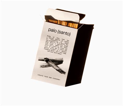
Graphic design for candles, particularly focusing on typography selection, involves a deliberate process that melds aesthetic appeal with functional clarity. Designers must consider the candle's brand identity and target audience while selecting fonts, as these elements can greatly influence buyer perception and choice. Serif fonts might be chosen for luxury candles to evoke a sense of elegance and timelessness, whereas sans-serif fonts could be favored for modern or minimalist brands that aim to convey simplicity and contemporary appeal. Typography must also ensure readability; intricate script fonts might look beautiful but could render important information such as scent notes or burn time unreadable if not carefully applied, thus balancing beauty with usability is crucial.
Logo placement strategy
When considering logo placement strategy for candles, it is essential to analyse the visual dynamics and tactile experience of the candle's physical form. Placing the logo directly onto the candle itself can evoke an elegant simplicity; however, depending on the candle's size and shape, the logo's proportion must be meticulously calibrated to ensure it remains unobtrusive yet discernible when the candle is lit. An embossed logo on or close to the base of the candle or the container can provide a subtle branding touch, inviting discovery without overshadowing the primary aesthetic--a luminous, ambient glow. Alternatively, incorporating the logo on a well-designed wrap or label around the candle's neck can create a tactile texture, offering the flexibility for seasonal or thematic variations while maintaining brand visibility even before the candle is unwrapped.
Visual storytelling elements
Graphic design for candles, when layered with effective visual storytelling elements, transforms a mere physical product into an evocative visual narrative. The play of textured backgrounds, soft gradients, and harmonious color palettes conjures the ambiance and mood the candle aims to evoke, inviting the observer into the story of the scent and its intended emotional journey. Typography selections, whether bold or elegant, speak not only to the candle's brand identity but also narrate the essence of its fragrance, guiding the viewer's sensory expectations. Iconography and illustrative elements, delicately incorporated, provide subtle nods to the candle's inspiration, be it a serene woodland escape or the warmth of a cozy fireside, crafting a multisensory experience that transcends beyond the visual realm.
Texture representation
Texture representation in candle graphic design involves the intricate illustration of the tactile qualities of wax, wicks, and surface embellishments, contrasted against their ethereal glow. The wax may be depicted with meticulous detail to exhibit its subtle variances, such as the smoothness of paraffin, the grain of a textured beeswax, or the mottled appearance of hand-poured soy, all with an emphasis on conveying their unique physicality and sheen. The wick, often understated, can be illustrated with precision, highlighting its fibrous nature and how it interacts with the flame's gently flickering embrace, adding another layer to the sensorial experience. Surface embellishments, be they etchings or molds, should be showcased to emphasize shadows and highlights that accentuate their relief, creating an image that not only evokes visual appeal but also the sensory perception of touch, transcending a flat visual experience.
Embossing design techniques
Embossing design techniques in candle graphic design involve the artistic manipulation of patterns or motifs that are physically raised above the surface, creating a tactile and visually captivating effect. The process starts with selecting or creating a design, which is then transferred onto a metal die that is used to press the design onto the candle surface, adding depth and dimension to the aesthetic. Candle designers often incorporate intricate designs such as floral patterns, geometric shapes, or textured gradients to enhance the enchanting glow of the candlelight, ensuring that each turn of the surface engages the eye in a dance of shadows and highlights. Choice of color palette must complement the embossed design, often opting for subtle hues that allow the texture to remain the focal point, while lighting plays a crucial role in casting mesmerizing shadows that accentuate the embossed details, transforming ordinary candles into works of art that dignify a space.
Mood board creation
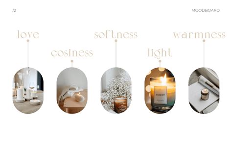
Mood board creation for candle graphic design encapsulates a meticulous blend of sensory and visual elements to evoke the desired ambiance. Designers begin by curating an assortment of textures, colors, and visual motifs capturing the essence of the candle's intended mood, whether it be serene and calming or invigorating and vibrant. A serene candle might draw inspiration from tranquil pastel hues, soft organic shapes, and ambient imagery, like serene nature scenes or intimate cozy nooks. In contrast, an invigorating scent could lead to a mood board featuring bold contrasts, dynamic geometric patterns, and vibrant color palettes, all meticulously arranged to convey the multi-sensory experience of lighting the candle and becoming enveloped in its fragrance.










Leave a Reply
Your email address will not be published.