Graphic design for church programs provides an exceptional way to convey messages of faith and community through visual storytelling. Historically, these designs were straightforward, yet today, a myriad of creative possibilities exists. Whether minimalist or intricate, the goal is to capture the essence of the spiritual message while enhancing the overall worship experience. While, at a glance, this task may appear conventional and straightforward, it is, in fact, a dynamic blend of tradition and innovation--and it's currently experiencing a wave of creativity at many worship centers. Elevate your church communications with the following graphic design ideas and craft a meaningful program of your own.
Church service layout
A well-crafted church service layout for a program dramatically enhances the worship experience by offering clarity and aesthetic appeal. By utilizing a harmonious color palette that aligns with the church's theme, the design should highlight key elements such as the order of service, hymns, scripture readings, and special announcements with distinct typography that ensures readability for all congregants. Incorporating meaningful symbols such as crosses, doves, or other religious imagery subtly weaves the church's spiritual undertone throughout the program, fostering a thoughtful engagement with the content. Moreover, the thoughtful placement of white spaces ensures the layout remains uncluttered, drawing attention to important details while allowing the congregation's focus to naturally transition from one part of the service to the next seamlessly.
Worship event flyer
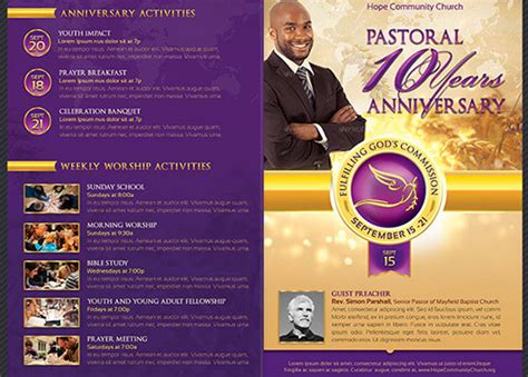
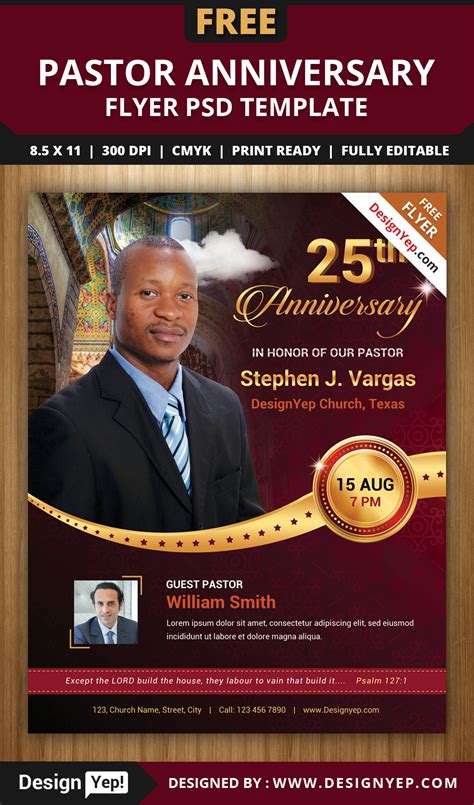
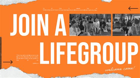
A worship event flyer designed for a church program requires a balance between aesthetic appeal and clear communication of essential information. Using a harmonious palette that reflects the church's branding or the theme of the event, designers can convey the spiritual atmosphere through soft, ethereal colors like serene blues and gentle golds to symbolize divinity and enlightenment. Typography should be thoughtfully selected, with bold fonts for the event title to capture attention and elegant serifs or sans-serifs for subtitles and details, ensuring legibility and a reader-friendly layout. Incorporating relevant imagery, such as an inspiring cross or serene nature scenes, serves as a visual representation of worship themes, while ensuring all critical details--such as date, time, location, and featured speakers or musicians--are prominently placed, guiding the viewer effortlessly through the flyer without overshadowing its spiritual message.
Sermon series artwork
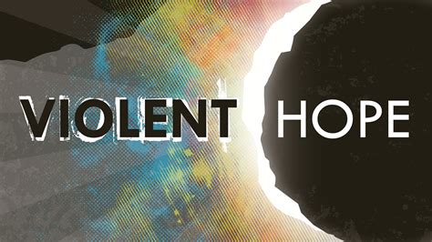
The graphic design for a church program, specifically focusing on the sermon series artwork, should encapsulate the spiritual essence and thematic message of the series while engaging the congregation visually. Utilizing a harmonious color palette that resonates with the season or theme is essential, such as earthy tones for a series on creation or purples and blues for an Advent series, creating an emotional connection and preparing the congregants' hearts and minds for the worship experience. Typography should be carefully selected to complement the theme; for instance, using modern sans-serif fonts for a contemporary series targeting younger audiences or elegant serif types for traditional teachings, all while ensuring readability and accessibility. Integrating symbolic imagery, such as a cross subtly embedded in artistic backgrounds or abstract representations of biblical stories, can provide a deeper level of engagement, offering a visual narrative that goes beyond words and encourages reflection and contemplation among the church community.
Liturgical color scheme
In designing a church program with a focus on the liturgical color scheme, it's essential to incorporate hues that reflect the current liturgical season, infusing the design with spiritual symbolism and cohesion. For example, during Advent, shades of violet or deep purple could be emphasized, symbolizing penitence and anticipation, while Christmas would feature vibrant gold or white, representing joy and purity. Consider using a layered design approach where the primary colors dominate major sections of the program, such as headers or borders, while secondary colors accentuate smaller elements and typography, enhancing readability and aesthetic balance. Texture and imagery should compliment these hues; organic motifs like vines or doves can interlace with the colors, enriching the visual narrative and inviting congregational engagement through seamless, symbolic storytelling.
Religious symbolism graphics
Graphic design for a church program centered on religious symbolism involves the thoughtful integration of sacred imagery and motifs that resonate deeply with the congregation's faith tradition. Crucial elements such as the cross, doves, fish, and other Christian symbols must be meticulously rendered, ensuring they evoke a sense of reverence and reflection. The use of color holds significant importance, where gold and silver can convey divinity and purity, while shades of blue may suggest serenity and peace, with the layout balancing text and imagery cohesively to guide the reader's eye effortlessly. Typography plays a supporting yet vital role, where script-like fonts may impart a classic, sacred feel, and serif or sans-serif typefaces can provide clarity and modernity, making sure the program is both visually appealing and spiritually meaningful.
Prayer meeting poster
Creating a visually compelling prayer meeting poster for a church program involves a harmonious blend of sacred symbolism and inviting aesthetics to capture the essence of spiritual gathering. The poster should feature a serene color palette, perhaps utilizing soothing shades of blue and gold, with an emphasis on light to convey a sense of hope and divinity. Incorporating traditional religious symbols such as doves, hands clasped in prayer, or subtle crosses can evoke a sense of peace and contemplation. Typography should be clear and respectful, using a font that is both elegant and readable, with the event details prominently displayed to ensure attendees can easily access vital information such as date, time, and venue without distraction.
Bible verse typography
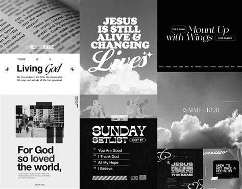
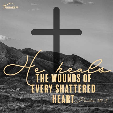
Creating graphic design for a church program with a focus on Bible verse typography requires a strategic blend of aesthetic appeal and reverence to scripture. Carefully selecting a harmonious color palette that reflects the solemnity and hope inherent in biblical texts can set the tone for worship; deep blues, rich golds, and soothing earth tones are often effective. Each Bible verse should be crafted with a typeface that complements the message conveyed, enhancing readability while adding a layer of nuanced emotion--serif fonts bring traditional gravitas, while sans-serif options might offer modern clarity. Incorporative decorative embellishments like flourishes, textured backgrounds, or subtly faded religious symbols can serve as visual anchors, drawing the congregant's eye naturally to the scripture while ensuring the holy word remains central and unsullied by excessive graphic distraction.
Spiritual iconography set
Graphic design for a church program focusing on spiritual iconography requires a harmonious blend of visual elements that capture the essence of faith, devotion, and serenity. The use of sacred symbols, such as crosses, doves, or halos, plays a critical role in evoking a sense of spirituality and reverence, often enhanced through soft color palettes like muted golds, comforting blues, or serene whites. These symbols can be intricately woven into the layout, guiding the eye with a balanced composition that offers both aesthetic appeal and spiritual significance, ensuring that they resonate with the audience's faith traditions. Typography also plays a pivotal role, with elegant serif fonts or script styles emulating traditional religious texts and scriptures, providing the text with an air of solemnity and grace that parallels the sanctity conveyed by the iconography.
Church bulletin design
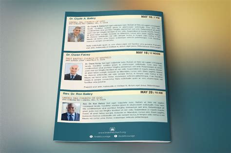
Creating a church bulletin design requires a sensitive balance of aesthetics, readability, and functionality to effectively communicate the church's message and activities. Attention to detail is crucial, starting with choosing a color palette that resonates with the church's brand and complements the religious tone of the program. Typography must be legible and formal yet welcoming, with clear hierarchy to guide the reader through headings, subheadings, and body text. Incorporating symbolic imagery such as subtle crosses, doves, and other religious motifs can enhance the visual appeal, while strategically placed white space ensures the design remains uncluttered, allowing the congregation to focus on the content without distraction.
Faith-based visual theme
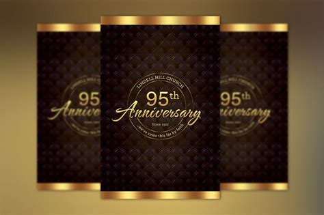
The graphic design for a church program requires an immersive faith-based visual theme, which can be achieved through the careful curation of symbols and colors that resonate deeply with religious iconography. Shades of serene blue and white often symbolize purity and hope, while incorporating gold can signify divine presence and glory. Utilizing imagery such as doves, crosses, or stained glass not only aligns the design with sacred traditions but also establishes an immediate connection with the audience's spiritual journey. Consider using elegant typography that evokes a sense of tradition, yet remains clear and readable, to effectively communicate the words of faith intended to inspire and uplift the congregation.















Leave a Reply
Your email address will not be published.