Graphic design for flyers gained popularity in the 20th century as businesses sought captivating ways to attract potential customers. Back then, there was a single, dominant style; now, the possibilities for flyer design are endless. Regardless of the technique, flyer graphic design conveys messages effectively and adds aesthetic flair to promotions. Although initially perceived as basic and straightforward, it has evolved into a dynamic and exciting form of communication--and it is currently experiencing a renaissance. Elevate your advertising strategy with these innovative graphic design ideas for flyers and create striking visual statements of your own.
Color palette
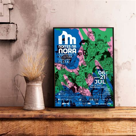
Graphic design for flyers requires a meticulous selection of a color palette to make the flyer visually appealing and effective in conveying its message. A well-chosen color palette not only attracts the eye but also influences the emotions and perceptions of the viewer, creating a specific atmosphere or tone. Bold, contrasting colors such as deep blues against vibrant yellows can demand attention, while a harmonious, analogous scheme of soft pastels like mint green and lavender evoke calmness or sophistication. The cultural and psychological connotations of colors should be considered to ensure the palette aligns with the brand's identity and target audience expectations, potentially incorporating trending shades for a contemporary edge or classic hues for timeless appeal.
Typography
Typography is the cornerstone of impactful flyer design, where the careful selection and arrangement of typefaces can significantly influence a viewer's perception and engagement. Selecting a font that resonates with the flyer's theme is pivotal; for instance, utilizing modern sans-serifs for sleek, contemporary events or traditional serifs for classical, upscale gatherings. The hierarchy is crucial, as it dictates the flow and can guide the reader through the essential information, often achieved through contrasting font sizes, weights, and colors to highlight key messages or calls to action. Negative space should be methodically employed to ensure readability and prevent overcrowding, which respects the reader's time and enhances visual appeal, making effective typography not just a design element, but a communication tool in itself.
Visual hierarchy
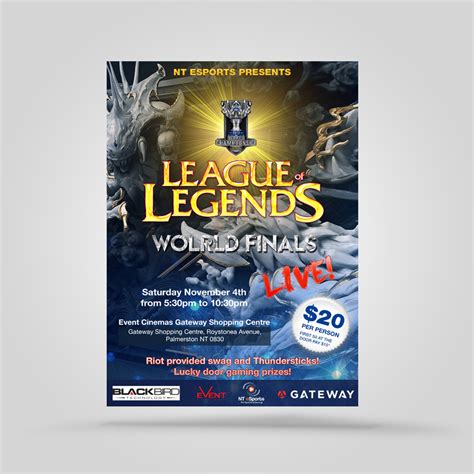
Designers must expertly manage visual hierarchy in flyer creation to effectively guide the viewer's eye through content, emphasizing messages in order of importance, akin to a roadmap. Large, bold headlines typically capture initial attention, drawing users in with compelling, succinct phrases that establish the flyer's purpose. Designers use contrasting colors or strategic placement to ensure key details, such as dates or calls to action, stand out from the surrounding text and graphics. Supporting images and secondary text maintain a balanced layout, subtly directing the viewer's gaze and reinforcing the primary message without overwhelming or distracting from the flyer's core intent.
White space
White space, or negative space, plays an essential role in graphic design for flyers, functioning not just as a neutral background but as a powerful tool that enhances readability and creates a balanced composition. This breathing space around images, text, and other elements helps to direct the viewer's attention, allowing the most critical information to stand out without overwhelming the viewer with cluttered visuals. Skillful use of white space facilitates a hierarchy of information, ensuring that promotional messages or calls to action are prominent, and the overall design remains aesthetically pleasing and easy to navigate. Incorporating generous amounts of white space can also impart a sense of sophistication and elegance to the flyer, appealing to minimalist design trends and ensuring that the content is accessible and memorable.
Grid system
The grid system acts as the backbone for designing flyers, offering a structured framework that enhances visual harmony, alignment, and coherence among elements. By utilizing well-defined columns and rows, designers can strategically allocate space, ensuring that textual content, images, and icons are balanced and aesthetically pleasing. This approach not only aids in maintaining consistency throughout multiple flyers within a campaign but also guides the viewer's eye across the design seamlessly, improving their engagement and absorption of the information being presented. Additionally, employing a grid system facilitates ease of modification or adaptation for different formats and platforms, streamlining the design process and enhancing overall productivity for graphic designers.
Brand identity
Creating a flyer that aligns with brand identity requires meticulous attention to elements such as color schemes, typography, imagery, and overall composition. Brands convey their unique message using consistent visual elements; hence, the design must capture and reflect the essence of the brand, be it luxurious sophistication or youthful vibrance. Designers choose fonts that echo the brand's personality, be it modern sans-serifs for cutting-edge tech firms or ornate script for luxurious cosmetic brands. Carefully selected images either directly relate to the product being promoted or evoke the brand's desired emotional response, ensuring that potential customers instantly recognize and connect with the brand's values and vision.
Print resolution
Print resolution in graphic design is a crucial aspect, especially when crafting flyers that demand high-quality visuals to effectively convey the intended message. High-resolution designs typically require a minimum of 300 DPI (dots per inch), ensuring that images and texts appear crisp and professional when printed. Designing within a high-resolution framework involves creating images in suitable software like Adobe Illustrator or Photoshop, paying attention to detail such as bleed areas and ensuring color modes are set to CMYK to match printing processes. Moreover, utilizing vector graphics wherever possible can significantly enhance the print quality, as vectors maintain clarity regardless of scaling, which is essential for the assorted sizes flyers can be printed in.
Bleed area
The bleed area in graphic design for flyers is a crucial element to ensure a professional and polished final product. It refers to the extension of the design beyond the actual dimensions of the flyer, usually by about 0.125 to 0.25 inches on each edge. This additional space is essential because it prevents unsightly white borders when the flyers are trimmed to size, which can occur if the cut is not perfectly aligned. Designers must extend images, backgrounds, and any other design elements that reach the edge of the flyer into the bleed area, ensuring seamless continuity after trimming, while keeping all critical content like text and key images within the safe margin to avoid accidental cropping.
Design elements
Creating a compelling flyer requires a keen understanding of fundamental design elements such as layout, typography, color, imagery, and hierarchy. Layout plays a vital role in guiding the viewer's eye, arranging the elements in a way that ensures a seamless flow of information; this can be achieved through the use of grids or asymmetrical arrangements that add dynamic movement. Typography is crucial, where the choice of font and size can evoke specific emotions and, when used effectively, can distinguish between headline and body text, enhancing readability and impact. Color selection demands attention to how different hues interact to create mood and emphasis, using complementary or analogous palettes to enhance appeal; meanwhile, imagery should be high resolution and relevant to the flyer's message, ensuring it connects with the audience while maintaining balance with white space to avoid a cluttered appearance.
Image compression
Image compression is a crucial aspect of graphic design for flyers as it ensures that high-quality visuals are delivered efficiently without compromising the overall aesthetic or clarity. When designing flyers, designers often grapple with the challenge of maintaining image quality while reducing file size to ensure swift loading times, particularly for digital distribution. Techniques such as lossless compression preserve the intricacies of the imagery by only removing redundant data, allowing for crisp, clear visuals that retain their original quality. Lossy compression, though reducing file quality slightly, achieves more substantial size reduction by eliminating bits of data deemed less critical, which can be beneficial for web use where faster loading times are prioritized over minimal quality loss.

















Leave a Reply
Your email address will not be published.