Graphic design for invitations emerged as an art form at the turn of the century, adding a personal touch to the social traditions of celebration and gathering. Well, back then, the choices were more streamlined, whereas now various graphic design styles for invitations flourish. Regardless of the aesthetic, designing an invitation captures the tone of the event and sets the mood for its attendees. While at first glance this endeavor might seem intimidating and complex, it is actually a creative and enjoyable process--and it's experiencing a vibrant revival. Enhance your next event with the following graphic design tips for invitations and craft a memorable invite of your own.
Typography selection
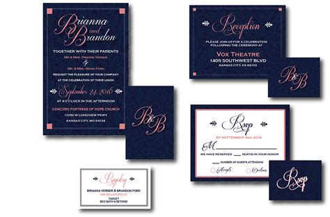
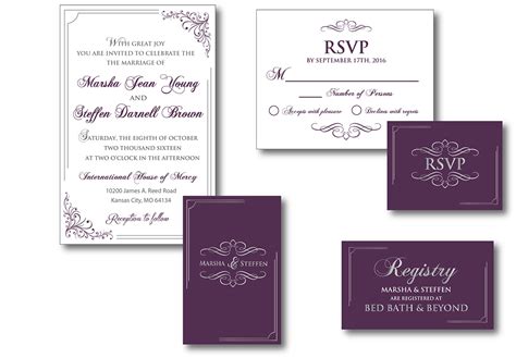
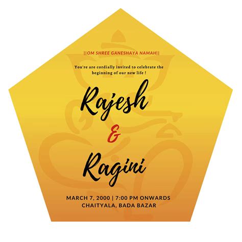
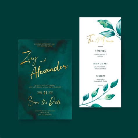
In creating an invitation, typography selection is paramount as it sets the tone and conveys the event's mood before any image meets the eye. The first step is to consider the event type--whether it's formal, casual, themed, or modern--to determine if serif, sans-serif, script, or decorative fonts are appropriate. A wedding invitation might benefit from the elegance and tradition of a script font like Bickham Script, suggesting sophistication and intimacy, whereas a tech event might opt for a clean, modern sans-serif font like Helvetica or Arial to express sleekness and innovation. Additionally, typographic hierarchy is crucial, so headlines should be noticeable and impactful, potentially incorporating bold or larger fonts, while accompanying text should maintain readability and flow, often utilizing complementary font pairings to enhance harmony and avoid typographic discord.
Color palette
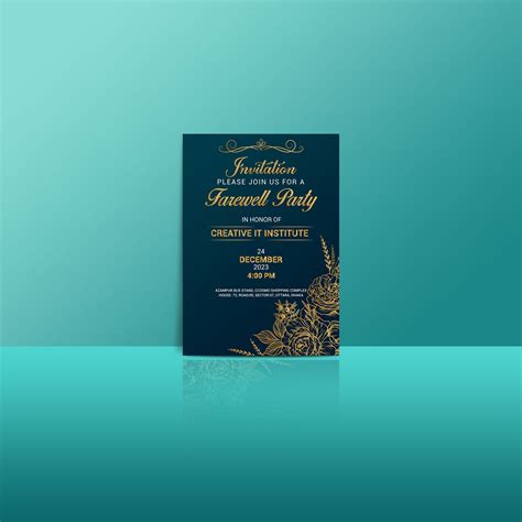
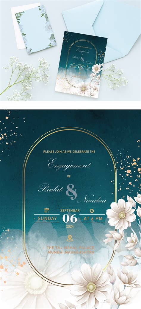
Graphic design for invitations hinges significantly on the choice of the color palette, which ultimately sets the mood and tone for the entire event. A thorough understanding of color theory is critical as designers must consider harmony, contrast, and the psychological effects colors may have on the invitees. When curating colors, the designer must also account for elements such as seasonality and theme, tailoring selections that resonate with the intended atmosphere, be it warm and inviting for a fall wedding or vibrant and dynamic for a summer party. It's imperative that the colors not only complement each other but also enhance the typography and imagery incorporated, ensuring an aesthetically pleasing and cohesive invitation that communicates the desired narrative effectively.
Visual hierarchy
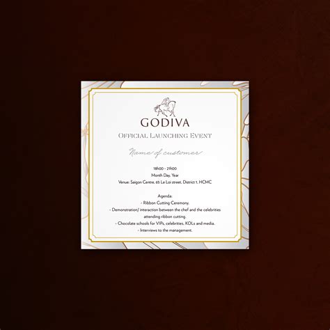
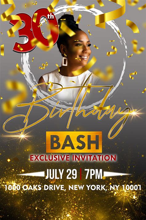
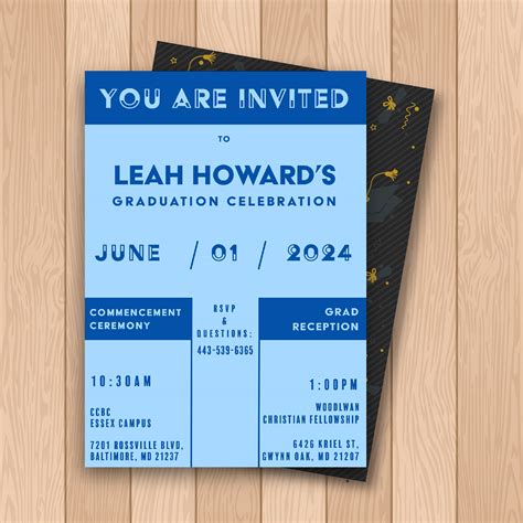
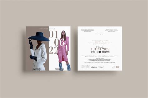
Visual hierarchy in graphic design for invitations involves the strategic arrangement of elements to guide the recipient's eye and emphasize the most important information first. This can be achieved by varying font sizes, weights, and colors, where the host's name or event occasion often takes prominence at the top or center in a bold, large typeface. Supporting details like date, time, and venue are sequentially presented in a more subdued fashion through smaller or softer text, which follows the initial point of focus, ensuring an easy flow through the invitation. Imagery and decorative elements, such as borders or motifs, should not compete with text but rather support the overall theme and mood, subtly leading the viewer from one section of information to the next while maintaining cohesion and balance.
Design layout
The design layout of an invitation in graphic design serves as the backbone that dictates the visual flow and hierarchy of information, ensuring that the first glance captivates the viewer's interest. A balanced layout incorporates a harmonious blend of typography, imagery, and white space, guiding the reader's eye seamlessly from the headline through the event details to any call-to-action elements. The careful selection and positioning of fonts and colors not only align aesthetically with the event's theme but also enhance readability, facilitating an effortless comprehension of the invitation's content. Grid systems are often employed to create a structured aesthetic coherence, allowing for creative exploration within a framework that maintains clarity and sophistication.
Invitation theme
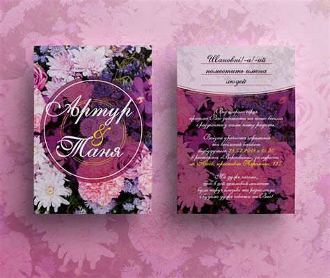
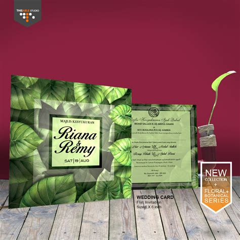
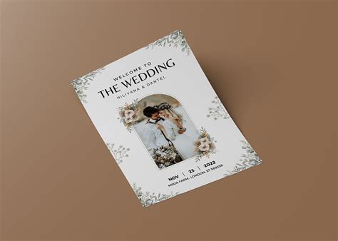
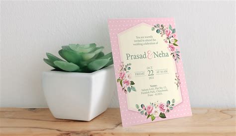
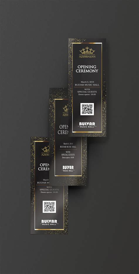
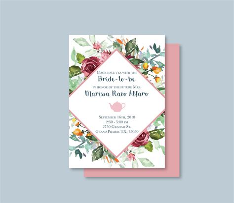
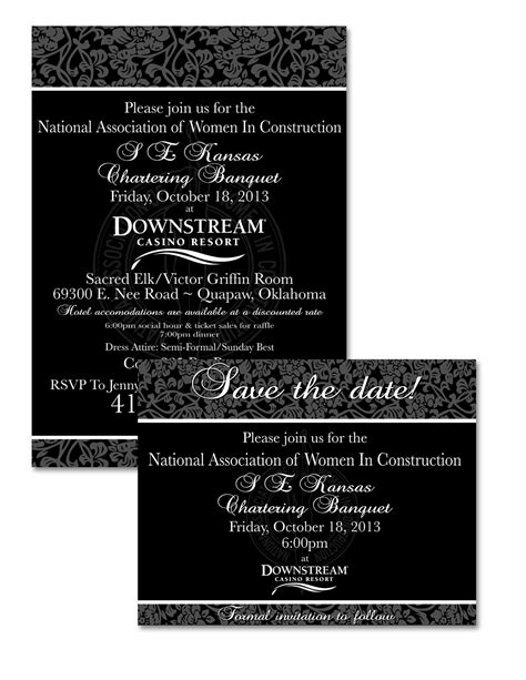
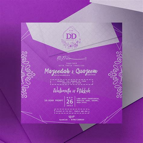
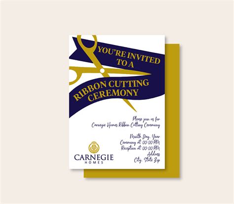
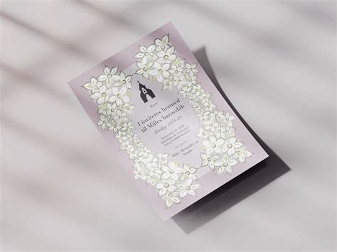
Creating a graphic design for an invitation requires a keen understanding of the invitation theme. This theme dictates the visual elements, such as color schemes, typography, and imagery, all of which must harmonize to convey the event's essence. For a wedding, for example, a romantic theme might utilize soft pastel hues, elegant script fonts, and floral motifs to evoke a sense of love and unity. In contrast, a corporate event might necessitate a sleek and minimalist design, incorporating the company's branding elements with a refined color palette and modern typography to communicate professionalism and sophistication.
Font pairing
In graphic design for invitations, font pairing plays a crucial role in establishing the piece's overall aesthetic and readability. Designers often select two fonts that contrast yet complement each other, such as pairing a bold serif font like Baskerville for the headings with a more delicate sans-serif font like Futura for the body text. This contrast not only defines hierarchy, guiding the reader's attention through the invitation, but also enhances the design's visual interest, ensuring that the invitation feels both elegant and harmonious. Consideration of the event's theme informs the font choice, ensuring that formal events lean towards classic types like Garamond paired with Gill Sans, while more casual or modern gatherings may use playful pairings like Pacifico with Open Sans, providing a consistent tone reflective of the occasion's spirit.
Graphics and illustrations
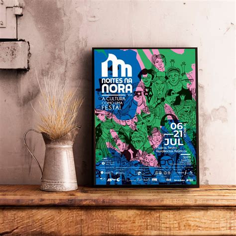
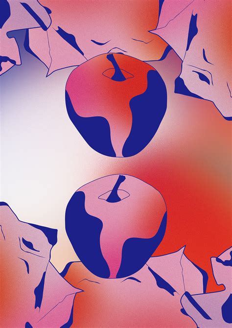
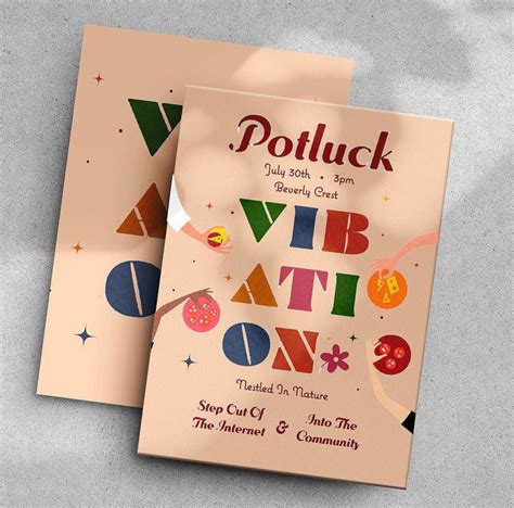
Creating graphic designs for invitations demands an adept balance between captivating aesthetics and meaningful communication. Graphics should encapsulate the event's essence, utilizing a color palette and typography that align with the occasion's mood. Illustrations must harmonize with these elements, offering a visually engaging narrative that intrigues and delights recipients. Every design component, from vector graphics to hand-drawn elements, needs to be meticulously curated to resonate with the invitation's purpose, ensuring an inviting allure that sets the tone and anticipation for the event ahead.
Paper texture
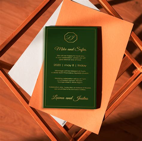
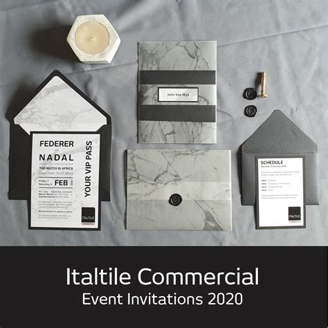
In creating a graphic design for an invitation that emphasizes paper texture, one might choose to incorporate a luxurious, tactile experience by selecting a paper with a distinct texture like linen or cotton weave, which adds an understated elegance to the design. The texture of the paper itself can serve as a foundational element that complements and enhances the visual elements, such as delicate calligraphy or subtle, nature-inspired graphics, allowing the interplay of light and shadow to add depth and sophistication. Strategic use of embossing or debossing techniques can further accentuate the texture, creating a three-dimensional effect that invites recipients to not only see but also feel the intricate details imbued within the design. The choice of textured paper can also influence color choices and printing techniques, with certain textures absorbing ink differently, sometimes requiring adjustments to color saturation or a preference for metallic inks that can stand out against a textured background, thereby turning the invitation into a sensory work of art that engages more than just the eyes.
Envelope design
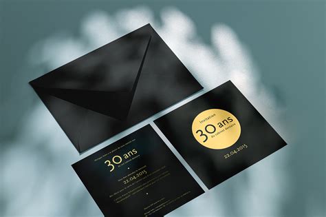
The envelope design for an invitation is often the first glimpse into the aesthetic and mood of the event it represents, serving as a tactile introduction to the experience awaiting the recipient. A well-executed envelope design may incorporate elements such as elegantly embossed or debossed textures, luxurious foil stamping, or intricate die-cut patterns that hint at the invitation within, immediately sparking anticipation and curiosity. Color choices for the envelope should harmonize with the overall theme and color palette of the event, potentially utilizing rich, saturated hues like deep emeralds or sophisticated metallic shades such as rose gold to ensure a striking impression as it is handled or delivered. Typography, while secondary to the primary visual features of the envelope, plays a crucial role in mirroring the event's tone, whether it be formal, whimsical, or avant-garde, often using custom calligraphy or bespoke fonts to further personalize and elevate the recipient's tactile experience.
Print quality
Designers conceptualize each element to ensure print quality when creating invitation graphics. File resolution plays a crucial role, necessitating a minimum of 300 dpi for clear, sharp images and text. CMYK, rather than RGB, color mode is selected to ensure printed colors match the on-screen display since it correlates more accurately to ink reproduction. Designers also employ vector graphics for logos or illustrations to avoid any pixelation when the design is scaled, ensuring that the finished product is both visually striking and professionally rendered.





Leave a Reply
Your email address will not be published.