Graphic design has become a vital aspect of the insurance industry, crafting a bridge between complex information and audience engagement. Originally, insurance documents were dry and tedious, but modern graphic design strategies have revolutionized them into visually compelling narratives. Today, innovative graphic design in insurance includes infographics, interactive platforms, and user-friendly interfaces that demystify policies for clients. Though it may initially seem intricate and technical, graphic design in this sector is anything but dull--it's dynamic and client-centric. Elevate your insurance brand's image with the following graphic design tips for a compelling presentation.
Policy illustration design
Policy illustration design in the realm of insurance graphic design requires a meticulous blend of clarity and visual engagement to effectively communicate complex information. Designers must prioritize the creation of intuitive layouts that simplify policy details, often utilizing infographics and icons to convey data at a glance. Meticulous attention to typography ensures that critical terms and conditions stand out while maintaining a harmonious balance with aesthetic elements, such as color palettes and imagery, that align with the brand's identity and instill a sense of trust in the clients. Furthermore, leveraging digital tools allows the integration of interactive elements for online platforms, providing users with an engaging experience where they can delve into specific policy facets through animations and expandable sections, thereby enhancing comprehension and user engagement.
Claims process infographic
Creating a claims process infographic for the insurance industry demands a meticulous blend of clarity and visual engagement to effectively guide policyholders through potentially complex procedures. The initial step involves a concise representation of claim initiation, illustrating customer contact points and essential submission documents, possibly using icons like phones, documents, or emails to convey simplicity and accessibility. Following this, the infographic should detail each procedural milestone, from claim assessment, which could be depicted with magnifying glasses or checklist icons, to the approval stage, indicated by symbols such as thumbs ups or checkmarks, with accompanying timelines to set realistic expectations. Finally, incorporating color-coded pathways or progress bars can enhance understanding and retention by visually demonstrating each stage's significance, culminating in the resolution phase, effectively communicated through success indicators like open doors or green lights to signify completed claims and customer satisfaction.
Risk assessment visualization
Graphic design for insurance, particularly in the realm of risk assessment visualization, demands an intricate balance of clarity and precision to effectively convey complex data to stakeholders. Designers employ a combination of infographics, color-coded risk maps, and interactive dashboards, enabling users to instantly grasp potential risks and their impact magnitudes. High-quality vector illustrations elucidate statistical probabilities while maintaining aesthetic appeal, ensuring that information remains accessible without overwhelming the viewer. Digital interfaces often incorporate real-time data feeds which update continuously, allowing risk managers to make informed decisions with the latest insights, all presented through a seamless user experience that aligns with ergonomic principles.
Coverage plan brochures
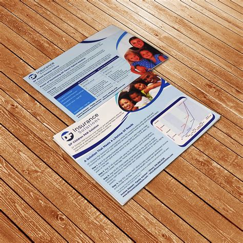
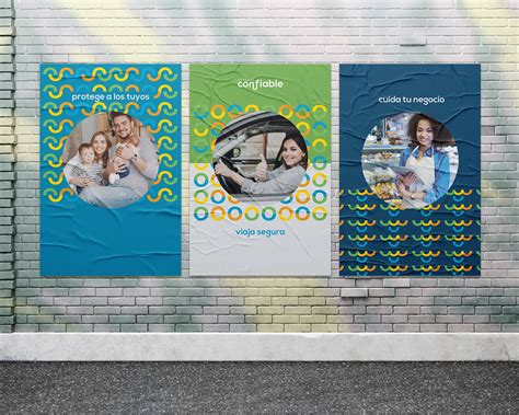
Graphic design for insurance coverage plan brochures requires a meticulous blend of clarity, appealing aesthetics, and informational hierarchy to ensure potential clients understand the services provided. The use of strong visual elements such as iconography and infographics can succinctly convey complex insurance terms, transforming dense policy information into digestible content; these elements should be complemented by a color palette that reflects trust and security, typically involving calm hues like blues and greens. Typography plays a pivotal role, where headings are bold and legible to guide the reader's attention, while body text remains refined yet clear, ensuring readability across various devices and mediums. Strategic use of white space is essential, not only to prevent visual clutter but also to create a focal point that draws attention to key features within the coverage plans, allowing potential customers to make informed decisions with ease.
Premium rate charts
Visual representation is crucial in conveying the complexities of premium rate charts to policyholders in the insurance industry. Designers often use clean lines, consistent color palettes, and intuitive layout structures to ensure clarity and comprehension, effectively breaking down data into digestible visuals. Infographics typically employ iconography to symbolize different coverage types, demographic categorizations, and risk factors, providing immediate understanding at a glance. Additionally, interactive elements like hover-over pop-ups or expandable sections can offer deeper layers of information, allowing users to explore the chart's details without becoming overwhelmed, fostering an engaging and educational experience.
Agency branding materials
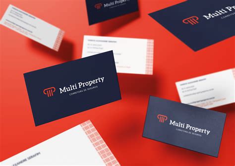
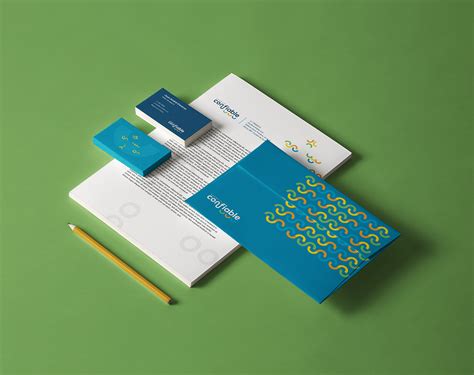
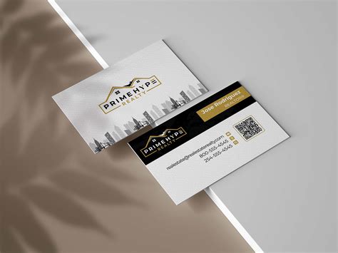
Graphic design for insurance agencies requires a strategic blend of visual elements to create cohesive and impactful branding materials that resonate with clients and convey trustworthiness. Designers often utilize a palette of calming, professional colors such as blues, grays, and whites to establish an aura of reliability and security crucial in the insurance industry. Incorporating timeless typography, which balances readability with distinctiveness, enhances the legibility and recognizability of brand messaging across various media such as flyers, business cards, and digital platforms. Additionally, consistent use of imagery like abstract symbols of protection or real-world icons relevant to insurance, such as homes or shields, aids in creating a visual narrative that aligns with the agency's commitment to safeguarding clients' interests.
Underwriting guidelines graphics
Graphic design in insurance, especially when focusing on underwriting guidelines graphics, necessitates a precise and methodical approach to encapsulate complex information into visually digestible formats. The design must seamlessly integrate typography with intuitive color coding, making distinctions between various risk levels and policy intricacies immediately apparent. Infographics play a pivotal role, as they transform dense data, such as actuarial tables and risk assessment matrices, into streamlined visuals that facilitate quicker comprehension among stakeholders. Furthermore, utilizing interactive elements like clickable flowcharts and sliders can enhance user engagement, allowing insurance professionals to simulate different underwriting scenarios dynamically, reflecting the nuanced nature of risk evaluation processes.
Insurance product mockups
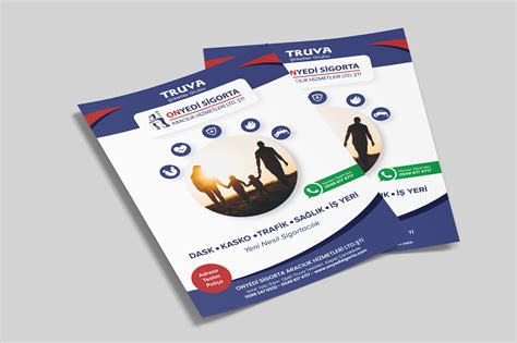
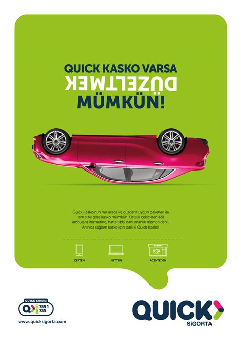
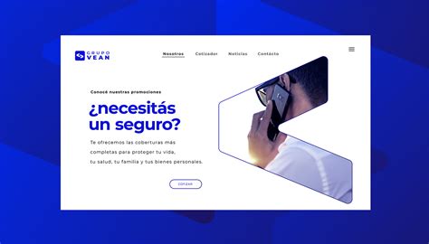
Creating graphic design mockups for insurance products requires a nuanced understanding of both the technical aspects of design and the distinctive needs of the insurance industry. It involves crafting visually compelling presentations that transform abstract policy benefits into tangible, relatable scenarios for potential clients. Designers must meticulously balance simplicity with complexity, ensuring that essential information is conveyed clearly while maintaining the aesthetic appeal to elicit trust and engagement. Attention to detail is imperative, as these mockups often integrate data visualization and iconography to illustrate coverage terms, premiums, and benefits, subtly guiding the viewer through a seamless narrative that aligns with the company's brand identity.
Client onboarding presentations
Client onboarding presentations in the insurance industry demand a subtle blend of clarity and persuasion while maintaining stringent attention to detail and compliance standards. Designers should prioritize an intuitive layout that accommodates both textual information and visual elements like infographics or charts, which can demystify complex data. Minimalistic yet impactful color schemes can foster trust and professionalism, whereas custom typography enhances readability and brand coherence. Interactive elements such as clickable icons or embedded videos might also be included to encourage engagement, yet while ensuring every element adheres to the regulatory guidelines of the insurance sector.
Benefit summary visuals
Creating visually appealing benefit summary graphics for insurance entails a careful balance of clarity, conciseness, and branding. Designers must harness color schemes that align with the insurance company's identity to foster trust and recognition. Infographics and iconography simplify complex data, helping clients immediately grasp their coverage details, limits, and deductibles. Typography hierarchy, strategically used whitespace, and consistent layout guide the viewer's eye smoothly through key information, ensuring a comprehensive yet digestible understanding of their benefits without overwhelming them.




















Leave a Reply
Your email address will not be published.