Graphic design for landscape architecture emerged as a key discipline as cities expanded and green spaces became more integral parts of urban life. Initially, traditional methods dominated the scene, but nowadays, landscape graphic design concepts are plentiful and diverse. No matter the approach, this form of graphic design enhances natural settings and adds a layer of visual storytelling to outdoor environments. While it might initially appear intricate and reserved for specialists, in reality, it's an accessible and inventive field experiencing a significant renaissance. Elevate your outdoor projects with these landscape graphic design strategies and create stunning visuals that complement the natural environment.
Image Composition Techniques
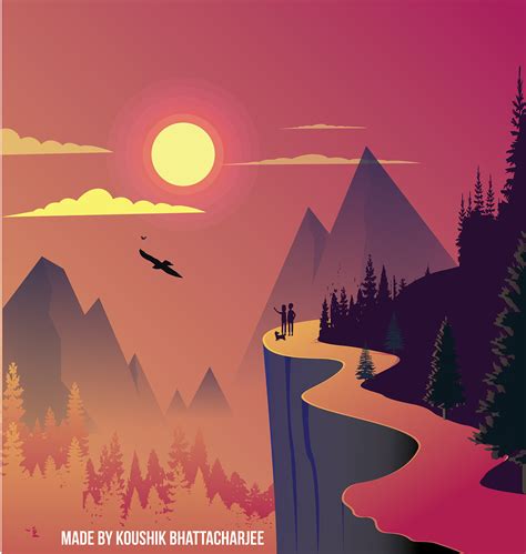
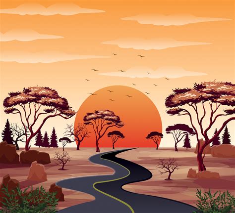
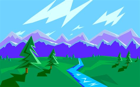
Image composition in graphic design for landscapes requires an astute understanding of the Rule of Thirds, leading lines, framing, and balance. The Rule of Thirds involves dividing the image into nine equal segments with two horizontal and two vertical lines, placing crucial compositional elements along these lines or their intersections to create dynamism and interest. Leading lines, like pathways or rivers, draw the viewer's gaze into the scene, guiding them through various compositional points and enhancing depth perspective. Framing uses natural elements such as trees or archways to enclose the image and direct focus towards the central subject while maintaining equilibrium with asymmetric or symmetric arrangements that prevent any part of the design from feeling heavier than the others.
Color Harmony in Landscapes
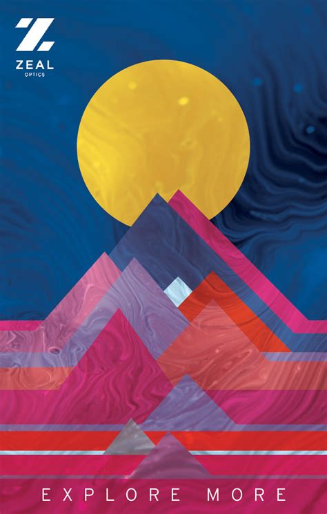
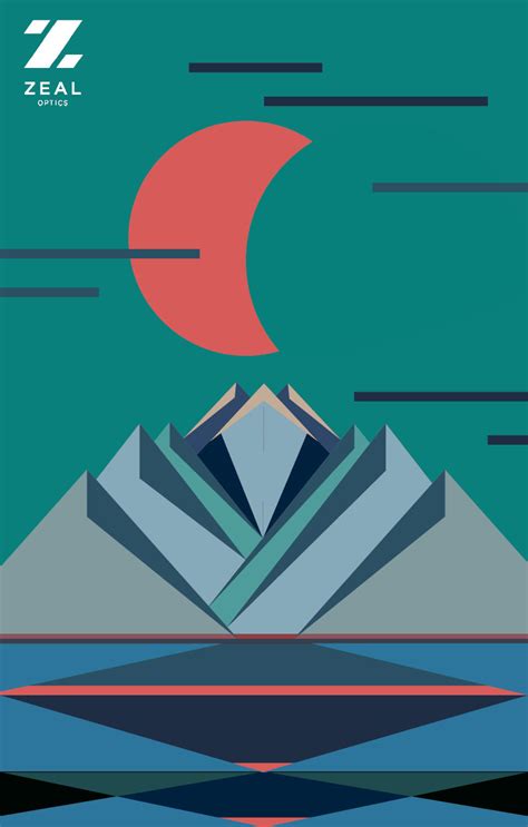
Achieving color harmony in landscape graphic design requires a nuanced understanding of color theory and its application to evoke the desired mood and atmosphere. By carefully selecting a palette that complements the natural environment--such as greens and browns for forested areas or blues and whites for coastal scenes--designers can create a balanced and aesthetically pleasing composition. They must consider the emotional responses elicited by colors; warm tones like oranges and yellows can impart a sense of warmth and vibrancy, while cool tones like blues and greens can convey tranquility and serenity. Utilizing techniques such as analogous, complementary, or triadic color schemes can further enhance the visual coherence, allowing each element within the landscape to support and enhance the overall design without clashing or overwhelming the viewer.
Typography in Outdoor Design
Typography in outdoor design plays a pivotal role in both aesthetic appeal and readability, especially when integrating seamlessly with natural landscapes. Designers must carefully consider font weight, size, and spacing to ensure texts stand out against varying textures and colors found in nature, such as foliage or mountainous backdrops. The choice of contrasting colors is essential; high contrast between text and background enhances legibility from a distance, making it crucial for informational signs or advertisements situated along trails and roads. Furthermore, designers often employ durable materials or protective finishes to prevent the elements--wind, rain, sunlight--from deteriorating the legibility of these typographic elements over time.
Landscape Mood Boards
Landscape mood boards are an essential tool for graphic designers aiming to capture the essence and atmosphere of a particular natural setting. They serve as a visual collection of images, textures, color palettes, and typography that together convey the intended mood and narrative of a landscape project. For instance, a palette might include soft greens and earthy browns that evoke serenity in a woodland area or vibrant oranges and blues capturing the dynamic energy of a seaside location. High-resolution photographs can showcase potential plant life, and supplementary materials such as fabric swatches or stone samples can provide tactile detail, ensuring the resultant design is harmonious with the environment's character.
Visual Storytelling Elements
In landscape graphic design, visual storytelling elements play a crucial role in conveying a narrative through imagery. Designers meticulously choose elements like color palettes, textures, and composition to evoke emotions and guide the viewer's eye across the scene. With the strategic use of layering, depth is created, allowing foreground elements to stand out while the background builds context, providing a sense of place. Typography, when integrated, serves not only as an informative tool but also as an aesthetic element that complements the natural or urban landscape depicted, often leading to a harmonious blend between text and image that strengthens the story being told.
Textural Contrast in Nature Designs
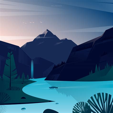
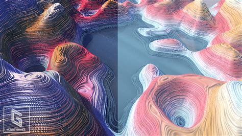
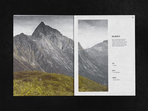
Textural contrast in landscape graphic design requires a keen eye for the intricate interplay between natural elements to create visual depth and interest. Designers must skillfully juxtapose smooth, flowing water features against rugged, craggy rock formations to emphasize differences in texture that captivate viewers. The variegated foliage of delicate ferns can be artfully combined with the coarser surfaces of tree bark or expansive grassy plains to enrich the overall narrative of the scene. Subtle gradients and contrasting color palettes further enhance these textural distinctions, drawing attention to the drama innate in nature's varied textures without overwhelming the overall harmony of the design.
Scale and Proportion in Landscapes
In graphic design for landscapes, scale and proportion serve as fundamental principles that deeply influence the viewer's perception and emotional response to the space depicted. A thoughtfully designed landscape must consider the relative size and ratio of different elements to create visual harmony and balance. For instance, larger objects, such as towering mountains or expansive forests, can convey an imposing sense of grandeur and strength, while smaller elements like delicate flower patches or winding pathways can introduce an inviting, intimate feel. Designers utilize techniques such as perspective, cropping, and positioning to manipulate scale and proportion, enabling them to guide the viewer's eye, highlight focal points, and evoke specific atmospheres within the landscape artwork.
Layering in Scenic Illustrations
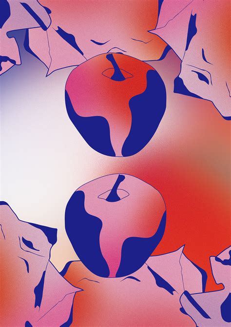
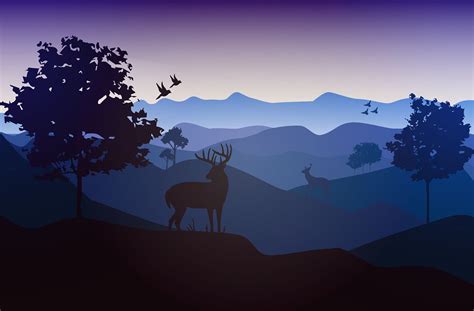
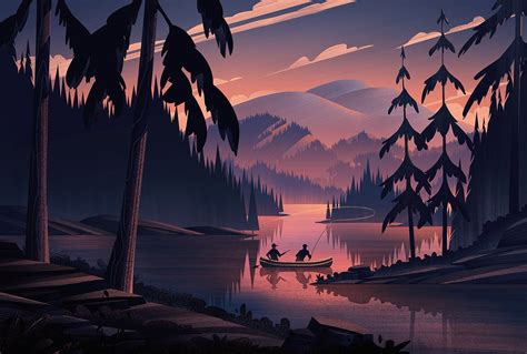
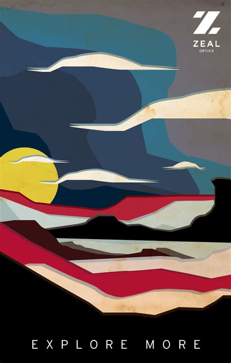
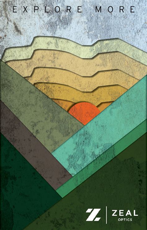
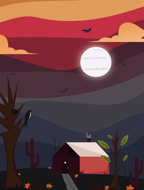
Layering in scenic illustrations allows graphic designers to build depth and complexity in landscape artworks, effectively creating a sense of three-dimensional space. By strategically placing elements at varying distances and heights, designers can simulate perspective, drawing the viewer's eye through the scene in a specific path and imbuing the image with dynamism. Skillful use of opacity and shadow enhances this technique, allowing elements to subtly overlap and indicating atmospheric conditions like fog or haze, which can further suggest distance. Color gradients and textures play a crucial role in defining layers, as cooler and muted tones recede into the background while warm and vivid hues emphasize foreground elements, ensuring a harmonious and balanced composition that captivates the observer with an illusion of reality.
Natural Light Effects in Design
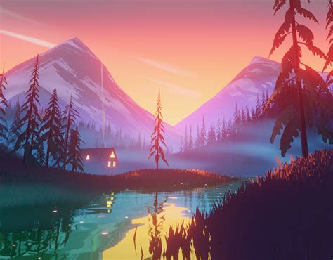
Natural light profoundly influences landscape graphic design by introducing elements like shadows, highlights, and gradients that add depth and dynamism to visuals. Designers often mimic the way sunlight interacts with the environment by strategically placing gradients and color transitions to simulate the natural progression of light across a landscape. This approach allows for the creation of visual narratives that change and evolve, mirroring the subtle shifts in natural light as seen in different times of the day or seasons, thus enhancing the emotional impact and realism of the design. Additionally, integrating these natural light effects requires a keen understanding of color theory and spatial awareness to seamlessly blend virtual elements with the expected natural aesthetics, ensuring the representation is harmonious and evocative.
Sustainable Design Practices
When it comes to landscape graphic design, the emphasis on sustainable design practices has increasingly gathered momentum due to the growing awareness of environmental impacts. Designers are now utilizing eco-friendly materials, such as recycled paper and biodegradable inks, to create prints and mock-ups that align with the values of sustainability, aiming to minimize waste and carbon footprints. The integration of digital tools not only reduces reliance on physical resources but also allows for innovative visualization techniques, like augmented reality, which encourage low-impact design iterations by enabling clients to experience potential outcomes without on-ground alterations. Accompanying visual aesthetics is the thoughtful incorporation of biodiversity-friendly elements and low-water-use vegetation within design plans, promoting ecological resilience and serving the dual purpose of aesthetic appeal and environmental stewardship.









Leave a Reply
Your email address will not be published.