Graphic design for photography came to prominence as the digital age revolutionized visual media. Back then, there was a singular approach to combining text and imagery, but today, innovative graphic design concepts for photography flourish. No matter the technique, these designs amplify the beauty of photographs and add layers of narrative to storytelling. While one might initially think that this type of design is overly complex and ornate, in reality, it's versatile and engaging--and it's experiencing a significant revival. Enhance your visual storytelling with the following graphic design ideas tailored for photography.
Color correction
Color correction in graphic design for photography involves meticulous adjustments to enhance the overall tone and quality of an image. Through careful manipulation of hues, saturation levels, and luminance, designers are able to bring out the intended vibrancy or subtly shift colors to evoke a specific mood. The process requires an eye for detail to ensure that skin tones remain natural, the balance between shadows and highlights is harmonious, and any color casts that may detract from the image's integrity are effectively neutralized. Advanced techniques such as split toning and selective color adjustments further refine the visual narrative, allowing the subject matter to convey the desired emotive impact.
Image composition
Mastering image composition in graphic design for photography requires a deep understanding of the elements that create visual impact and emotional resonance. The rule of thirds serves as a foundational guide, dividing an image into a 3x3 grid to position key components at intersection points, thereby enhancing focus and balance. Foreground, middle ground, and background layers contribute depth by leading the viewer's eye through the photograph, creating a dynamic journey rather than a static observation. Negative space, used judiciously, can amplify the subject's presence, providing contrast and breathing room that allows the viewer to appreciate details and textures often overlooked in more densely packed designs.
Visual hierarchy
Visual hierarchy in graphic design for photography establishes an order of importance among elements, guiding the viewer's eye to the most significant parts of the image. Designers often employ a variety of techniques like contrast, size, alignment, and spacing to create a focal point and lead the viewer through the visual narrative. Larger elements are used to attract immediate attention whereas contrasting colors can sharply delineate between primary and secondary information to prevent visual clutter. The alignment of text, shapes, or graphic components further ensures that key messages are clear and pathways are intuitive, allowing the photograph's story to unfold seamlessly.
Typography integration
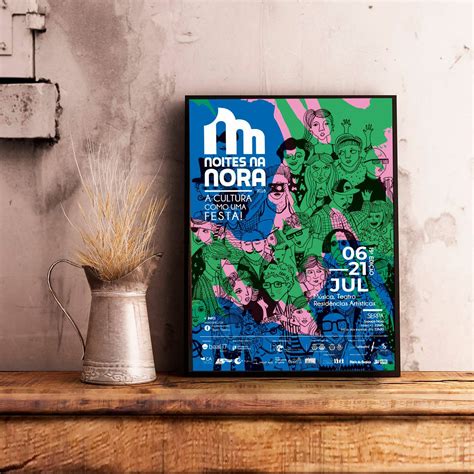
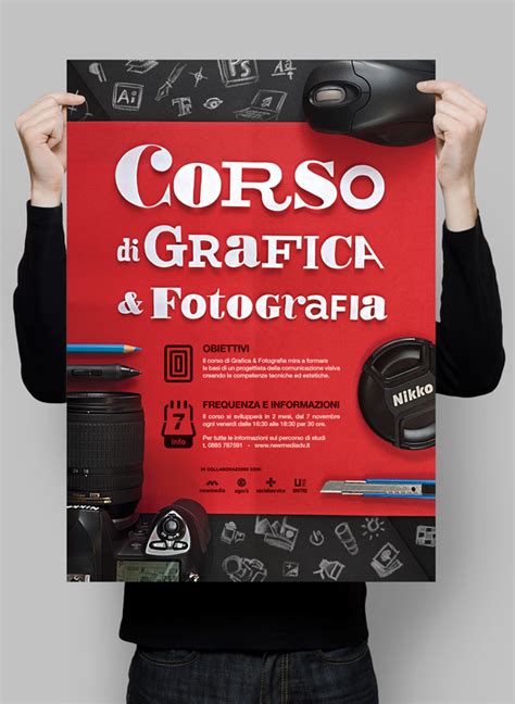
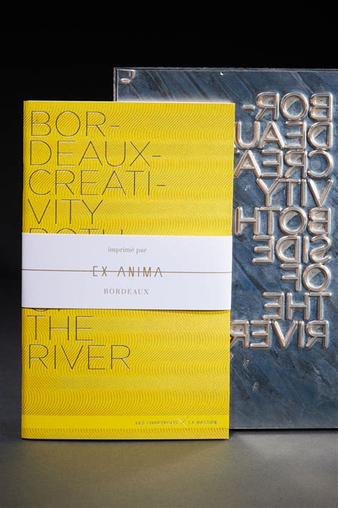
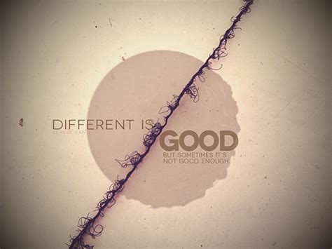
Typography integration into graphic design for photography involves strategically selecting and placing typefaces to complement the imagery, enhance storytelling, and guide viewer engagement. The typeface style, size, color, and positioning should harmonize with the photograph's mood and subject, subtly maintaining the image's focus while adding new layers of meaning. Designers need to consider the emotional tone of the photograph; for instance, a strong, bold sans-serif might suit urban photography with its modern, gritty aesthetic while a delicate serif font might enhance a serene landscape image. Careful kerning and leading are crucial; they ensure text readability without overwhelming the visual content, maintaining an elegant balance between textual elements and photographic art.
Photo retouching
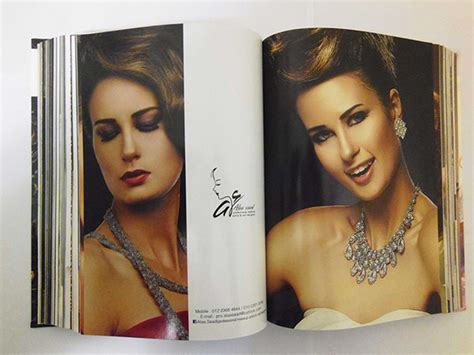
Photo retouching in graphic design for photography involves meticulously enhancing images to improve their aesthetic and emotional impact while preserving the essence of the subject. Techniques include adjusting contrast and brightness to create balanced dynamic ranges, using color correction to ensure true-to-life hues, and applying dodging and burning to emphasize detail. Retouching often involves removing imperfections such as blemishes, stray hairs, and unwanted background elements through tools like the clone stamp and healing brush, thus rendering a polished look. High-end retouching may require frequency separation to separately refine texture and tone or the use of advanced software like Adobe Photoshop for precision tasks, ensuring the final visual retains a natural yet captivating finish.
Brand aesthetics
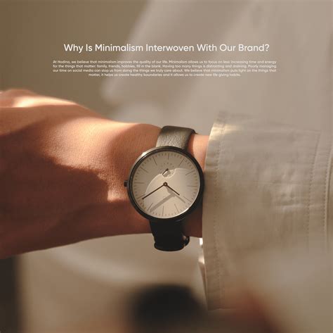
Graphic design plays a crucial role in photography by enhancing brand aesthetics, which serve as the visual language that communicates the photographer's unique identity and message to their audience. Meticulous attention to design elements such as color schemes, typography, and layout can elevate a photography brand, creating a cohesive and memorable visual experience that resonates with viewers. Colors are chosen to evoke specific emotions and moods, aligning with the photographer's style, whether it be vibrant and dynamic or soft and understated. Typography conveys the brand's tone and voice, guiding the visual hierarchy and ensuring that text elements complement rather than overshadow the images, while thoughtful layout design places photographs at the forefront, creating a seamless interaction between image and design and allowing the photographer's work to shine through with clarity and sophistication.
Layout design
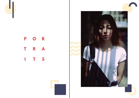
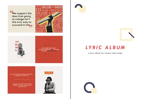
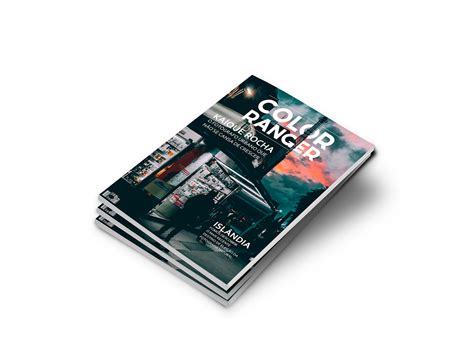
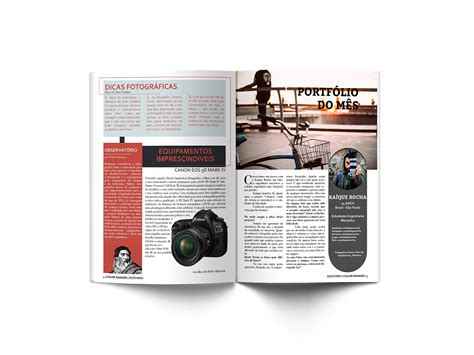
In the realm of graphic design for photography, layout design plays a crucial role in guiding the viewer's eye and enhancing the storytelling aspect of an image. A well-executed layout not only organizes visual elements with precision but also creates an intuitive flow, ensuring that the narrative within the photograph is conveyed effectively. Visual hierarchy is established through the strategic use of grids, whitespace, and alignment, allowing for primary subjects to command attention while supporting elements subtly contribute to the overall composition. Typography choices and color schemes further complement the imagery, providing cohesion and reinforcing the mood and message intended by the photographer, thus transforming a simple photograph into an engaging visual journey.
Mood board creation
Graphic design for photography, particularly in creating mood boards, involves curating a compelling visual narrative that echoes the essence and aesthetics of the photography project at hand. Each mood board begins with a thorough understanding of the project's theme which is then translated into a collage of images, textures, colors, and fonts that collectively inspire the desired emotional response and creative direction. Selection of elements for the mood board is highly deliberate; every texture and color swatch is chosen not only for its individual appeal but for its ability to harmonize with other elements, creating a cohesive and evocative tapestry. This meticulous assembly acts as a visual anchor throughout the photography process, ensuring that the creative team remains aligned with the envisioned atmosphere and style, ultimately guiding lighting setups, photographic angles, and post-production decisions.
Digital manipulation
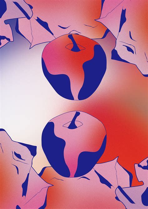
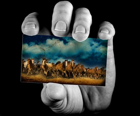
Digital manipulation in graphic design for photography involves altering or enhancing images using software tools such as Adobe Photoshop or GIMP. These tools allow for a vast range of adjustments including color correction, retouching imperfections, and compositing different images to create entirely new visuals. Photographers and designers can achieve surreal effects, transform ordinary shots into striking visuals, or subtly enhance the natural beauty of a photograph. Techniques like layer masking, blending modes, and smart object usage are critical skills, enabling the artist to maintain image quality while executing complex edits.
Contrast balancing
Achieving effective contrast balancing in graphic design for photography involves a nuanced manipulation of tones to emphasize the depth and dimension within an image. Photographers and designers must carefully calibrate highlights, midtones, and shadows to ensure the photograph maintains its intended mood and clarity. Advanced techniques such as curve adjustments or gradient mapping are utilized to dynamically enhance the contrast without losing detail or introducing undesirable artifacts. This harmonious balance not only heightens visual interest but also brings forward the subject matter, guiding the viewer's eye strategically across the composition's intended focal points.








Leave a Reply
Your email address will not be published.