Graphic design for podcasts emerged as a crucial element with the rise of podcasting as a popular medium of storytelling and information sharing. Initially, there was a standard approach to podcast graphics, but now podcast graphic design ideas are plentiful and diverse. Regardless of style, effective podcast design enhances the brand's identity and draws in listeners with its compelling visuals. While at first glance this niche area of design might seem niche or even daunting, in truth it's innovative and exciting--and is currently experiencing a significant boom. Elevate your podcast presence with the following graphic design strategies and create eye-catching visuals of your own.
Cover art
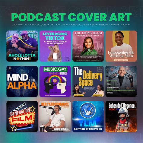
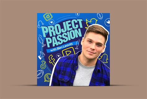
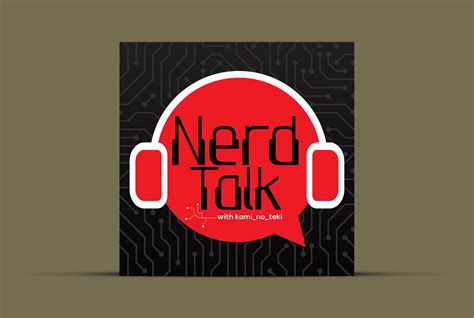
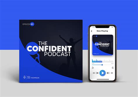
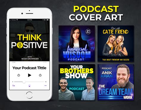
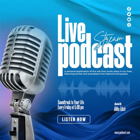
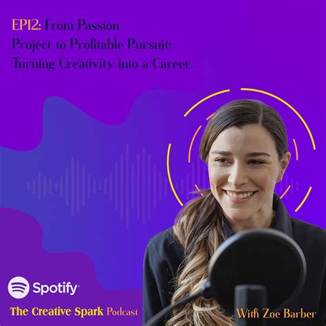
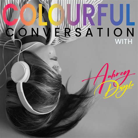
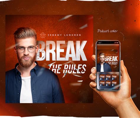
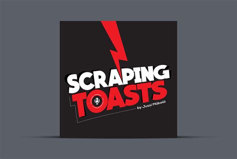
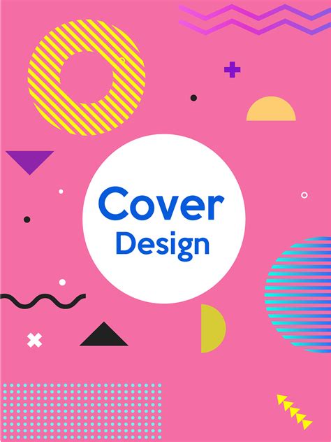
The cover art for a podcast serves as the visual ambassador of the audio content, acting as a crucial marketing tool to attract potential listeners amidst the oversaturated market of podcasts. A well-crafted cover should exude a balance of aesthetic appeal and informative clarity, using harmonious color schemes and typography that reflects the theme and tone of the podcast. The imagery should be high resolution, ensuring integrity across diverse platforms and screen sizes, while remaining scalable to maintain quality on both small podcast directories and full-screen displays. Incorporating elements such as the podcast's title, host(s) faces, or illustrative icons related to the subject matter in a creative yet legible manner can significantly enhance recognition and memorability, directly impacting the listener's decision to explore the content further.
Typography selection
Typography selection in graphic design for a podcast involves a strategic blend of aesthetics, readability, and brand communication. It is pivotal to choose a font that reflects the tone and theme of the podcast, whether it's casual and conversational, requiring a friendly sans-serif typeface, or formal and authoritative, necessitating a serif font. Designers must consider the hierarchy within the text, ensuring the title, episode numbers, and descriptive text are visually distinct yet cohesive, optimizing the listener's first impression and ease of navigation. The use of custom or unique typefaces can further enhance brand identity, although consistency across all platforms, from cover art to social media, is crucial for maintaining a unified visual experience.
Visual branding
A strong visual branding strategy for a podcast involves creating a cohesive and striking design that accurately represents the podcast's themes and tone. Designers should emphasize a memorable logo that captures the essence of the content, employing colors and typography that resonate with the target audience while ensuring scalability across different platforms. Consistency in visual elements like cover art, promotional graphics, and website design is crucial to establishing a recognizable and professional brand presence. Engaging graphics that align with social media platforms enhance audience connectivity and reinforce the podcast's identity, leading to increased listener engagement and loyalty.
Layout design
In the realm of podcast graphic design, layout design assumes a pivotal role by intricately balancing aesthetics with functionality to capture and convey the essence of the content. Designers must meticulously choose typography, often selecting bold, easy-to-read fonts that enhance visibility across various digital platforms, as well as harmonizing these typefaces with complementary color schemes to establish a distinct visual identity. The spatial arrangement of elements is crucial; designers often strategically position images, logos, and text to create a visually engaging hierarchy that not only grabs potential listeners' attention but also communicates key information efficiently. Furthermore, maintaining consistency in layout across different episodes and promotional materials strengthens brand recognition and fosters a coherent and immersive auditory and visual experience for the audience.
Color palette
A meticulously curated color palette is imperative for defining the visual identity of a podcast, influencing the perception and emotional resonance of the content it represents. Each hue should be deliberately selected for its psychological impact, ensuring it aligns with the podcast's theme and tone, so listeners can draw a connection between the visual elements and the auditory experience. Analogous, complementary, or triadic schemes can be employed to create a harmonious balance, with primary colors providing immediate visual recognition, while accent colors add layers of depth and intrigue. The consistency of the chosen palette across all branding materials, including cover art, social media assets, and promotional graphics, establishes a cohesive and memorable brand presence that enhances viewer recall and engagement.
Iconography elements
When designing iconography for a podcast, capturing the essence of the show's theme and content becomes crucial in creating a visual language that resonates with listeners. Incorporating elements such as distinct colors, typography, and imagery tied to the podcast's subject matter can help in constructing a recognizable and relatable icon. Use of bold, clear symbols can ensure visibility even at smaller sizes, while careful consideration of negative space enhances clarity and aesthetic appeal. Harmonizing these elements can ultimately lead to an icon that not only draws attention but also conveys the podcast's narrative and emotional tone effectively.
Graphic consistency
Graphic design for podcasts prioritizes graphic consistency as it fosters brand recognition and ensures a cohesive visual experience across various platforms. A consistent color palette and typeface maintain visual harmony, which aids in embedding the podcast's identity in the audience's memory. Moreover, using repetitive motifs or icons across episode covers, website banners, and promotional materials reinforces thematic elements that listeners come to associate with the podcast. Carefully crafted visual assets that align with the podcast's tone and subject matter enhance listener engagement and convey professionalism and reliability.
Audience engagement visuals
Graphic design for a podcast should prioritize audience engagement through dynamic and striking visuals that distinctly resonate with the show's thematic essence and intended listener demographics. Utilizing vibrant color schemes, in alignment with the podcast's branding, can create a visual identity that captures attention and provokes interest from potential listeners. Infographics and episode-specific artwork can serve to visually encapsulate the content, piquing curiosity and encouraging shares across social media platforms. Interactive visual elements such as polls, quizzes, or behind-the-scenes peeks can enhance listener interaction, fostering a sense of community and keeping the audience invested in the podcast's journey.
Promotional graphics
Promotional graphics for a podcast are crucial in capturing audience attention and conveying the essence of the show. Designers must consider the target demographic, as this impacts color schemes, typography, and imagery choices. Bold designs with vivid contrasts work effectively for energetic or comedic podcast genres, whereas more muted tones might better suit contemplative or narrative-driven content. Consistency across platforms is paramount; thus, employing a recognizable logo and maintaining a thematic visual style enhance brand recognition and foster a deeper connection with the audience by ensuring each graphic aligns seamlessly with the podcast's tone and message.
Episode thumbnails
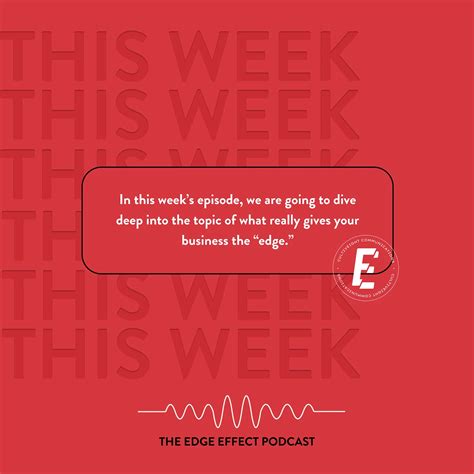
Episode thumbnails serve as visual representations of podcast content, capturing the essence of each episode. They act as the first point of contact for potential listeners, necessitating a bold, clear design that effectively communicates the podcast's theme and tone. High-quality graphics, legible typography, and consistent branding elements are pivotal, ensuring the thumbnail stands out among a plethora of options on various platforms. Designers often incorporate imagery related to the episode topic, use contrasting colors to draw attention, and include the episode number to aid in content organization, all while maintaining a cohesive style across all thumbnails to reinforce brand recognition.











Leave a Reply
Your email address will not be published.