Graphic design for polo shirts emerged as a trend in the late 20th century, transforming plain garments into canvases for expression and brand identity. Back then, simplicity reigned supreme, and polo shirt designs were more restrained, but today, a myriad of creative approaches are at your disposal. The essence of polo shirt graphic design lies in striking a balance between style and subtlety, providing a fresh take on everyday fashion. While at first glance this may appear like a straightforward endeavor, it offers endless possibilities for individuality and innovation. Elevate your fashion game with these polo shirt graphic design ideas and create something uniquely yours.
Vector artwork
Vector artwork for polo shirts offers incredible precision and flexibility, allowing designers to create scalable and highly detailed graphics. The use of vector formats, such as Adobe Illustrator (AI) or Scalable Vector Graphics (SVG), ensures that the design retains its sharpness and clarity, irrespective of the size, whether it's printed small on a chest pocket or large on the back. Designers can manipulate various elements such as lines, shapes, and colors, giving them the creative freedom to construct intricate patterns or incorporate brand-specific logos that are seamlessly integrated into the polo shirt's fabric. This precision not only enhances the aesthetic appeal but also allows for easy color customization and modification, which is essential for producing branded apparel collections catering to diverse market segments and promotional activities.
Color gradients
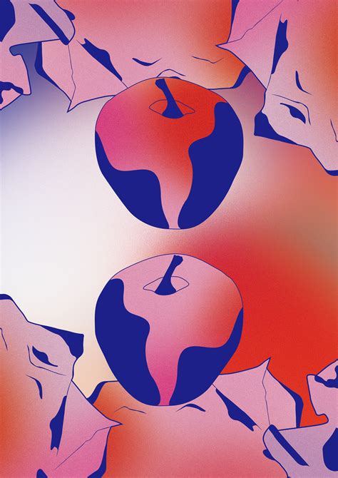
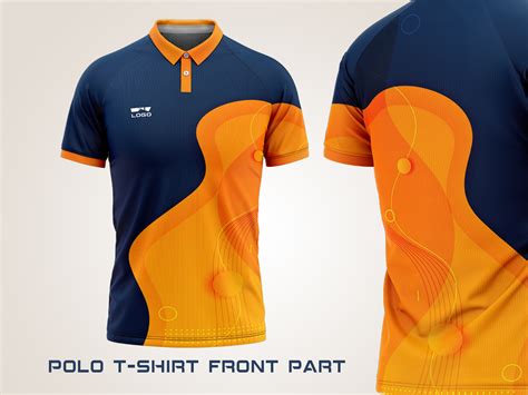
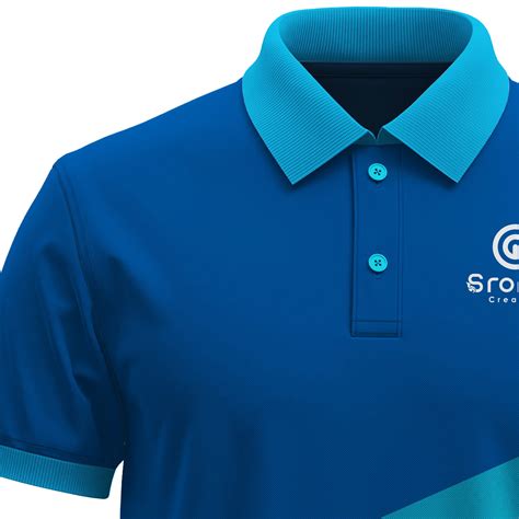
Color gradients on polo shirts create a mesmerizing visual effect by blending hues seamlessly across the fabric, enhancing the garment's aesthetic appeal. A well-executed gradient can transition from a deep navy blue at the base, through shades of teal and aqua, to a gentle sky blue at the collar, evoking a sense of fluid movement. The choice of color palette dramatically influences the mood and style; for instance, warm fiery gradients of red to orange convey energy and passion, whereas softer pastel gradients foster a sense of calm and sophistication. The fabric's texture also plays a crucial role in how the gradients appear, with smoother cotton allowing for sharp, vibrant transitions while pique weaves may diffuse the colors slightly, adding depth and subtlety to the overall design.
Typography styles
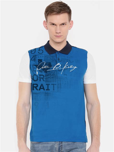
Typography styles in graphic design for polo shirts require an intricate balance between aesthetics and readability. Serif fonts, with their classic and traditional look, are often utilized for formal and elegant designs, suitable for corporate settings or luxury brands. Sans-serif fonts, known for their clean and modern appearance, are typically favored for sports teams and casual wear, offering a fresh and youthful vibe. Script and decorative fonts add a touch of personality and flair, perfect for boutique or niche markets; these styles can introduce a sense of individuality and creativity if used sparingly and in harmony with the overall design theme.
Print resolution
Graphic design for polo shirts requires meticulous attention to print resolution, as it significantly impacts the clarity and quality of the final product. Ensuring a high print resolution is crucial; typically, designers aim for at least 300 DPI (dots per inch) to achieve sharp and crisp images that do not lose detail when printed on fabric. This resolution ensures that intricate patterns, logos, and typography are rendered with precision, maintaining their visual appeal and brand integrity. Designers must also consider the type of fabric, as certain materials might absorb ink differently, potentially affecting resolution and requiring adjustments like tweaking the design for optimal ink distribution and color accuracy.
Logo placement
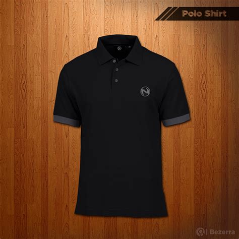
In the realm of graphic design for polo shirts, logo placement plays a critical role in defining the garment's aesthetics and branding efficacy. A prominent and traditional spot for logo positioning is the left chest area, often favored for its subtle visibility and association with quality and exclusivity--akin to luxury brands and corporate attire. However, the right chest area has gained traction for innovative designs, offering a balanced symmetry and unexpected appeal, particularly when the brand desires to disrupt conventional design norms. Equally significant are logos placed on sleeve cuffs, catering to a more discreet and sophisticated audience by allowing them to subtly flaunt the brand while maintaining a refined appearance, ensuring the logo does not overpower other design elements such as piping or color blocking.
Custom embroidery
Custom embroidery on polo shirts involves a meticulous design process that elevates the garment's aesthetic appeal and brand representation. The initial step in this craft is selecting high-quality thread that matches the client's logo or design, ensuring vibrancy and durability. Advanced embroidery machines then translate digital designs into intricate stitch patterns, requiring precision in every thread count and stitch placement that brings each detail to life. The process demands careful attention to fabric type, as this affects thread tension and the final appearance, ultimately producing a polo shirt that seamlessly combines professional flair with personalized branding.
Pantone colors
In graphic design for polo shirts, utilizing Pantone colors can ensure consistency and vibrance, essential qualities often sought after by brands that aim to maintain a recognizable identity. Designers meticulously select specific Pantone shades to achieve the perfect hue that aligns with the brand's message, considering factors like fabric texture and printing methods that may affect color appearance. This practice involves not only choosing the right primary colors but also understanding the subtle distinctions between Pantone variations to create a harmonious and visually appealing design that resonates with the target audience. Each Pantone color is carefully calibrated, enabling both designers and manufacturers to communicate seamlessly, minimizing discrepancies between the design process and the final product, ensuring that the polo shirt's aesthetic appeal aligns precisely with the envisioned brand standards.
Design templates
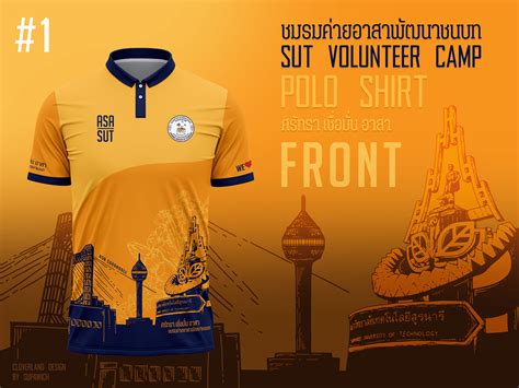
Creating captivating graphic design templates for polo shirts involves a nuanced combination of aesthetics and functionality that caters to diverse fashion sensibilities. Designers often incorporate various elements such as typography, color palettes, and intricate patterns, ensuring that each shirt balances visual appeal with practicality. The templates usually start as vector-based files to allow scalability without losing quality, offering a diverse range of motifs like geometric shapes, floral patterns, and abstract forms tailored to different target audiences. Contextual considerations--such as contrasting elements for logos or embroidery placement--transform the design from a mere sketch into a wearable piece of art, seamlessly marrying the client's brief with cutting-edge design trends.
Stitch patterns
Stitch patterns in graphic design for polo shirts play a crucial role in adding texture, durability, and visual appeal to the garment. The selection and arrangement of these patterns, such as pique, interlock, or jersey stitches, can greatly influence the shirt's feel, its breathability, and overall aesthetic. Utilizing a pique stitch, for instance, offers a subtle raised texture that enhances the classic appeal of a polo while providing breathability, making it a popular choice for athletic wear. Advanced design techniques might incorporate decorative stitches like zigzag or flatlock, either to strengthen seams or as a stylistic element, thereby offering a bespoke touch that aligns with brand identity or consumer preference, achieving a harmonious blend of functional and aesthetic considerations.
Fabric mockups
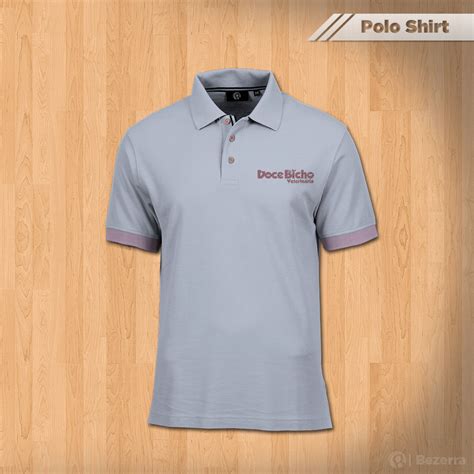
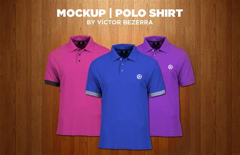
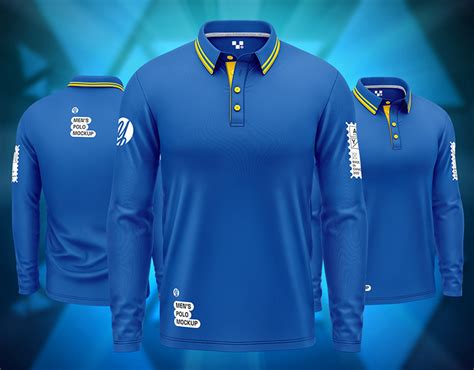
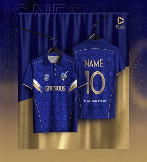
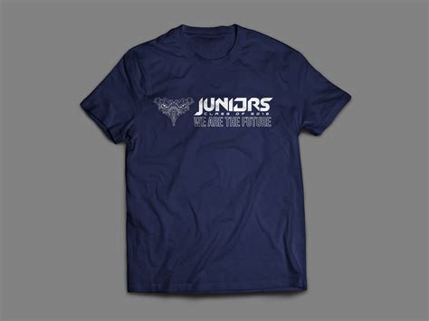
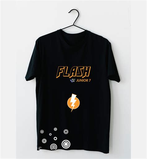
When creating graphic designs for polo shirts, focusing on fabric mockups requires attention to texture, color accuracy, and how the design interacts with the natural folds and contours of the garment. High-quality mockups must simulate the fabric's weave, whether it's a smooth cotton pique or a stretchable polyester blend, to ensure the design appears authentic when transferred from screen to actual product. Designers must incorporate shadowing and lighting effects in mockups to realistically represent the depth and movement expected in real-world scenarios, enhancing the design's positioning and visibility. Ensuring that colors and elements stay true to brand identity while maintaining their vibrancy on various fabric types is crucial, as is considering the placement and scaling of graphics to harmonize with elements like collars, plackets, and buttons, all while adhering to the spatial limitations dictated by seams and hemlines.


Leave a Reply
Your email address will not be published.