Graphic design for shirt printing has its roots in the vibrant culture and art movements of the 20th century, transforming personal and promotional storytelling. Over time, what was once a niche craft has evolved into a dynamic and diverse form of expression, with countless graphic design ideas at your fingertips. Shirt printing, at its core, marries creativity with functionality, breathing life into wearable art. While some might initially perceive it as commercially driven or overly trendy, the reality is that it's an immensely rewarding and imaginative field--currently enjoying a renaissance of creativity and innovation. Elevate your wardrobe and showcase your individuality with the following graphic design ideas tailored for shirt printing.
Vector graphics
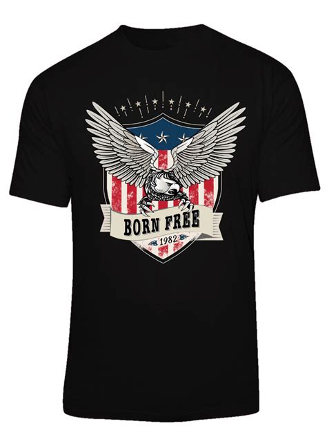
Vector graphics, essential in shirt printing, offer scalability and precision that are unparalleled. These graphics use mathematical equations and geometric shapes such as points, lines, and curves to create designs that maintain clarity at any size, avoiding pixelation and preserving detail. Designers can manipulate individual elements easily, allowing for intricate patterns and vibrant color palettes that enhance the printed output's quality. They also enable efficient color separation, crucial for screen printing processes, ensuring each shade in a design is distinct and results in crisp, professional finishes.
Screen printing
Screen printing, a predominant method in shirt printing, involves creating a stencil, known as a screen, and using it to apply layers of ink onto the fabric. Each color within the design necessitates a separate screen, thus requiring precision and care during production to maintain the integrity of the image. The screen is crafted by coating a mesh with a light-sensitive emulsion, which hardens under a UV light exposure except where the design blocks the light, leaving a detailed stencil through which the ink passes onto the shirt. This approach is favored for its durable, vibrant finish that withstands multiple washes, making it particularly suitable for designs demanding bold colors and intricate detailing.
Color separation
Color separation is a crucial stage in graphic design for shirt printing where an artwork is meticulously divided into individual color components. Each hue in the design is isolated, often through software like Adobe Illustrator or Photoshop, facilitating the production of separate screens for each shade in screen printing. This process ensures that the vibrant and complex designs maintain their integrity when transitioned from a digital platform to fabric. Precise registration marks are aligned across screens to maintain color accuracy and detail, thus ensuring the final print mirrors the original digital vision seamlessly across every shirt in a production run.
Halftone patterns
In the realm of shirt printing, halftone patterns are revered for their ability to replicate gradients and detailed images with a limited color palette. The technique involves using dots of varying sizes and spacings to create the illusion of depth and shading, enabling a smoother transition between colors and enhancing the visual complexity of the design on fabric. Printers meticulously adjust the dot density and angle to achieve diverse textures and tones, allowing for intricate imagery to be rendered with remarkable precision and visual appeal, even under the constraints of traditional screen printing methods. Designers often leverage halftone patterns to infuse a retro or comic-inspired aesthetic into their artworks, strategically integrating these patterns to amplify focal points within the design or to subtly blend hues for a seamless multi-color print, thereby elevating the shirt's overall artistic expressiveness.
Fabric compatibility
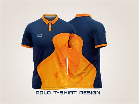
Graphic design for shirt printing demands a thorough understanding of fabric compatibility, which significantly influences the longevity and vibrancy of the design. Cotton, highly favored for its breathability and softness, absorbs ink effectively, making it ideal for detailed digital prints. However, synthetic fabrics such as polyester require sublimation printing to ensure the design bonds well with the fabric fibers, preventing peeling or fading. Additionally, blends of cotton and polyester present unique challenges, where hybrid printing techniques like DTG or screen printing with plastisol inks are essential to achieve crisp outcomes without compromising fabric integrity.
Custom typography
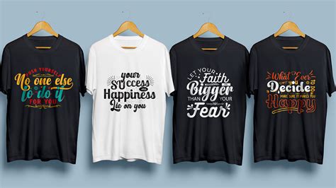
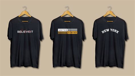
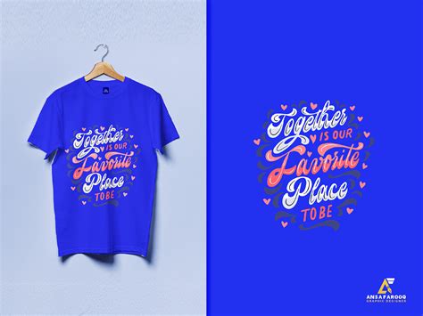
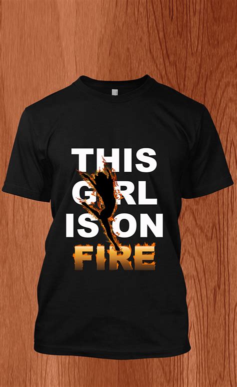
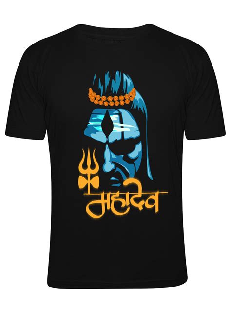
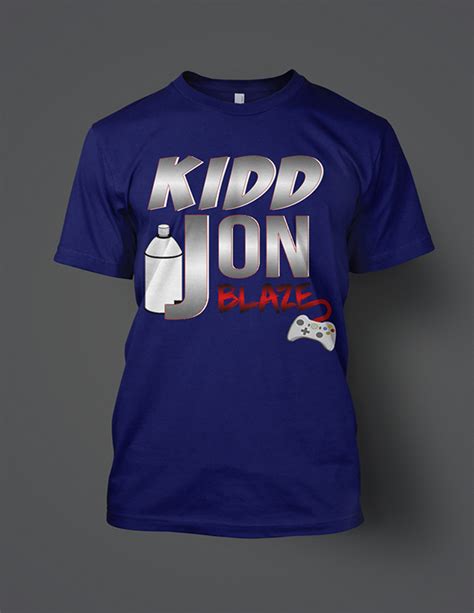
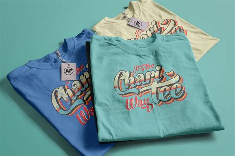
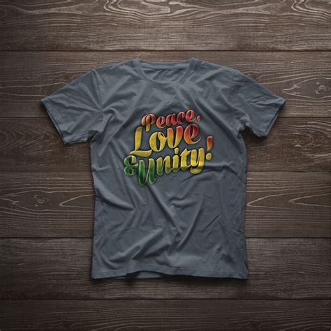
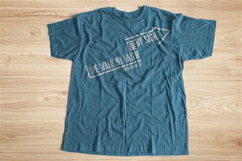
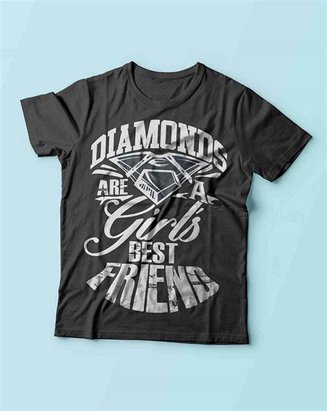
Custom typography in shirt printing serves as a foundational element that offers brands and designers a unique avenue to express identity and enhance visual appeal. Meticulously crafted letterforms can translate specific moods or themes by leveraging aspects like font style, size, and color, which ultimately resonate with a target audience on a deeper, emotional level. Designers often experiment with juxtaposition of bold, eye-catching fonts against contrasting backgrounds or integrate subtle, intricate scripts to evoke sophistication or intrigue, thereby augmenting the shirt's narrative and wearer's connection. Such typographic expressions not only personalize apparel but also encapsulate moments, ideas, or brand ethos that transcend basic design, contributing to both aesthetic allure and marketing value.
Ink saturation
Ink saturation in graphic design for shirt printing plays a crucial role in determining the vibrancy and durability of the final product. A higher saturation level ensures that colors appear vivid and can resist fading over time, essential for designs intended to catch the eye and maintain their appeal after multiple washes. Designers must consider the type of fabric, as natural fibers like cotton absorb ink differently than synthetics, influencing the saturation level necessary for optimal results. However, excessive saturation can lead to bleeding and muddiness, necessitating precise calibration during the digital design phase to achieve a balanced and high-quality print.
Print resolution
Print resolution is a critical aspect of graphic design for shirt printing, as it determines the clarity and intricacy of the design when transferred onto fabric. A higher resolution, typically recommended at 300 dpi (dots per inch), ensures that intricate details and vibrant colors are vividly captured, avoiding the risk of pixelation or blurriness once the design is printed. This high level of detail is essential not only for capturing complex graphic elements but also for maintaining the readability of text and ensuring that any gradients or color transitions appear smooth rather than banded. Designers must be sure to set their digital artwork at the appropriate resolution from the onset of the project and work within the color limitations of the chosen printing method, such as screen printing or direct-to-garment (DTG), to achieve the best results on the fabric.
Design mockup
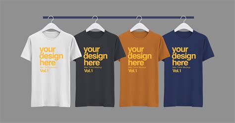
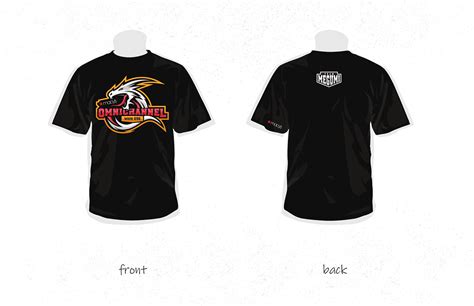
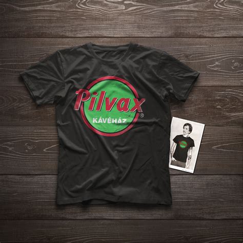
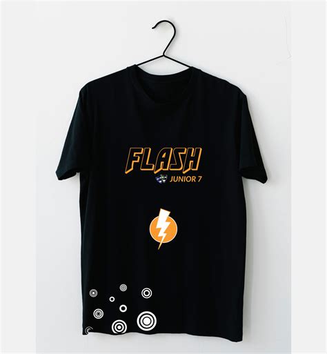
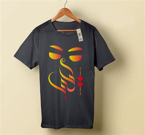
Graphic design for shirt printing often involves creating detailed design mockups that serve as a crucial blueprint for the finished product. Designers meticulously select colors, patterns, and fonts to visually communicate the intended message, considering how each element will appear on fabric when printed. Advanced design software enables the creation of realistic mockups that simulate how the design will drape over different sizes and styles of shirts, highlighting the texture and ensuring placement accuracy. Incorporating elements like shadows and highlights in the mockup not only enhances the realism but also aids in visualizing the final product's appeal, providing a clear guide for both clients and printers to anticipate the outcome with precision.
Heat press application
The art of graphic design for shirt printing, particularly through heat press application, is a meticulous blend of creativity and technical precision. Designers must first create vibrant, high-resolution digital artwork using software like Adobe Illustrator or Photoshop, ensuring that colors and lines will maintain their integrity under the heat and pressure of application. The next critical step involves the selection of the right heat transfer vinyl or printable paper that can flawlessly adhere to fabrics such as cotton and polyester without compromising the design's original essence. Precision in temperature, typically between 320degF and 350degF, and pressure settings, often between 40 psi to 60 psi, are crucial variables in the heat press process to ensure the final product not only looks striking but also withstands the test of time and multiple washes, maintaining its vibrancy and detail.






Leave a Reply
Your email address will not be published.