Graphic design for sweatshirts emerged as a dynamic trend in fashion, taking the humble garment from simple to standout. While traditional designs once dominated, today there is a multitude of innovative graphic design ideas to explore. At its core, graphic design for sweatshirts captures attention and expresses individuality. Although some might perceive sweatshirt design as run-of-the-mill and predictable, in actuality it is versatile and inspiring--and currently experiencing a significant renaissance. Elevate your wardrobe with the following graphic design ideas and craft a sweatshirt that truly makes a statement.
Typography design
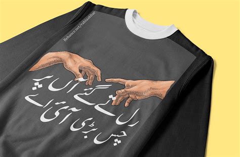
The sweatshirt's typography design should embody both modernity and timelessness, with clean lines that speak volumes without overwhelming the fabric's canvas. Utilizing a combination of sans-serif and serif fonts, the design should focus on creating an engaging contrast, allowing each letter's form to be a work of art in itself. Techniques like kerning and tracking should be meticulously applied to ensure both readability and aesthetic appeal, while negative space is skillfully incorporated to enhance the dynamism and fluidity of the text layout. Bold colors should be strategically used to highlight specific words or phrases, ensuring they capture attention while still maintaining harmony with the sweatshirt's overall color palette.
Color palette selection
Selecting an effective color palette for a sweatshirt graphic design requires a nuanced understanding of color theory and the emotional impact of hues on potential consumers. Rich, warm tones like deep burgundy or burnt sienna can evoke feelings of comfort and coziness, which are ideal for fall and winter collections. Alternatively, utilizing cooler shades such as teal or olive can communicate a refreshing and rejuvenating aesthetic, suitable for spring and summer designs; the key is achieving a balance that resonates with the target demographic while maintaining visual harmony across the sweatshirt's entirety. A thoughtful integration of neutral tones, including soft gray or beige, can add sophistication and versatility, ensuring the design remains timeless and adaptable to various fashion trends.
Vector graphics
Vector graphics in sweatshirt design offer precise and scalable imagery that maintains quality regardless of size adjustments, essential for intricate and bold designs. Using vector software like Adobe Illustrator, designers ensure crisp, clean lines and vibrant colors that curve smoothly along the body's contours, making the sweatshirt visually appealing. The use of layers and paths in vector graphics allows for easy adjustments, color changes, and detailed customization which is ideal for producing unique, personalized apparel. Additionally, vector formats facilitate seamless printing processes, whether for silkscreen, digital printing, or embroidery, ensuring that every detail is captured accurately on the sweatshirt material.
Print placement
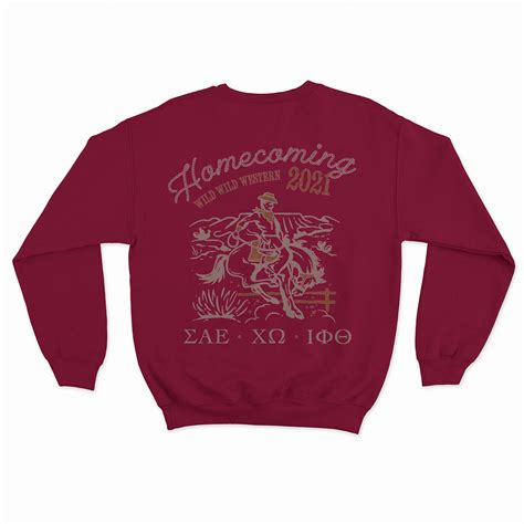
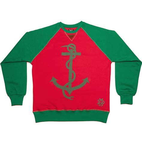
Print placement on a sweatshirt plays a critical role in determining both aesthetic appeal and wearer satisfaction. The primary design area is often centered on the chest, which aligns the graphic with the natural line of sight and draws immediate attention, making it crucial for brand logos or bold motifs. However, innovative designers often explore alternative placements such as wrapping designs around the sleeves or utilizing the back for surprise effects, which can offer a unique visual narrative and allow for playful or complex graphic installments. Balance and scale are essential, as a misplaced or disproportionately large print can disrupt the symmetry and clutter the garment, while subtle yet strategically placed graphics can enhance wearability and transform a simple sweatshirt into a statement piece.
Logo integration
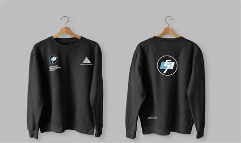
When designing a sweatshirt with a focus on logo integration, it's essential to balance aesthetic appeal with brand representation. The logo should be strategically placed to not overshadow the overall design yet remain prominent enough to be easily recognizable. Selecting the right color palette that complements the logo without clashing is crucial; typically, monochromatic schemes or contrasting colors work well. Designers must also consider the fabric texture and printing method, as these can affect the visibility and durability of the logo, taking into account possible options like screen printing, embroidery, or vinyl transfer to best suit the intended style and purpose of the sweatshirt.
Fabric texture
A graphic design for a sweatshirt with a focus on fabric texture should emphasize the tactile experience and visual depth of the material. By utilizing high-resolution images that showcase the intricate weave patterns and subtle variations in the fabric, the design can create a sense of dimensionality and richness. The play of light and shadow on the textured surface adds dynamism and a sense of movement, enhancing the overall aesthetics of the garment. Strategic incorporation of additional elements such as layered graphics or embroidered accents can further accentuate the texture, making it not only an eye-catching piece but also one that invites touch and curiosity.
Pattern creation
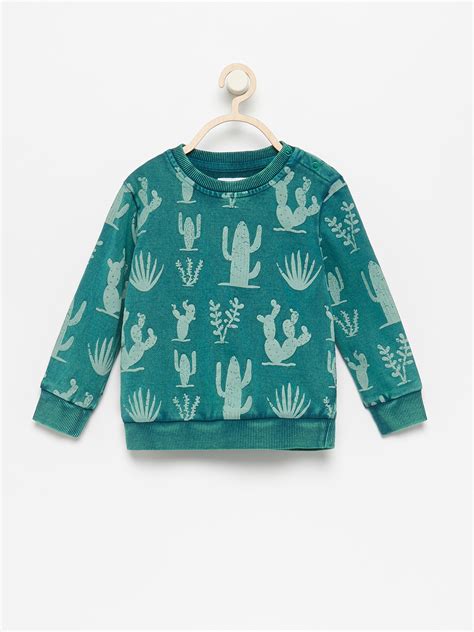
Creating a graphic design for a sweatshirt centered on pattern creation involves a meticulous blend of elements that resonate both aesthetically and conceptually. The process begins with an exploration of motifs--shapes, symbols, or graphics--that encapsulate the intended message or theme, whether abstract, floral, geometric, or a fusion of multiple styles. Designers pay close attention to color theory, ensuring the patterns complement the fabric hue and seasonal trends, often using software to prototype seamless repetitions and scale adjustments to maintain visual harmony across the sweatshirt's surface. Additionally, the tactile experience is considered, experimenting with textures or layering techniques in embroidery or print that add depth and dynamic interplay when the garment is worn, resulting in a distinctive piece that commands attention and speaks to the wearer's personality and lifestyle.
Branding elements
Creating a captivating graphic design for a sweatshirt focused on branding elements involves incorporating distinct motifs that resonate with the brand's identity. Utilizing a cohesive color palette aligned with brand standards subtly reinforces brand recognition while ensuring visual harmony across the design. Incorporating the logo as a central or secondary element, possibly with innovative rendering like embroidery or patchwork, enhances the tactile experience and strengthens brand visibility. Typography should echo the brand's voice, using fonts that reflect its ethos and incorporating slogans or taglines strategically to forge an emotional connection with the wearer, thus turning the sweatshirt into both a fashion statement and a moving advertisement.
Sizing specifications
When designing a graphic for a sweatshirt, sizing specifications are crucial to ensure the artwork complements the garment dimensions and provides an optimal visual impact. The design's scale should be carefully adjusted to correspond with various sweatshirt sizes, ensuring it neither overwhelms smaller sizes nor appears diminutively on larger ones. Typically, a central chest design might range from 8 to 14 inches in width, proportionally increasing for larger sweatshirts to maintain a balanced appearance. The placement should also account for the garment's natural drape when worn, placing important elements well above the hem and centering them along shoulder lines to preserve the artwork's intended alignment and prominence.
Visual balance
Creating a graphic design for a sweatshirt with a focus on visual balance requires an understanding of both symmetry and asymmetry that enhances aesthetics while ensuring comfort and wearability. Designers often employ the principles of harmony and proportion, using elements such as color blocking, typography, or motifs to guide the eye evenly across the surface, thereby preventing any one part from overwhelming the others. For instance, a symmetrical design might use mirrored graphics divided along the central axis of the sweatshirt, achieving a calming and orderly impression, whereas an asymmetrical design might place a bold graphic on one side, counterbalanced by subtle details on the opposite side, such as contrasting cuff lines or understated logo placements. Textures and fabric are chosen carefully to complement the visual elements, ensuring that the tactile experience aligns with the visual one, thereby crafting a cohesive piece that resonates aesthetically and functionally with a wide range of audiences.



Leave a Reply
Your email address will not be published.