Graphic design for tees emerged as a creative outlet in the vibrant 1960s, transforming the t-shirt from a basic garment into a dynamic canvas for self-expression. Back then, screen printing was the go-to method, while today, the possibilities are vast with digital printing and unique design techniques available at our fingertips. Whatever the method, designing for tees merges art and fashion, providing wearers an opportunity to showcase personal style or send a powerful message. Although some might initially view this as a niche or quirky pursuit, in actuality, it's both versatile and innovative--and it's experiencing a renaissance right now. Elevate your wardrobe and creativity with these inspiring t-shirt graphic design ideas to craft your own standout piece.
Vector artwork
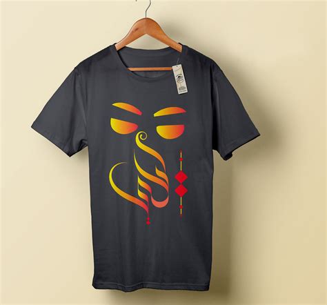
Vector artwork plays a crucial role in designing for tees and T-shirts, offering scalability and crispness, ensuring the design retains its sharp edges and vibrancy across different garment sizes. The process usually begins with conceptual sketches that capture the essence of the theme, which are then meticulously refined using vector software like Adobe Illustrator or CorelDRAW, ensuring every curve and line maintains precision and fluidity. Designers often utilize layers to experiment with various color schemes and patterns, enhancing the potential for customization that appeals to diverse target audiences. Vector formats such as SVG or EPS allow designers to easily make adjustments and facilitate seamless integration with digital printing machines, ensuring the final design is flawlessly transferred to the fabric, maximizing visual impact and brand appeal.
Typography layout
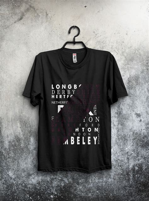
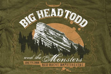
Typography layout for t-shirt design involves a strategic arrangement of text elements that harmonize with the overall aesthetic and message. Each element, from font choice to spacing, plays a pivotal role in conveying the intended narrative, be it bold and daring for streetwear or elegant and understated for a minimalist look. The use of hierarchy in typography ensures that the crucial aspects of the message stand out, guiding the viewer's eye from the most to the least important information. Balancing kerning, leading, and alignment, designers skillfully utilize negative space to enhance readability while maintaining visual interest, ensuring that the design is both impactful and wearable.
Color palette
Graphic design for T-shirts heavily relies on crafting a compelling color palette that resonates with the intended audience. A thoughtfully curated palette enhances the thematic essence of the tee, whether it's one that evokes nostalgia with pastel shades or projects modernity with bold, contrasting hues. Designers often utilize color theory principles, combining complementary colors to yield designs that are both aesthetically pleasing and emotionally impactful. A successful color palette doesn't merely align with current fashion trends, but also considers the durability of colors under various lighting and washing conditions to ensure prolonged visual appeal and garment longevity.
Screen printing
Screen printing, a traditional yet ever-evolving technique, remains a favored method for creating detailed and vibrant graphics on tees and t-shirts. This process involves pushing ink through a stencil-supported mesh screen, and each color requires its own screen, allowing for precise layering and color separation, which is critical for intricate designs. Modern advancements have led to the use of eco-friendly inks and digital capabilities for designing screens, enabling designers to achieve high levels of detail and subtle gradients previously unattainable. With the ability to print on various fabrics and accommodate large quantities, screen printing proves ideal for both small indie brands seeking unique appeal and large-scale productions aiming for consistency and durability.
Graphic motif
In the realm of graphic design for tees, the motif stands as a pivotal element, encapsulating the theme and essence that transforms a mere garment into a canvas of self-expression. Each motif--whether abstract, illustrative, or typographical--carries a narrative or conveys a message, requiring a delicate balance between creativity and practicality to ensure it resonates with the target audience yet remains feasible for mass production. Designers must consider the interplay of colors, shapes, and negative space, employing techniques such as layering or texture to add depth and intrigue, while simultaneously adhering to garment constraints, like fabric type and printing technology, to ensure the integrity of the motif is maintained from conception to wearable art. Moreover, successful motifs often tap into current cultural trends or timeless aesthetics, providing wearers with a sense of connection or nostalgia that transcends the transient nature of fashion, thereby securing a lasting imprint on both the fabric and the wearer's identity.
Design mockup
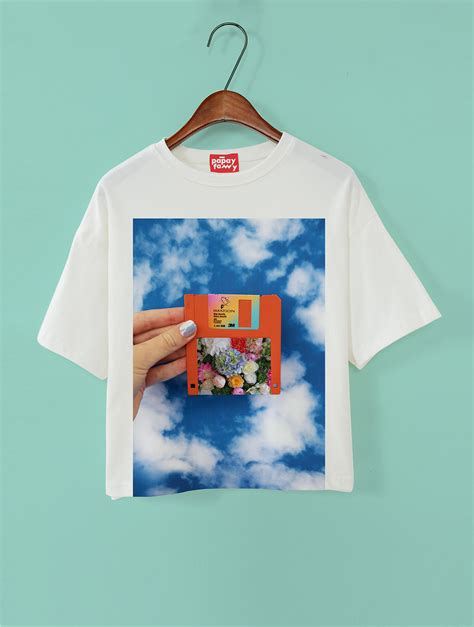
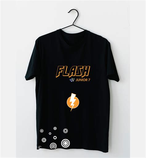
Graphic design for tees and t-shirts relies heavily on creating design mockups that effectively showcase the artwork's potential impact and marketability before committing to large-scale production. The process entails using specialized software to generate high-resolution, realistic representations of how the design will appear once printed, meticulously considering aspects such as placement, size, and color schemes. Designers meticulously analyze the interplay of fabric texture and color fidelity to ensure that the mockups convey an accurate depiction of the final product while also facilitating client feedback and approval. These mockups are essential in bridging the gap between conceptual designs and final products, helping designers and stakeholders make informed decisions about adjustments, potential enhancements, and alignment with brand identity before moving forward with actual production.
Fabric texture
The tactile sensation of a garment significantly influences the appeal of T-shirts, rendering fabric texture a crucial aspect of graphic design in the apparel industry. Designers meticulously select fabrics like cotton, polyester blends, or bamboo fiber, each offering unique textural characteristics that can either enhance or diminish a graphic design's visual impact. The fabric's weave, be it jersey, ribbed, or interlock, directly affects how printed designs will appear and feel, making it imperative for designers to match texture with the intended aesthetic and functional purpose of the tee. Techniques like screen printing, embroidery, and DTG printing interact differently with each texture, requiring a sophisticated understanding of material behavior and the interplay between tactile feel and visual design to ensure that the final product not only looks but also feels harmonious and of high quality.
Logo placement
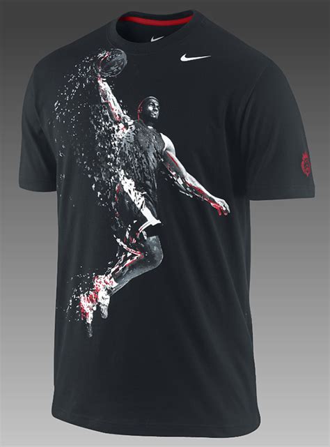
Strategic logo placement is crucial for visually impactful and marketable tee shirts, as it can significantly influence the garment's appeal and brand recognition. Logos positioned on the upper left chest area typically provide a classic and understated look, ideal for customers seeking subtle branding while maintaining strong visibility. On the other hand, larger logos that dominate the torso area can make a bold and striking statement, capturing attention and asserting brand identity, which is particularly effective for vibrant and youthful brands aiming to make a memorable first impression. Additional placements, such as in the center of the back or along the sleeves, can add unique elements to a design, offering versatility and reinforcing the logo's visibility from different angles, catering to various market segments and aesthetic preferences.
Illustration style
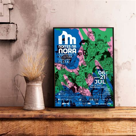
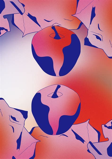
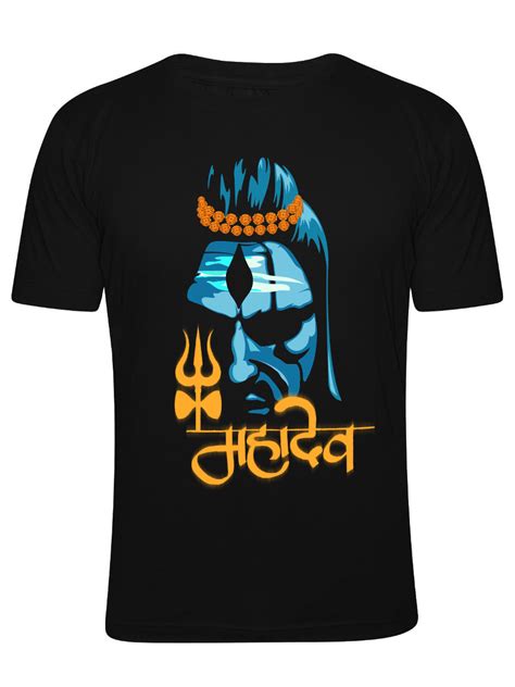
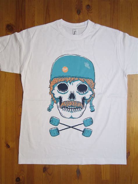
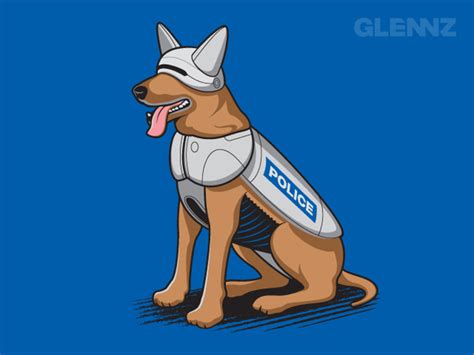
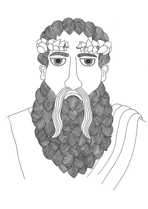
Graphic design for T-shirts, especially when focusing on illustration style, often involves a delicate balance between vivid creativity and practical wearability. Designers frequently utilize bold lines, vibrant colors, and expressive typography to create visually striking artwork that captures attention. Popular techniques include vector illustrations for sharp, scalable designs, and hand-drawn sketches that lend an artisanal, unique touch to each garment. The integration of themes such as pop culture, abstract art, or nature motifs can enhance the shirt's appeal, while the consideration of various printing methods like screen printing or direct-to-garment ensures the final product maintains the integrity and resolution of the design.
Print resolution
When creating graphic designs for tees, ensuring optimal print resolution is crucial to achieve the highest quality finish and vividness of the imagery. Dots per inch (DPI) plays a significant role in this process, with a standard of 300 DPI often employed to ensure that the printed design is sharp, detailed, and professional-looking, avoiding any pixelation that could detract from the design's clarity. Additionally, understanding the specific requirements of the print method, such as screen printing, direct-to-garment (DTG), or heat transfer, is essential since each method might have different resolution needs; screen printing may handle lower resolutions well due to its layering of colors, whereas DTG might require higher resolutions to maintain detail in intricate designs. Furthermore, the dimensions of the design in pixels need to match the intended output size on the T-shirt to avoid stretching or compressing, ensuring that the resolution remains consistent across the final printed area, preserving the designer's original color integrity and detail.











Leave a Reply
Your email address will not be published.